Role
Brand Designer
Date
July – August, 2017
With
Myself
Where
Hometopia & home, Beijing
Analysis & Ideation
Hometopia wants to create an international youth apartment brand. Its Chinese name is ‘请住 (Qing Zhu)’, meaning ‘please come and live here’, and its slogan is ‘有家有理想’, meaning that young people in big cities should have a home of their own and pursue their ambitions, and Hometopia hopes to become their ideal home.
After discussing and visiting, I found some keywords:
Young, energetic, safe, warm, ideal, international
So my basic idea was as follows:
1. Information & emotion: Logotypes convey specific information, and graphics convey abstract emotion.
2. Young & dynamic: Simple and clear graphic elements; modern sans-serif fonts; bright colours, but still recognizable in monochrome and small size.
3. Safety: A brand related to an apartment needs to convey a sense of safety and reliability, so it is necessary to maintain a balance of graphics and text. The overall shape is preferably a regular geometry; the font-weight is at least ‘regular’.
4. Warmth & ideal: Conveying the ideal and warmth in the graphics, hoping to remind people of images such as light, future, distance, home, etc. The logotype should have some humanistic style.
5. Internationalization: As the target users include international students, both Chinese and English versions of the logo are required. At the same time, they should match each other for consistency.
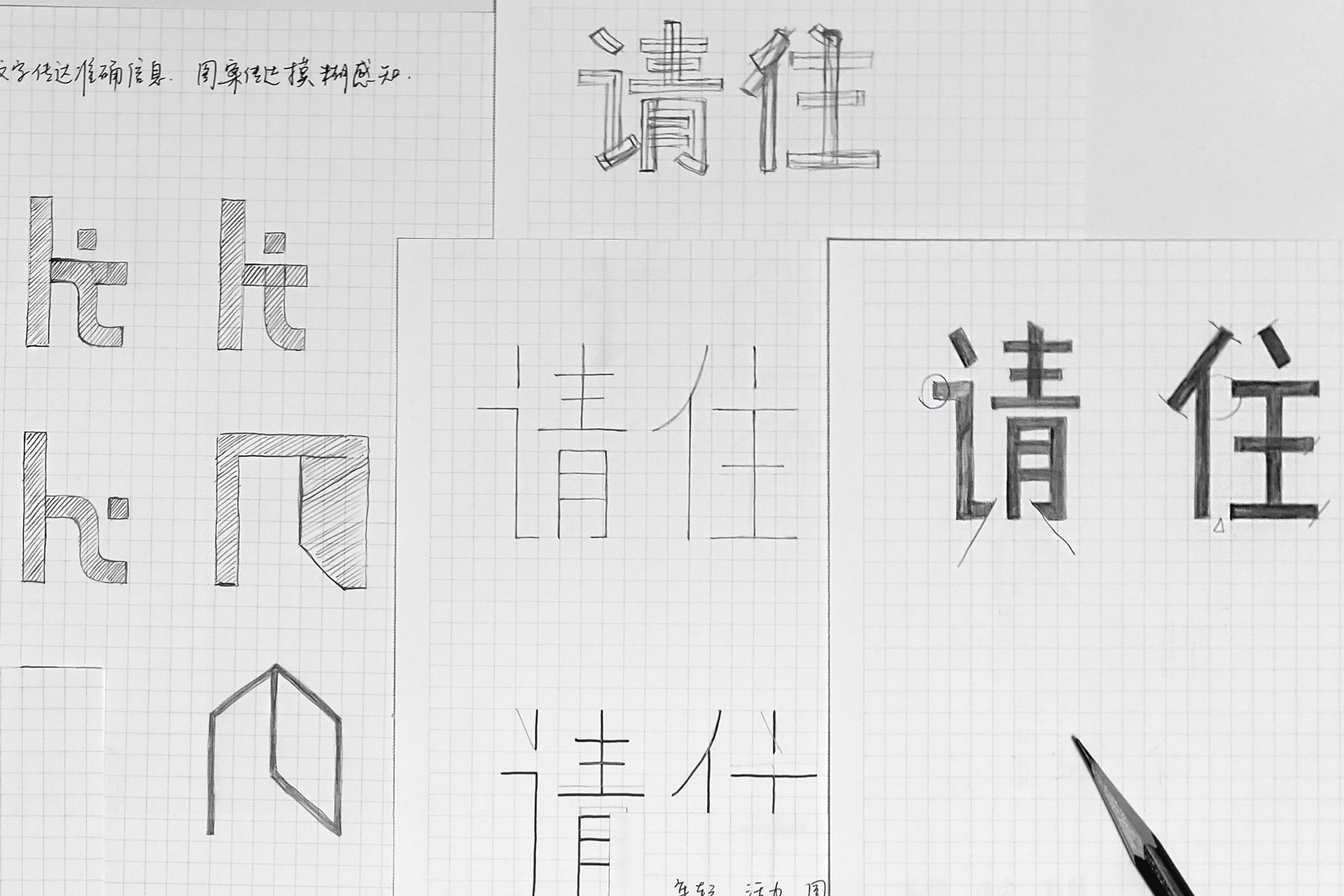
Logo Sketches

Logotype
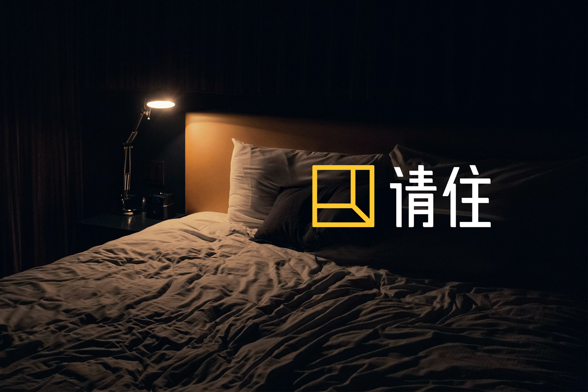
Chinese
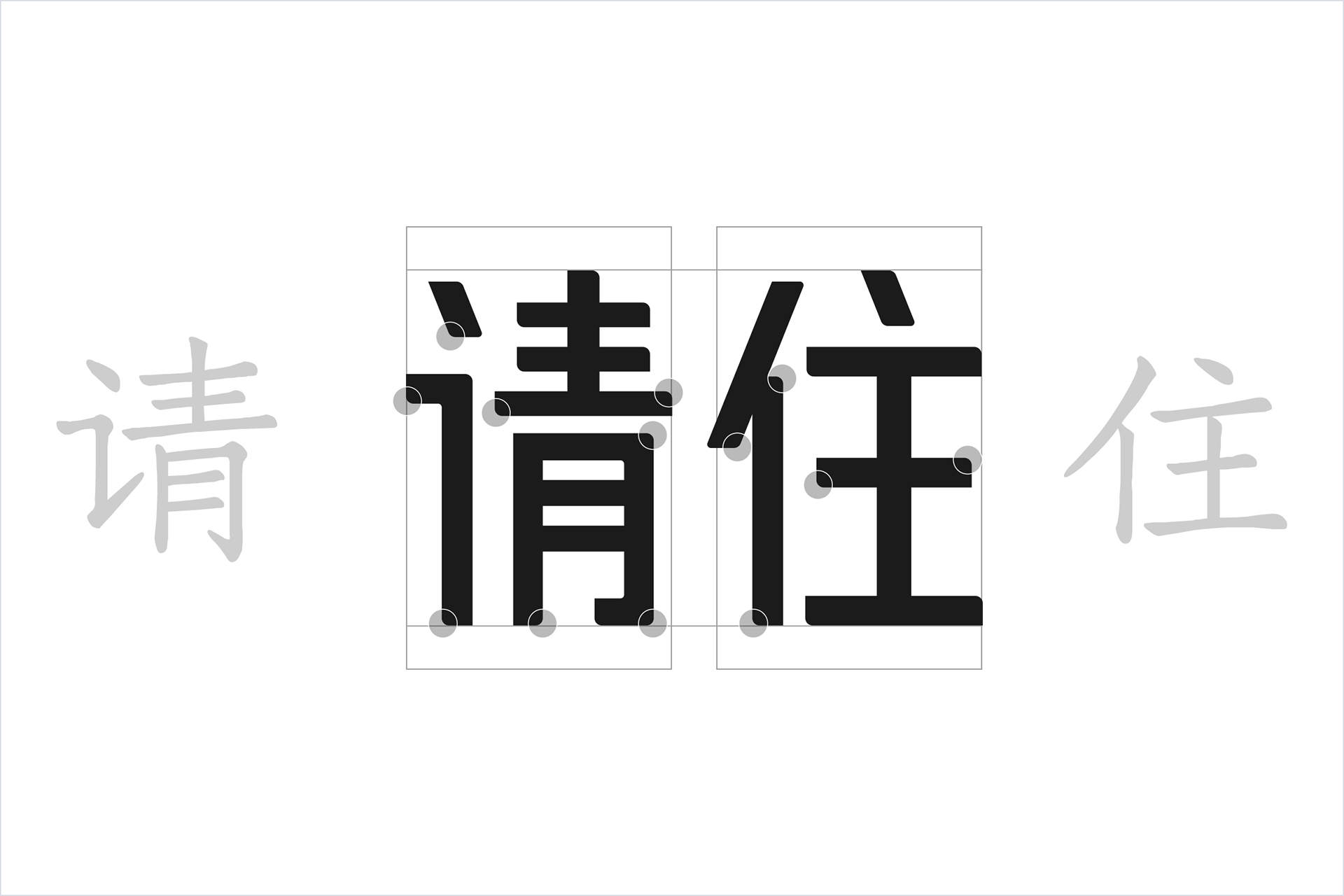
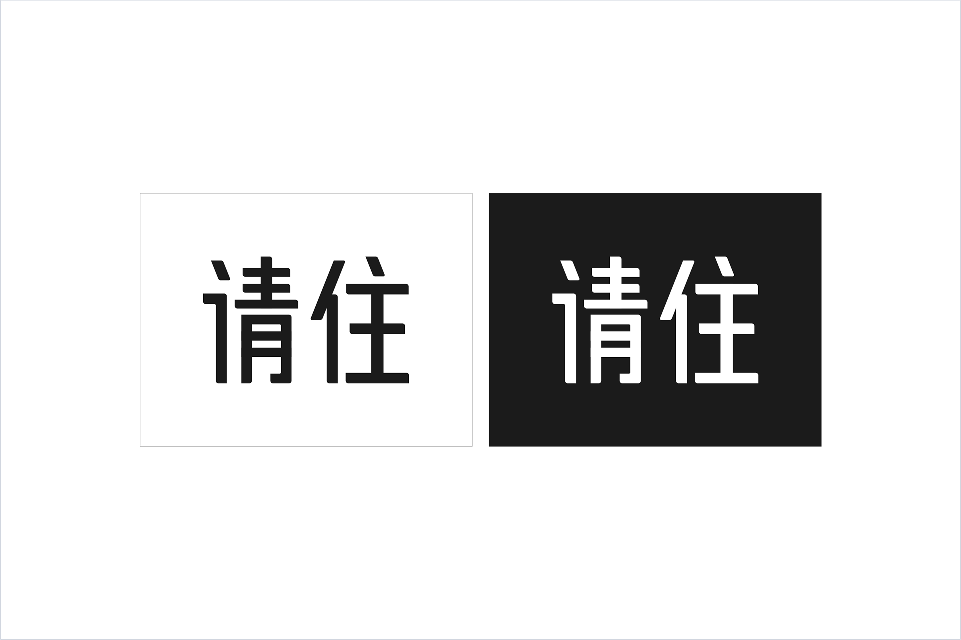
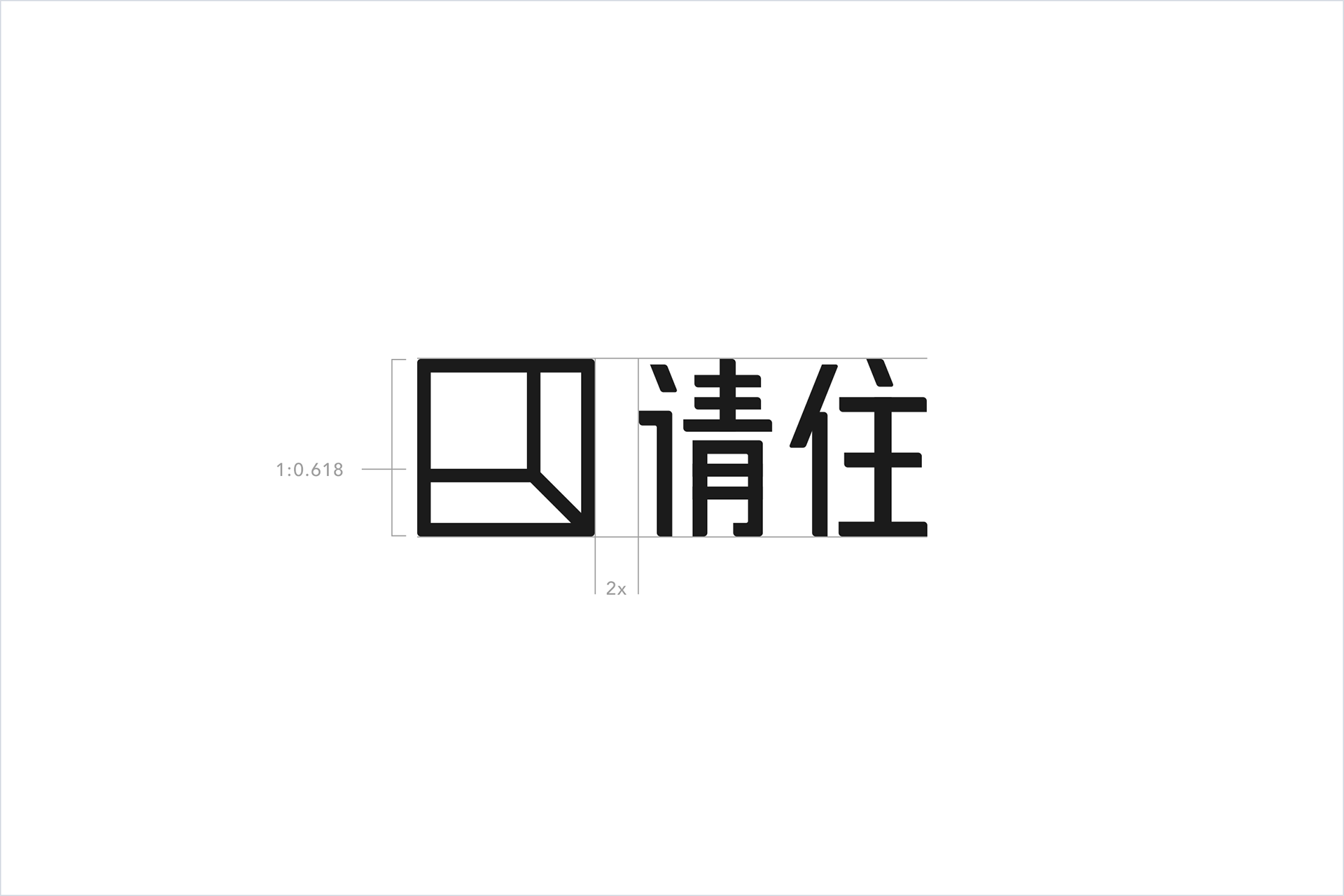
Firstly, I designed a Chinese logotype. Because the structure of the characters is vital in Chinese typeface design, I determined the structure first, and then complete the style and details.
The overall structure follows the golden section.
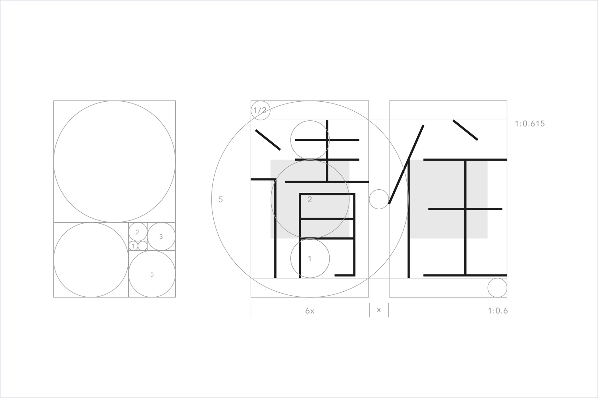
The two characters ‘请住’ mainly consist of horizontal and vertical strokes, which naturally give a sense of stability and solidity. I emphasized this feature in my design. Additionally, I borrowed the style of ancient italics and added rounded corners to certain strokes to increase the sense of warmth and humanity in the logo.
Latin
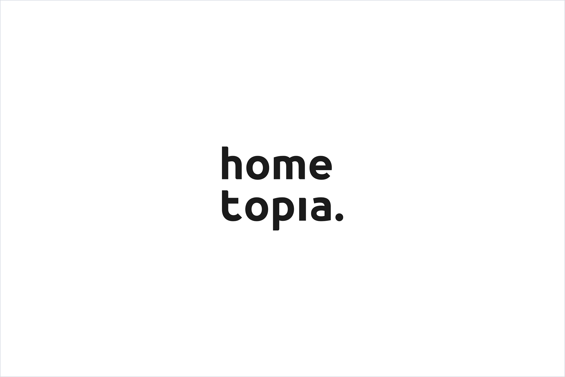
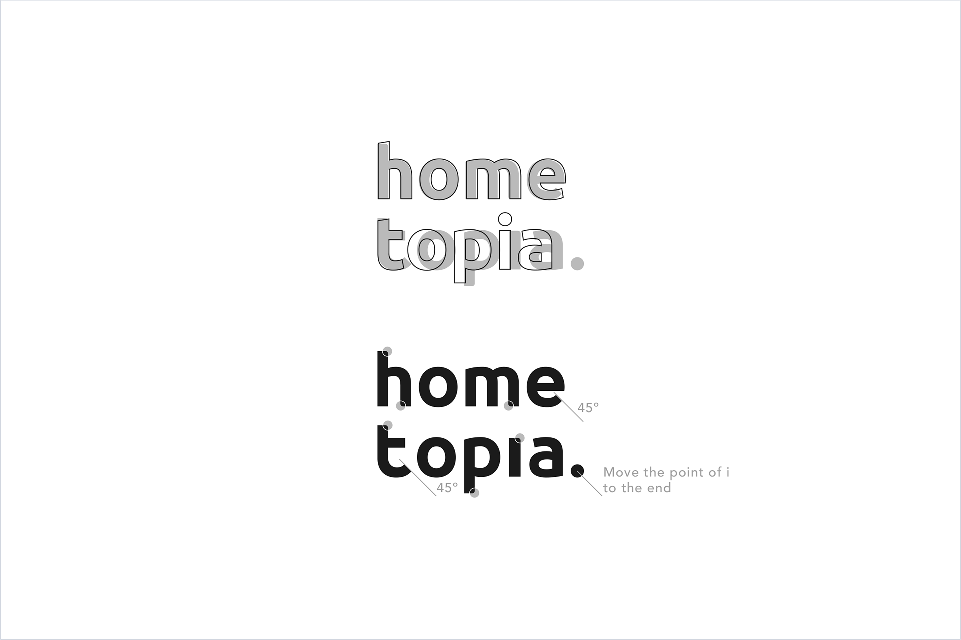
When designing the Latin fonts for ‘hometopia’, I faced the challenge of the name being longer than its Chinese counterpart. To maintain consistency, I divided the name into two sections and chose all lowercase letters to give it a friendlier appearance.
To create the font, I referred to Ubuntu by Dalton Maag, the world’s first large-scale open-source font project. Ubuntu is a modern sans-serif font known for its excellent legibility, readability, and high recognition. During the design process, I made adjustments to the curves and chamfers to ensure consistent stroke thickness and a geometric feel. I also added rounded corners at the beginning or end of some strokes to echo the design of the Chinese part and to incorporate Latin writing conventions.
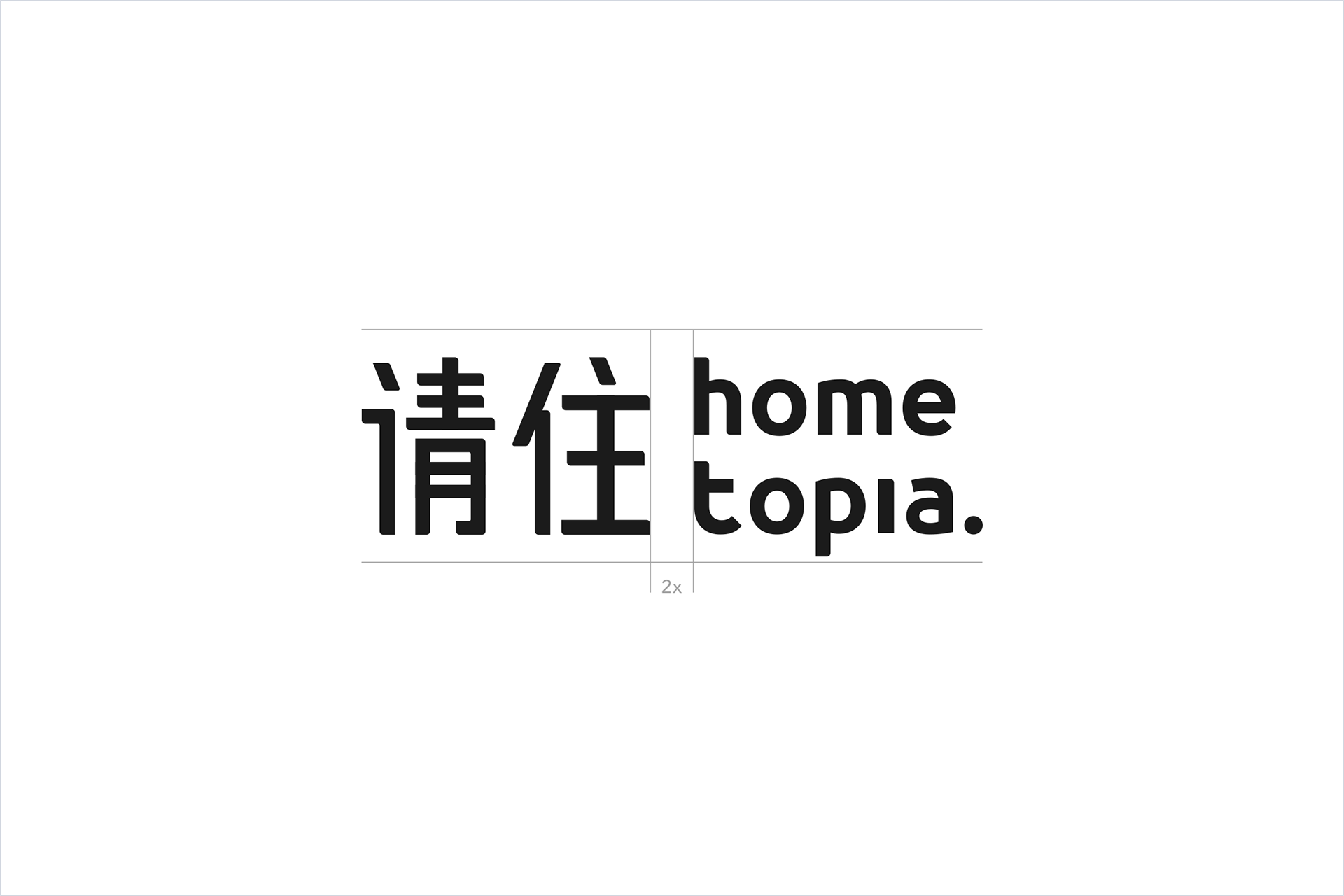
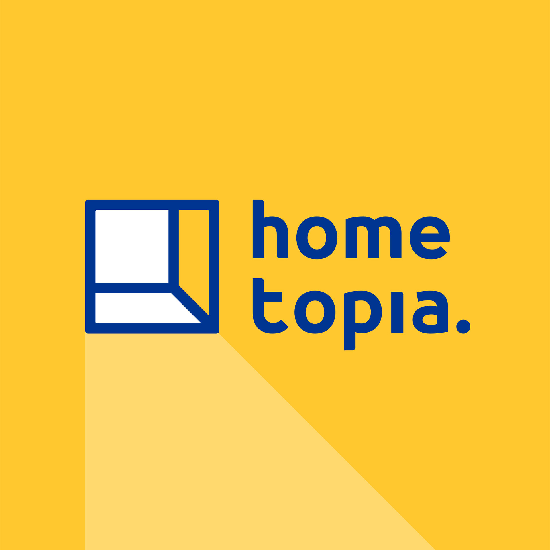
The standard combination of two logotypes.
Logo Mark
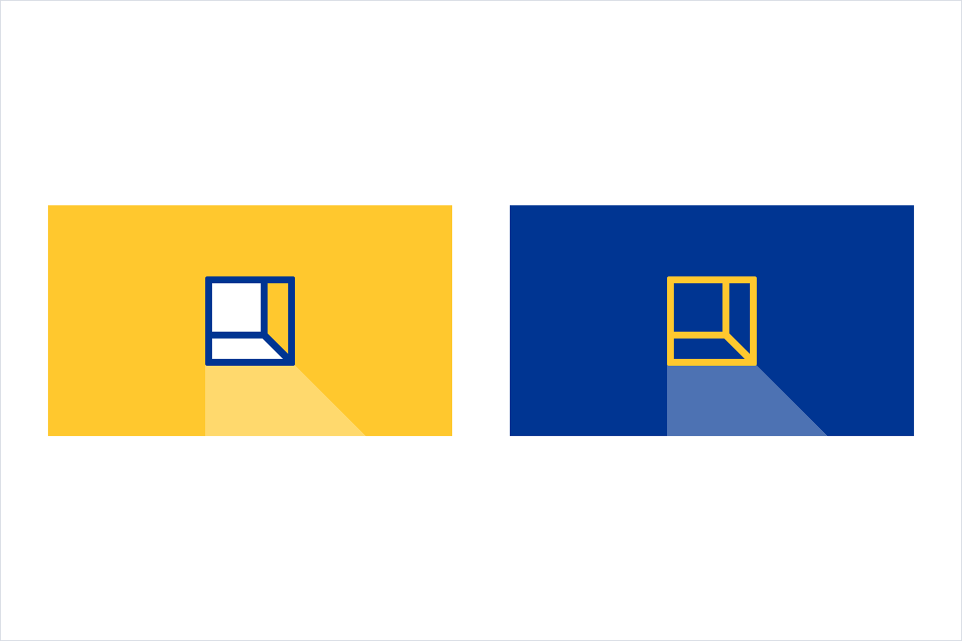
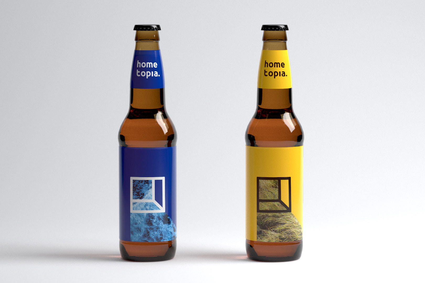
I hope that the logo can not only be a beautiful and memorable graphic, but also convey an abstract emotion.
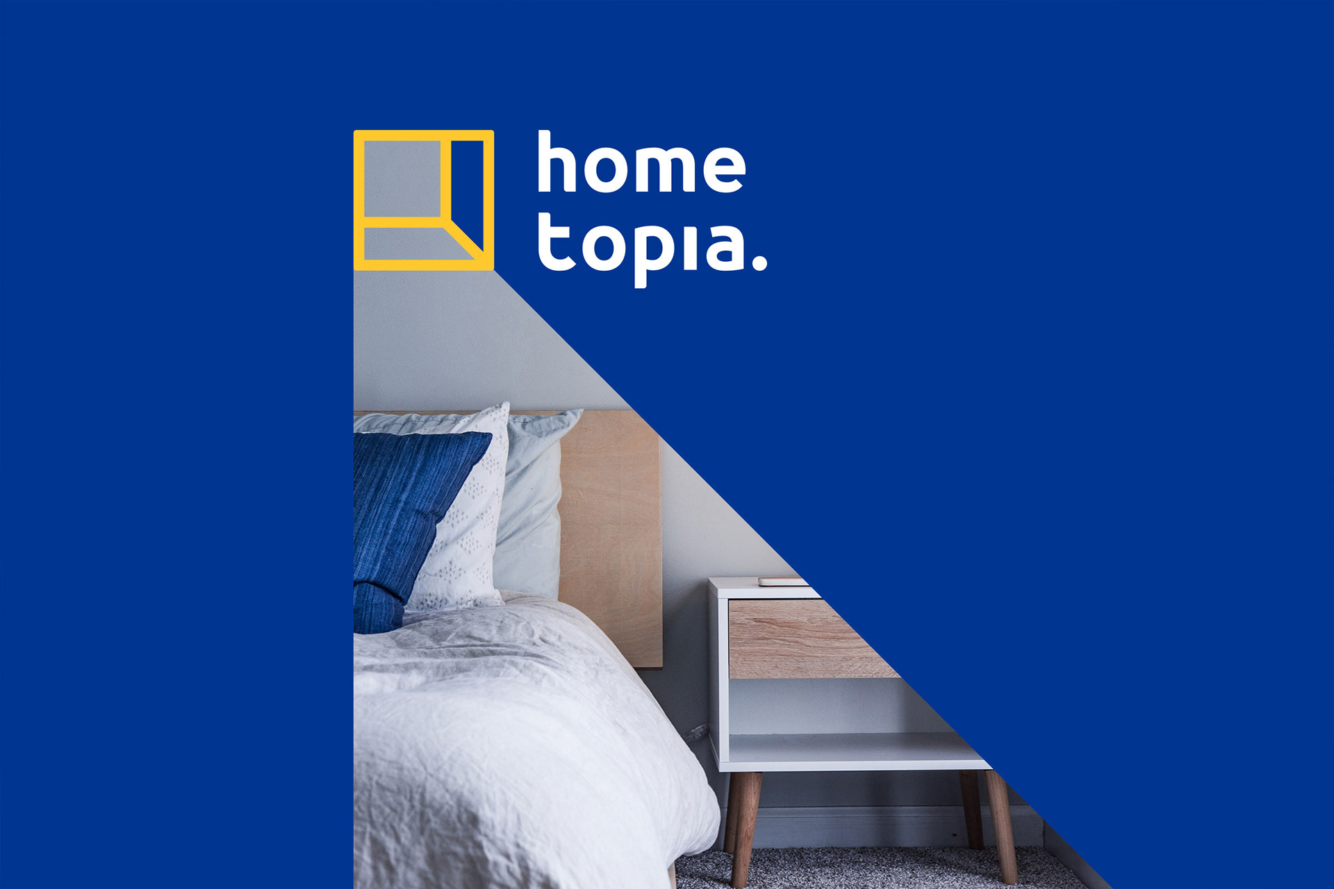
The graphic of the logo represents an inner space that is also an open door, with light shining through it.
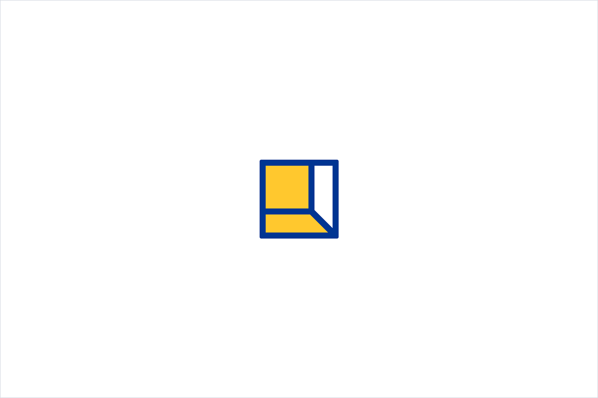
It was inspired by such a scene:
In the evening, a light from an open door is waiting for us to come home. It symbolizes the feeling of being young, fearless, and hopeful about the future, even in the face of the unknown.
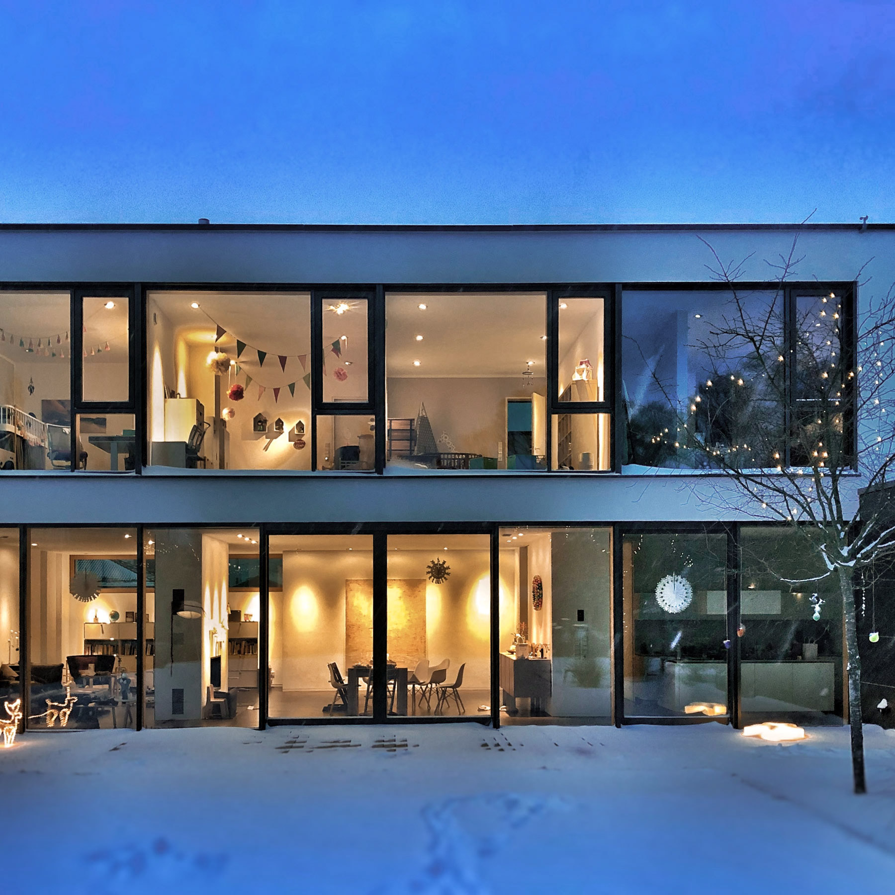
Photo by Stephan Bechert on Unsplash
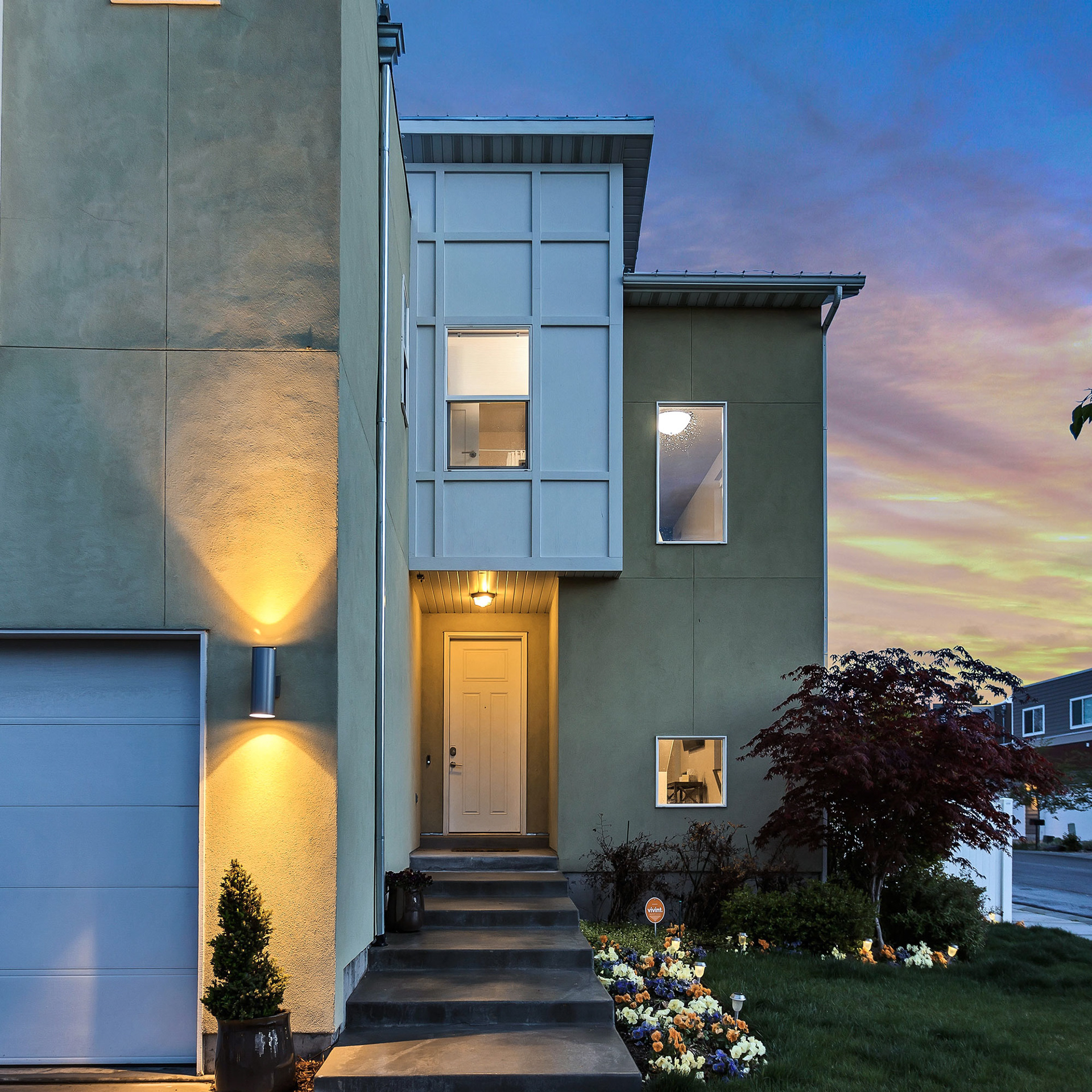
Photo by Brian Babb on Unsplash

Photo by Matthew T Rader on Unsplash
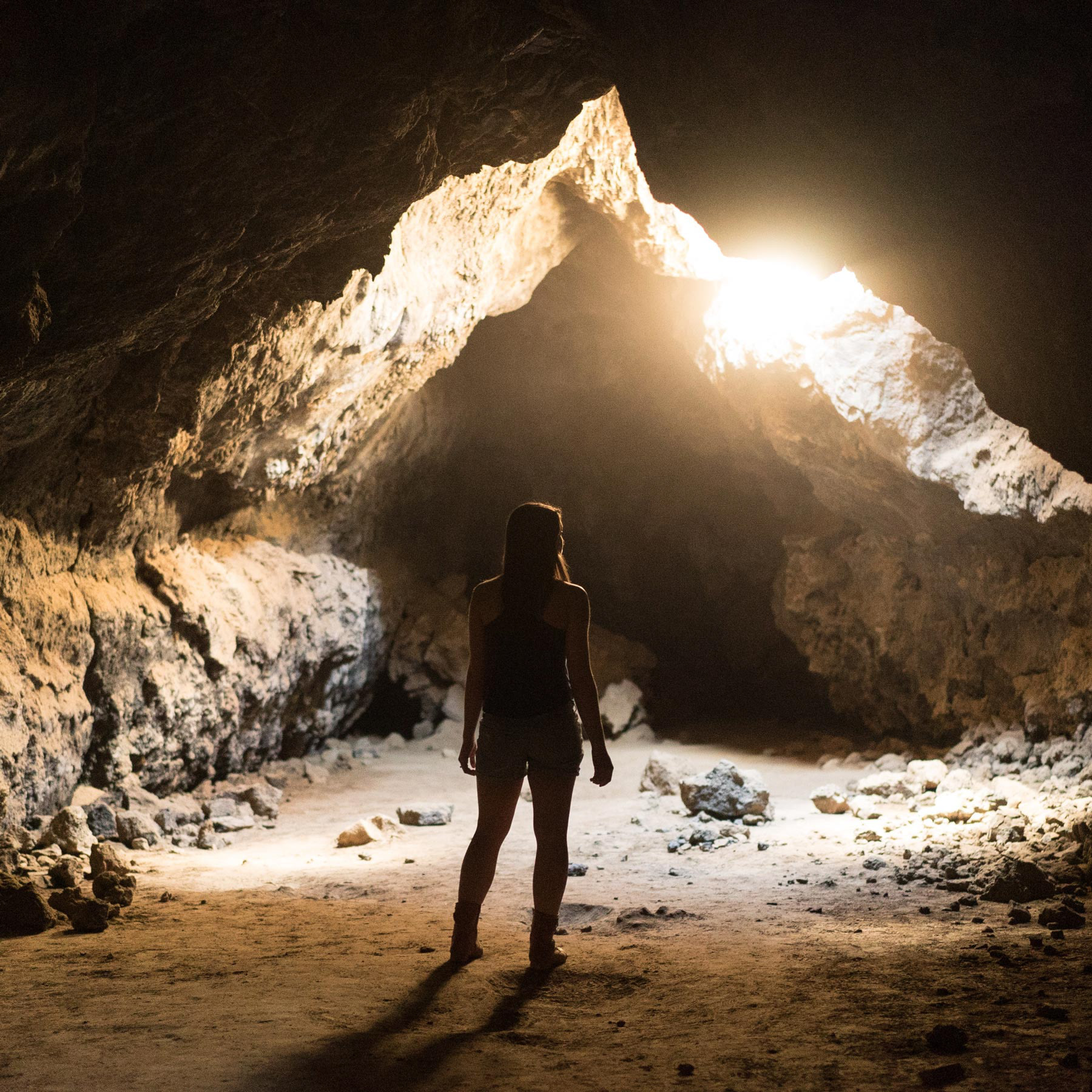
Photo by Joshua Sortino on Unsplash
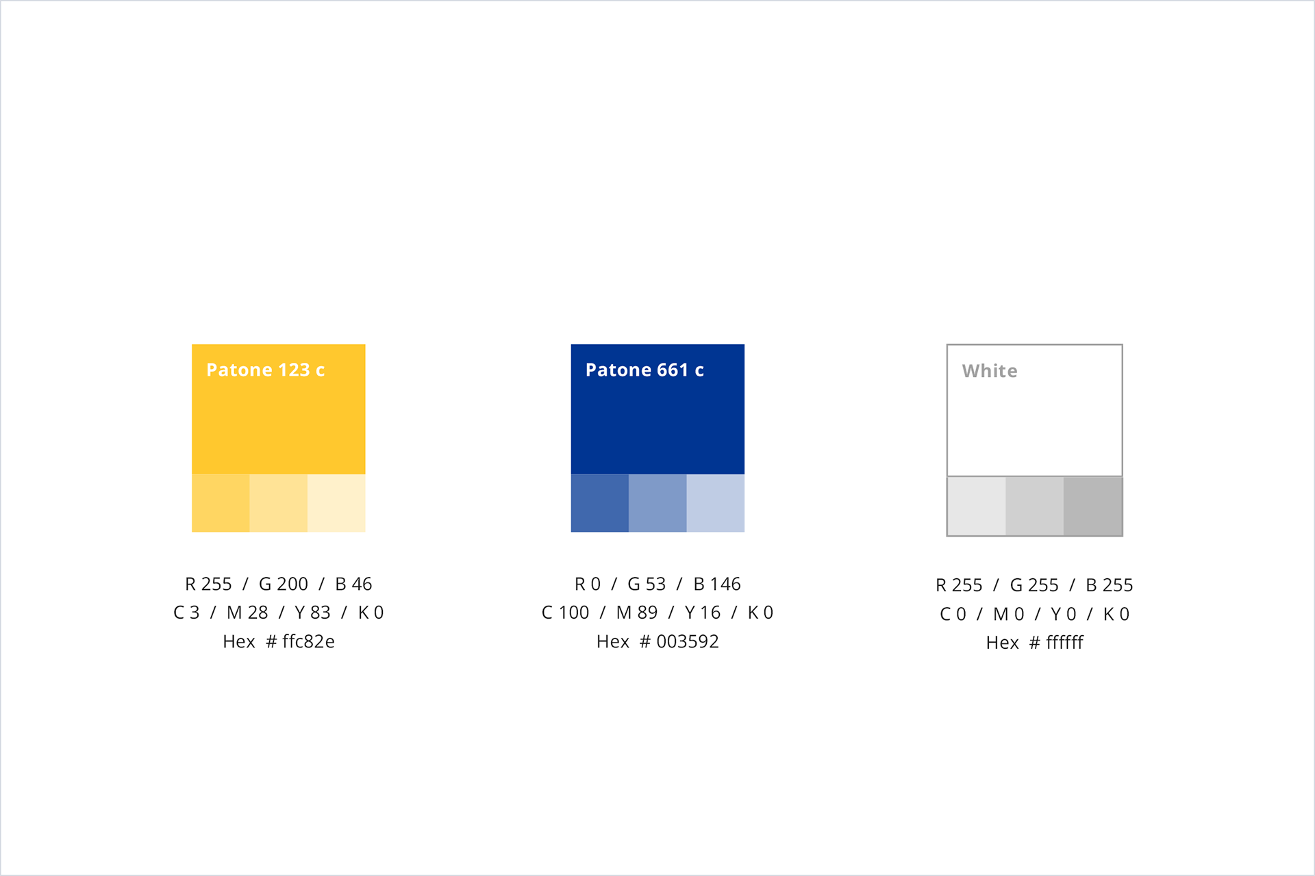
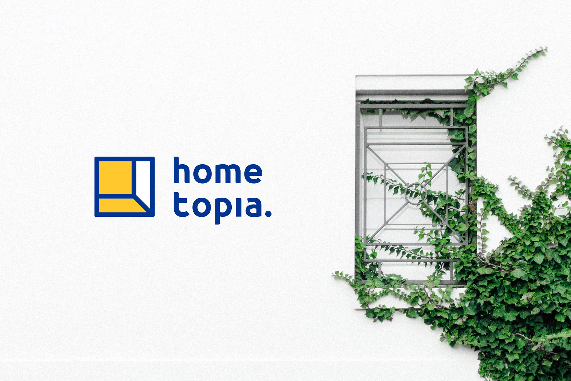
So naturally, based on the image of ‘light from home at night’, I chose yellow and blue as the main colours of the brand.
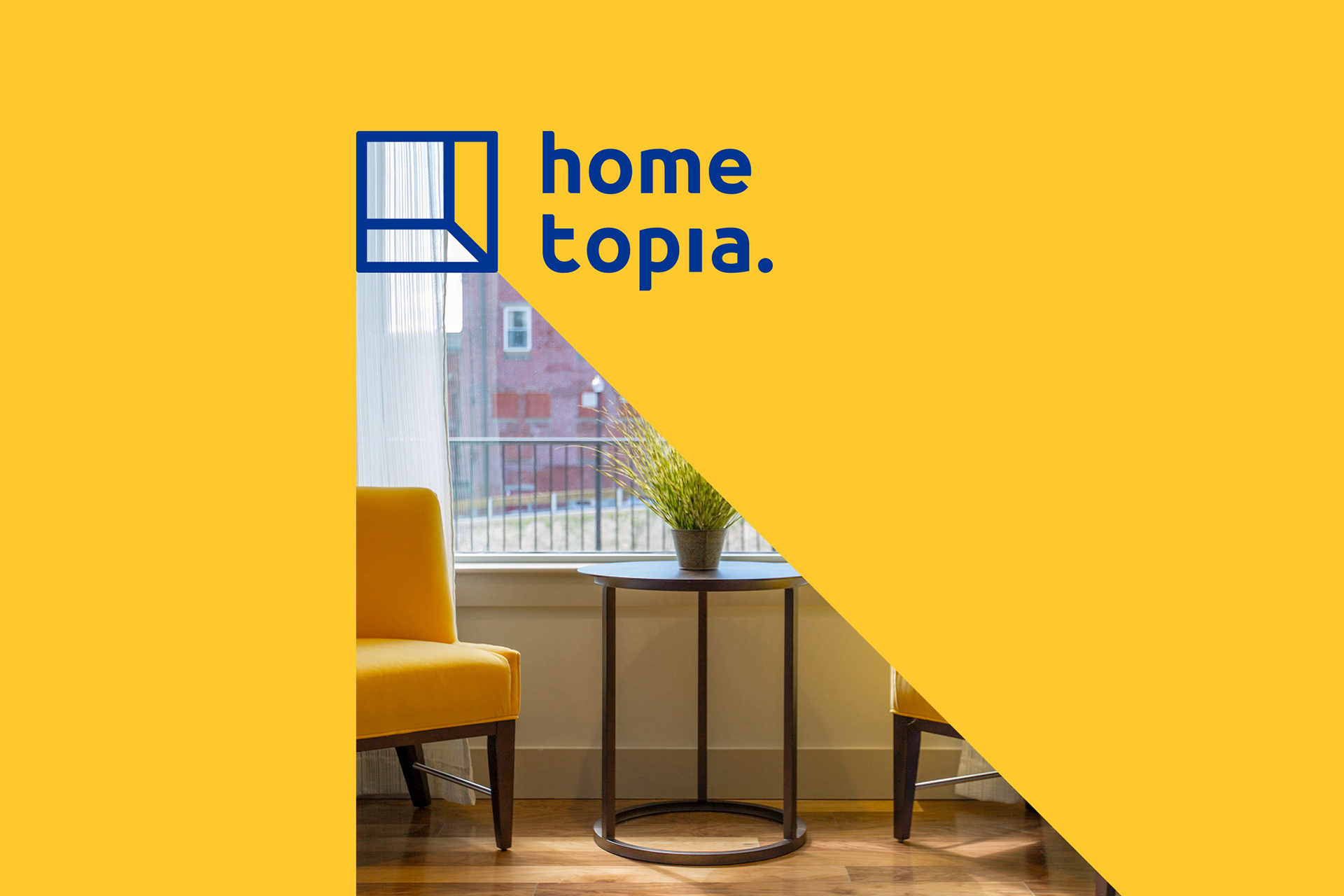
The standard combination of the logo mark and the logotype.
The following images showcase the versatility of the logo in different backgrounds and combinations. It is impressive to see that as long as you change the background a little, you can really ‘let the light shine through the door!’
Application
With the brand identity guideline, Hometopia’s logo mark, logotypes, and standard colors can be applied in various situations and products, creating a consistent and comprehensive brand image for the company.
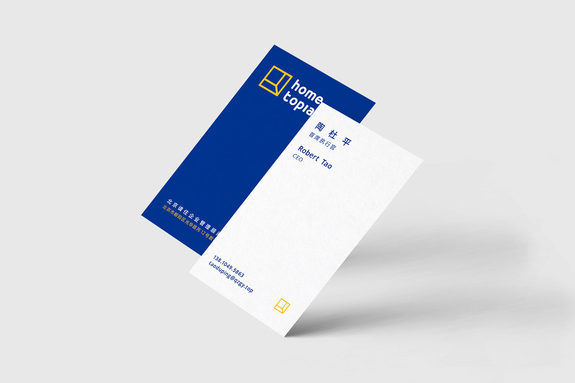
Business card.


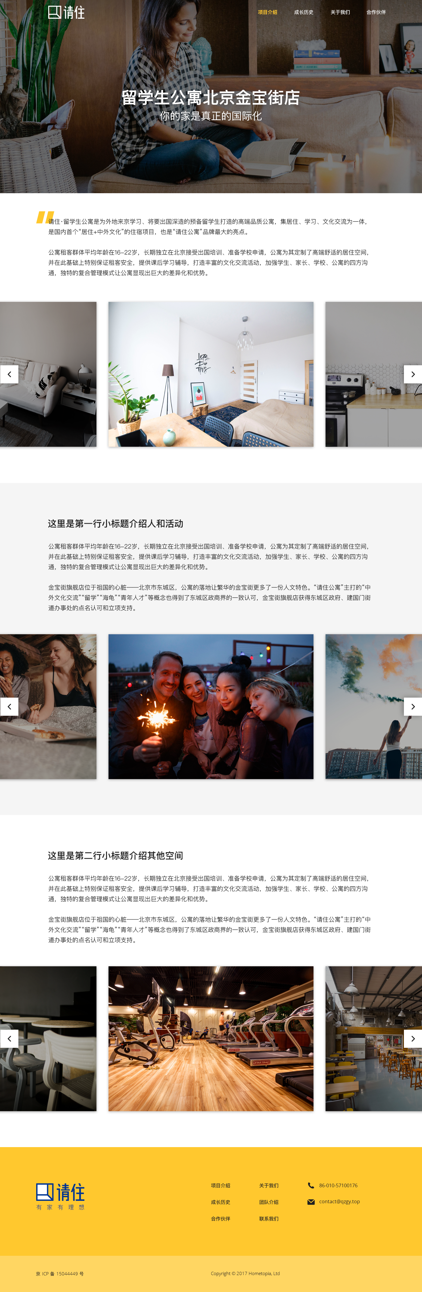
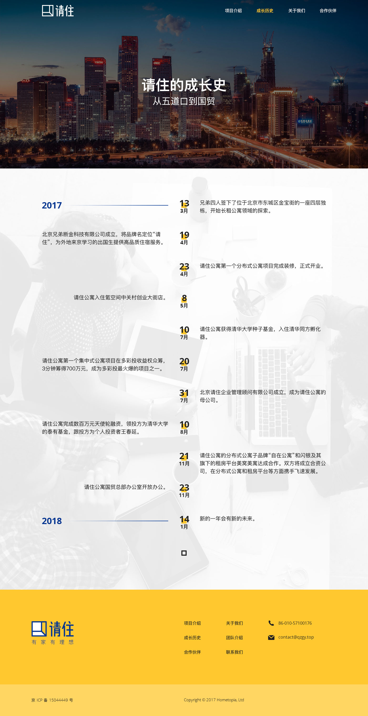
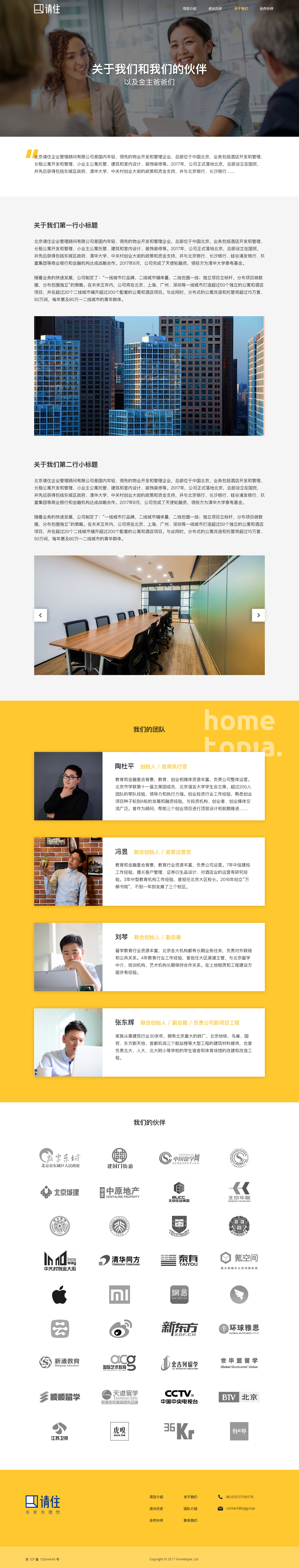
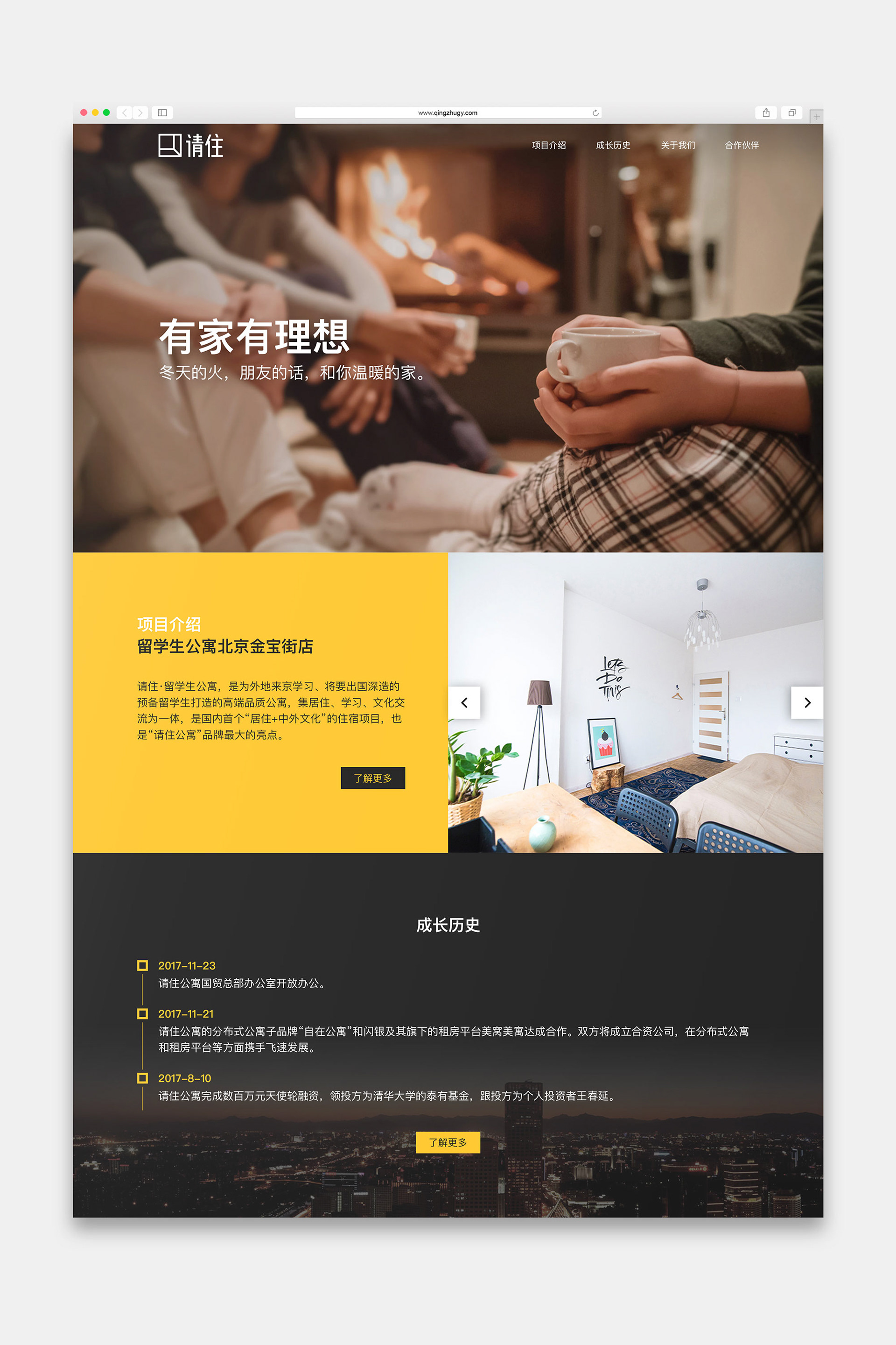
The UI of the official website, but unfortunately the website was not implemented.