Role
Product Design Manager
UX and UI Designer

Date
May 2015 – May 2018

With
My 4 coworkers in the RiceDonate product design team

Where
RiceDonate, Beijing

Link
http://ricedonate.com (Unavailable. The company was acquired by Qingsongchou in 2019 and the product has been suspended in 2021.)
RiceDonate was mentioned in the news of NPO IT Day held by Microsoft China.
Background: Charity in China
In China’s charity sector, there are three main players: individuals, non-profit organizations, and corporations. Corporate donations make up the majority, about 60% to 70%, of total donations each year.

Our research shows that most people have limited participation in charity, mainly through donating money and items, but struggle to find enjoyable ways to get involved.

Grassroots charity organizations make up the majority, but they lack effective ways to connect with potential donors.

Corporations are eager to engage in charity for social responsibility, goodwill, and tax deductions. However, they find it challenging to find a comprehensive charity service.
What RiceDonate Does?
We created RiceDonate to make charity accessible and enjoyable for everyone by taking on three different roles.

For individual users
RiceDonate is a fun and interactive app that incentivizes good habits such as walking, waking up early, and connecting with loved ones to earn a virtual currency called ‘rice.’ Users can then donate their rice to support their favorite charity projects. Once the user’s donated rice meets the project’s goal, the project can receive real goods and financial support from the corporations we collaborate with.

For nonprofit organizations
RiceDonate is an online platform that serves as a hub for fundraising and community operation. Non-profits can submit their projects and fundraising applications digitally, and we help them find donors and gain social attention and supporters so they can focus on project design and implementation.

For corporations
RiceDonate is a one-stop platform that meets all charity needs. We provide services ranging from project selection to connecting corporations with non-profits, brand marketing, tax deductions, and more.
RiceDonate App on the App Store.
Nonprofit organizations can submit and manage their projects through org.ricedonate.com.
Corporations can use our website to find projects they want to donate to and manage them.
As a result, RiceDonate creates a strong bond among individuals, companies, and non-profit organizations, with each party benefiting from the collaboration.

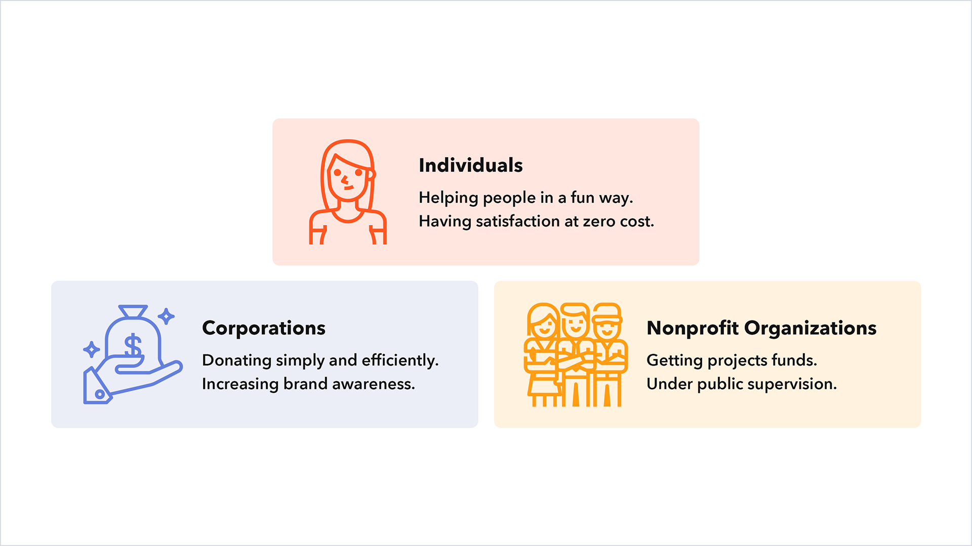
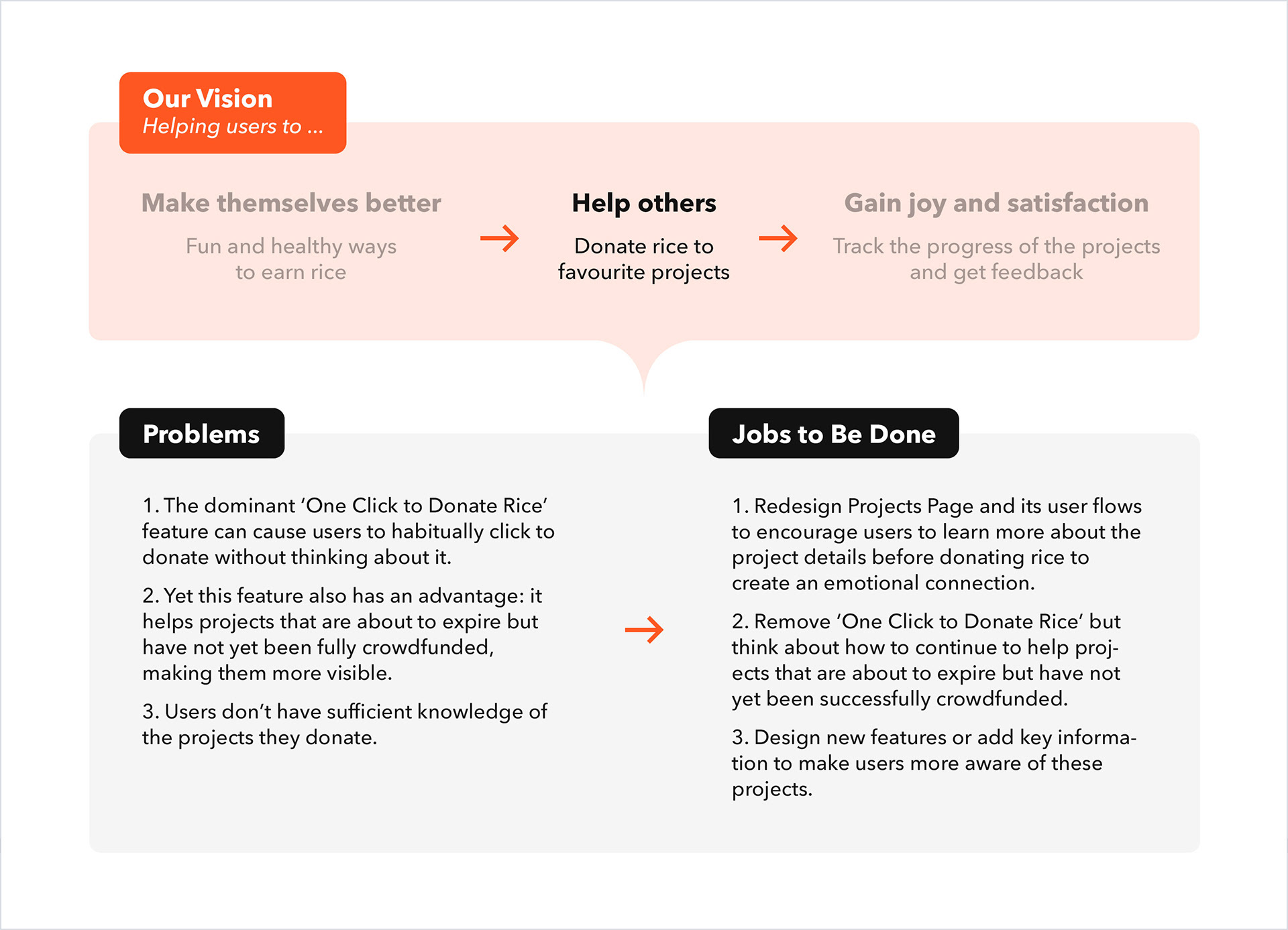
Three participants in RiceDonate.
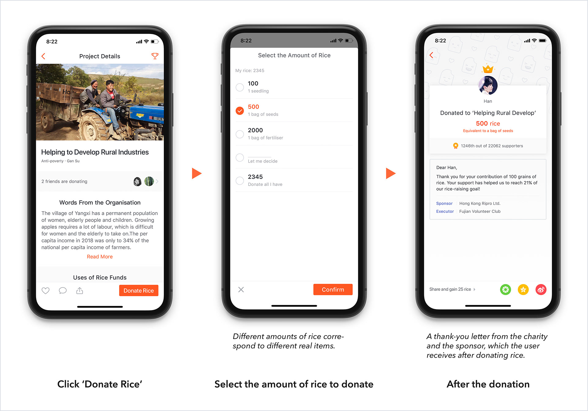
My Role & Our Goal
My role
Product Designer (Manager): I was one of the early product designers to join RiceDonate and grew to become Product Design Manager a year later, leading a design team of four. 

Together with the founder, we developed and made decisions on the product strategy, and designed the features and structure of the RiceDonate App, almost from scratch.

I led the creation of the UX/UI design guidelines (now we call it Design System), deeply involved in and managed each design iteration, from user research to prototyping, to UI and visual design.

Our goal
We strongly believe that individual users are at the heart of the strong bond formed by these three participants. Therefore, our team’s important goal is to make it easy for every user to participate in charity and bring them joy and happiness.

Now, I will take you through the design details of RiceDonate’s key product, the native app, from the perspective of the user journey.
User Journey at RiceDonate
At RiceDonate, there are three essential things that every user will go through:

1. Earn rice.
2. Donate rice.
3. Track the progress of the project.

The picture below shows the main user journey.
‘Rice’ is a virtual currency that can be used to support any charity projects you like. Users can earn rice in four easy and fun ways, while developing some good habits.
RiceWalking
RiceDonate records users’ daily steps and rewards them accordingly. To make this process more enjoyable, we designed a mechanism called ‘Encounter’, which allows two users who do not know each other to appear on the maps of both sides and have a short chat.
RiceMorning: recording wake-up time
Users can get different amounts of rice by recording their wake-up time (to encourage themselves to get up early), and they will also receive a ‘Good Morning Card’ containing a selection of other user-generated content — a small achievement in their lives.
RiceCalling: connecting with relatives and friends
Yes, it is also important for most young people to be in regular contact with friends and relatives. Users can call up to six times a week and get a lot of rice.
RiceQuiz
We update a question every day. After answering the question, users will get the answer, relevant knowledge and rice. The questions users encounter and their answers will be recorded for easy review.
Next, they can donate rice to their favorite charity project on the app to help with its implementation. Afterwards, they can also track the progress of the project by viewing reports that are updated in real-time. These feedbacks give the user a very great sense of satisfaction as they can see that they have really helped some people!
Donating rice
Users select their preferred charity project and donate rice. Once the project reaches its crowdfunding goal, say 100,000 grains of rice, it will receive real donations of money and items from businesses and get underway.
Keeping track of the progress of projects
We will track the progress of the project and report it to our users in real-time. ​​​​​​​ In this way, we try to bring the users as close as possible to the charity project so that they can be satisfied and motivated.
Challenge 1: Redesign the App & Align it With our Vision
Identify problems
After joining RiceDonate, my first challenge was to redesign the existing application to better align with our product’s value and vision. By interviewing a diverse group of users and creating user personas, as well as combining the initial ideas of the founders, the vision of the product was quickly defined:

1. Helping users to make themselves better.
2. Helping users to help others.
3. Helping users to gain joy and fulfillment.

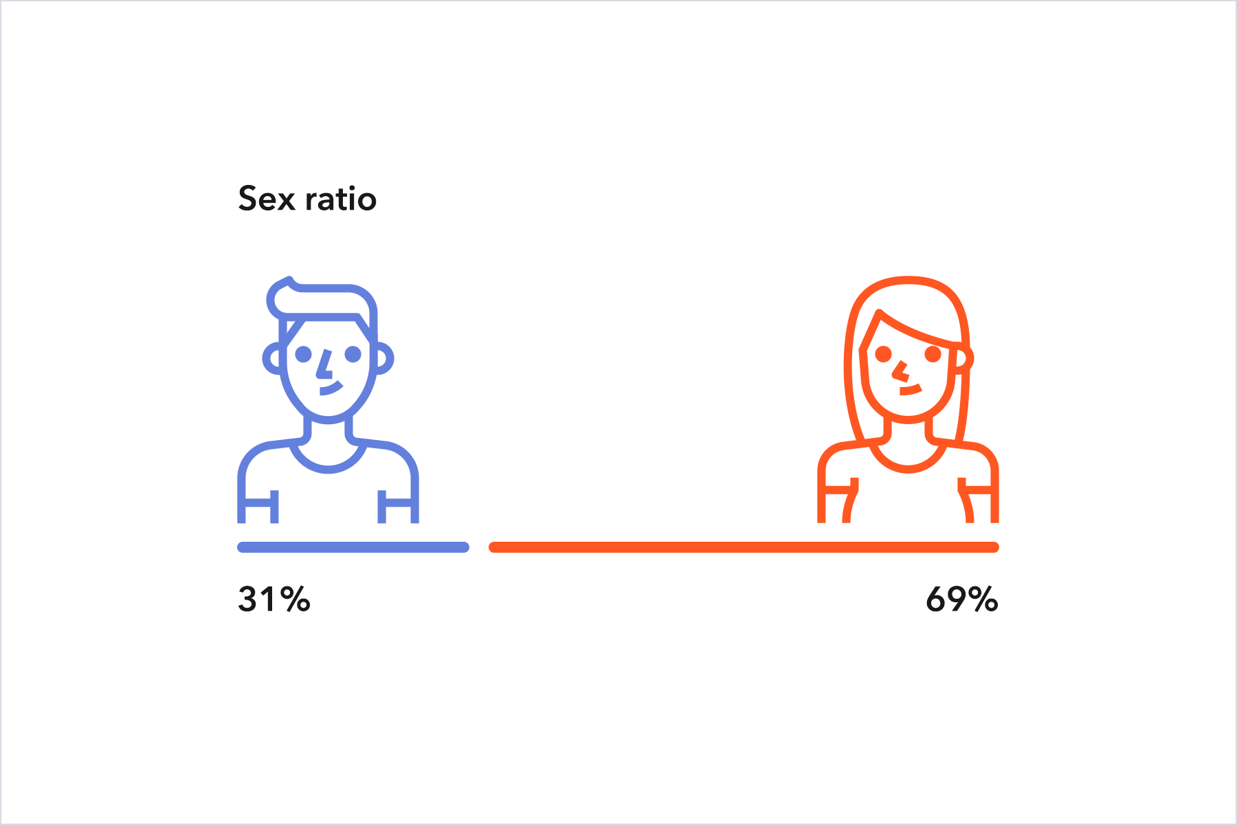
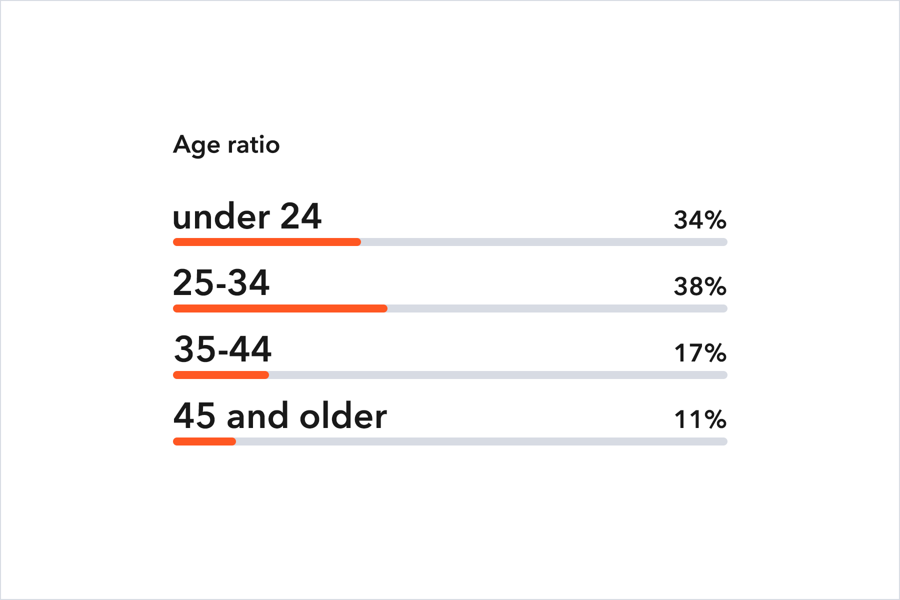
We utilize statistical tools like Baidu Statistics to gain the demographics of users.

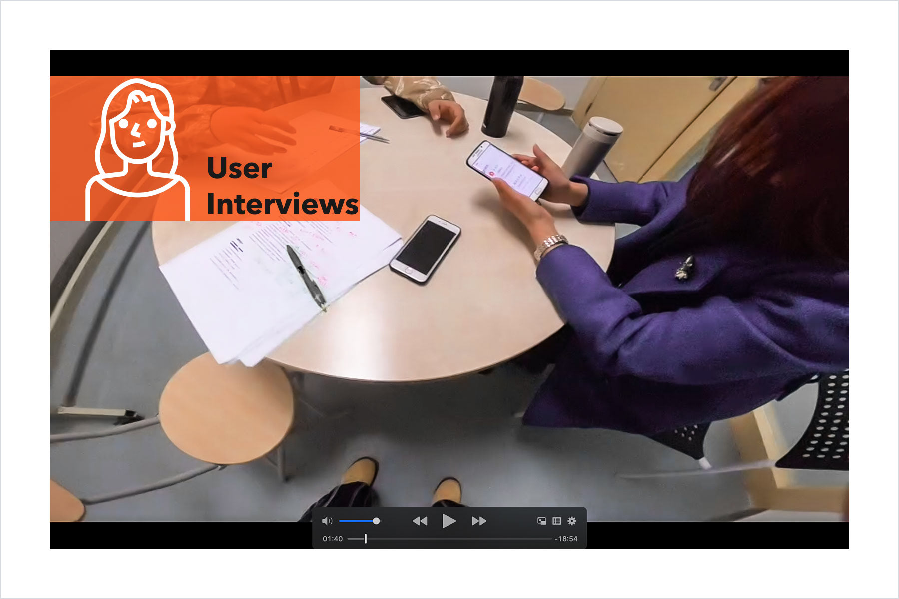
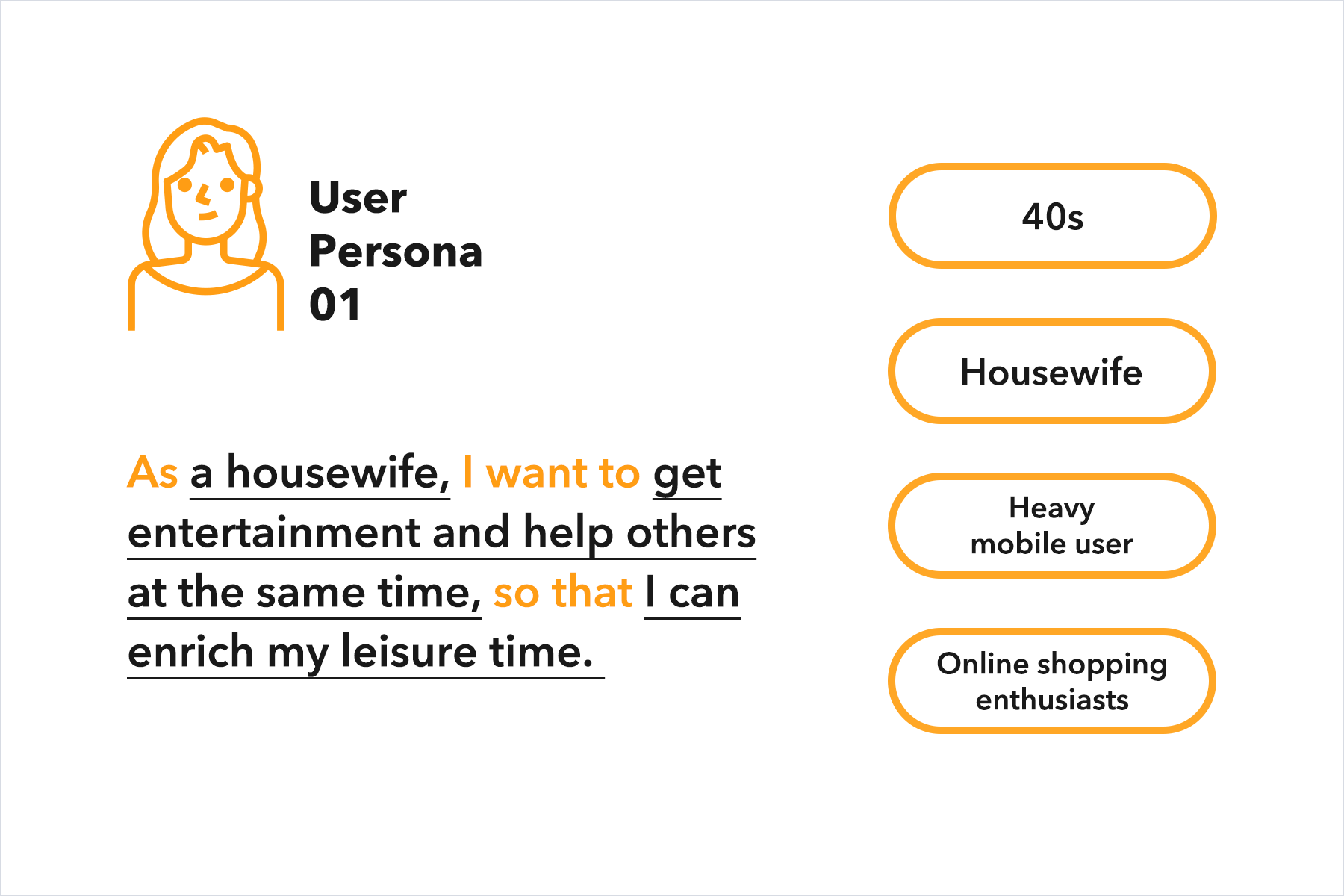
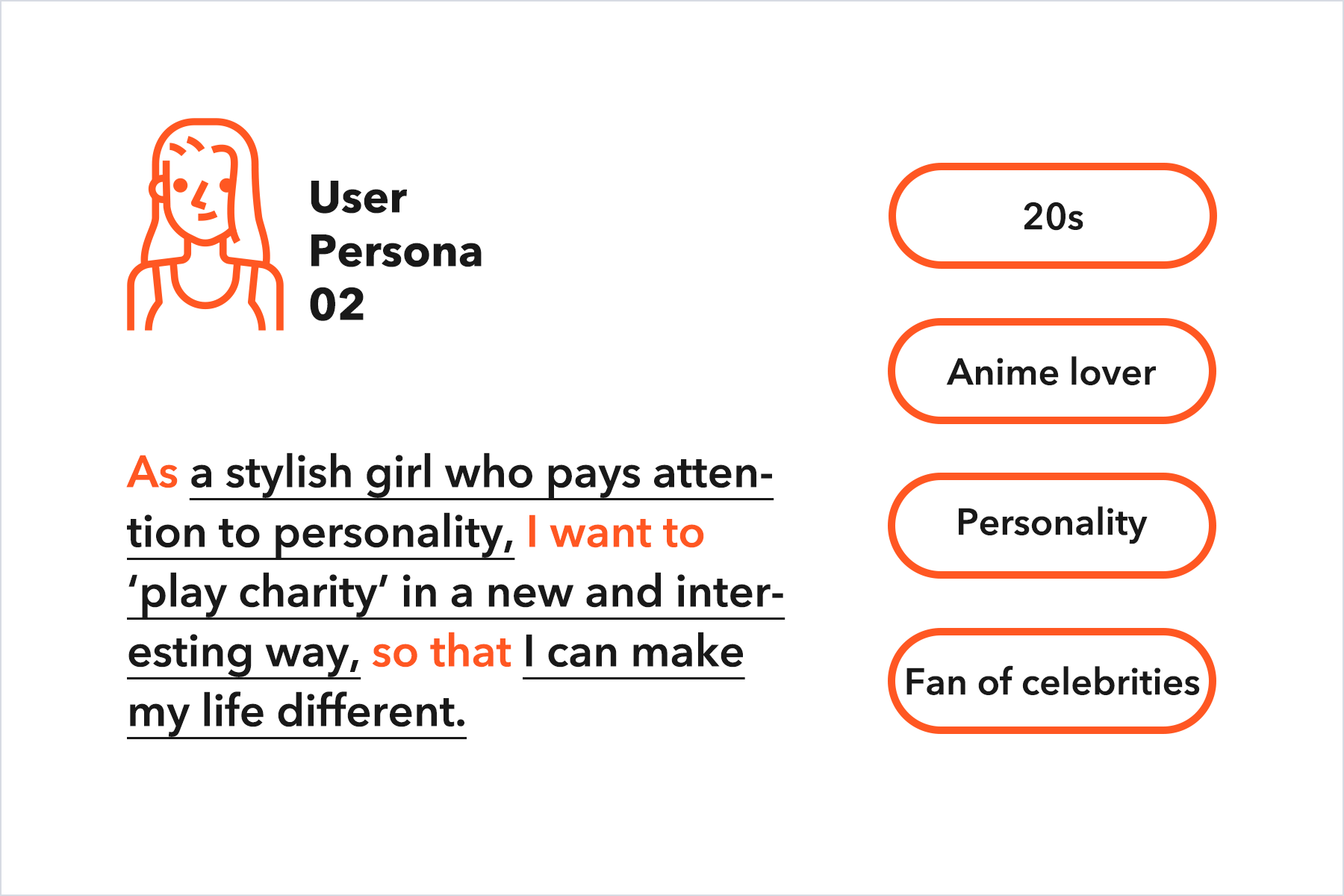
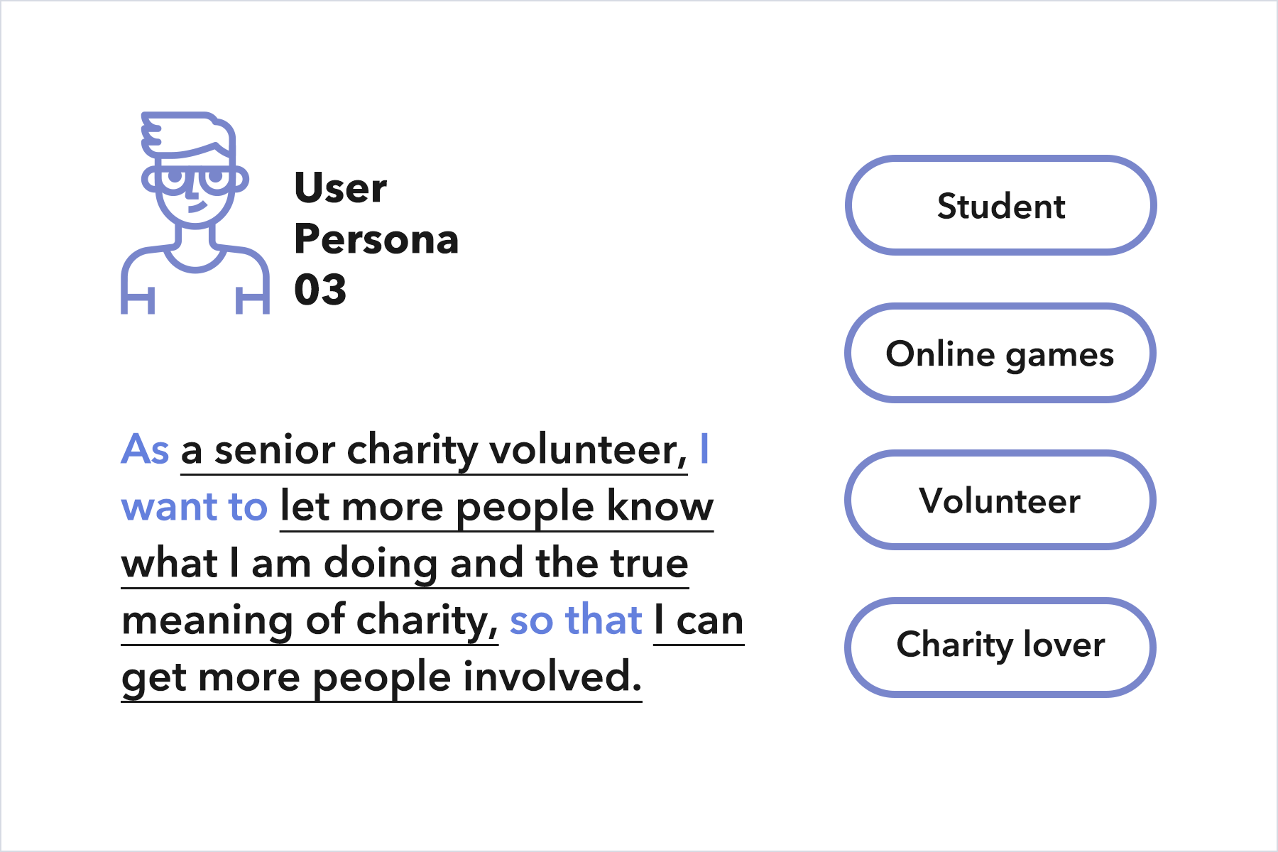
Doing interviews and creating user personas.

After that, we corresponded the three stages of the user journey to each vision and continued with Think Aloud and user interviews to understand the main issues under each stage, as shown in the diagram below.

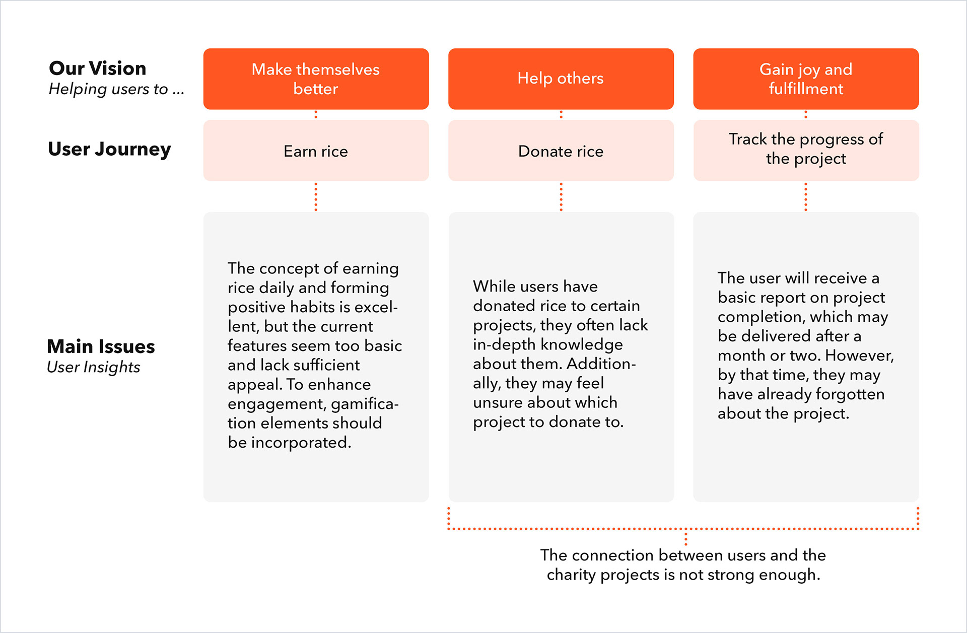
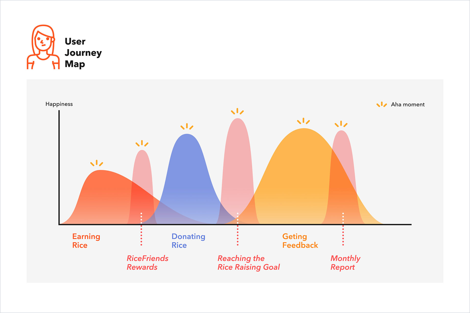
We relate the insights (main issues of the UX) gained from the user research to the corresponding user journey stages.

After identifying our main issues, we took the following actions:

1. Used the Jobs to Be Done framework to break down the problems and find feasible solutions.
2. Created UX/UI Design Guidelines.
3. Redefined the page structure and iterated on each major feature.

The following set of images showcases some of the key design improvements in the main features and pages. Let’s dive in!

Details of the redesign
1. Design improvements for vision 1: helping users to make themselves better — through more interesting ways of earning rice.

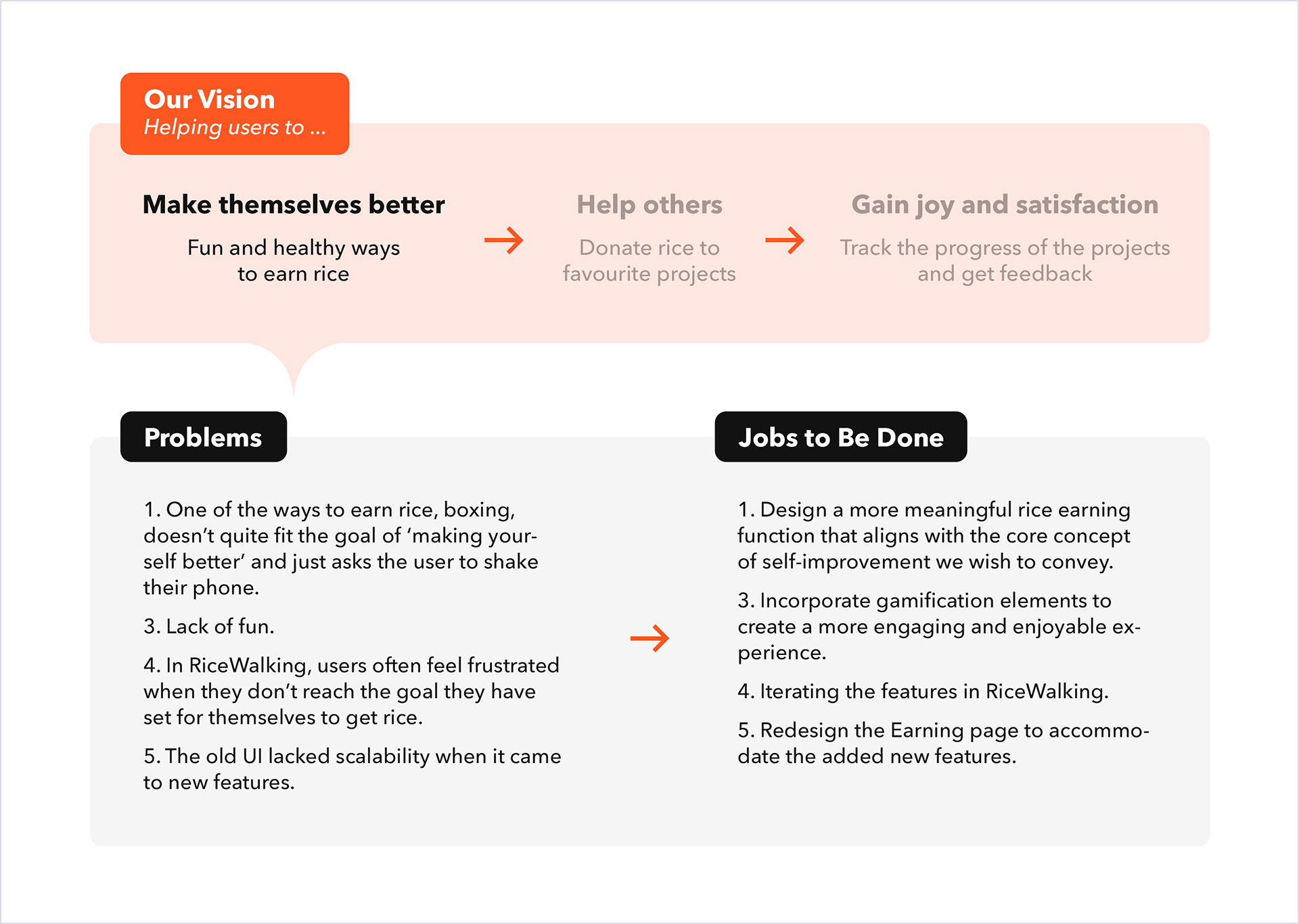
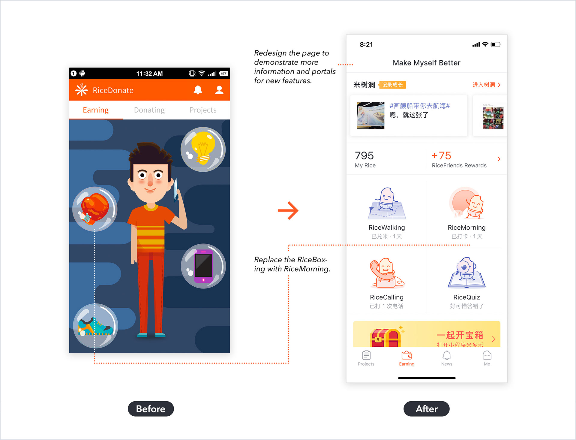
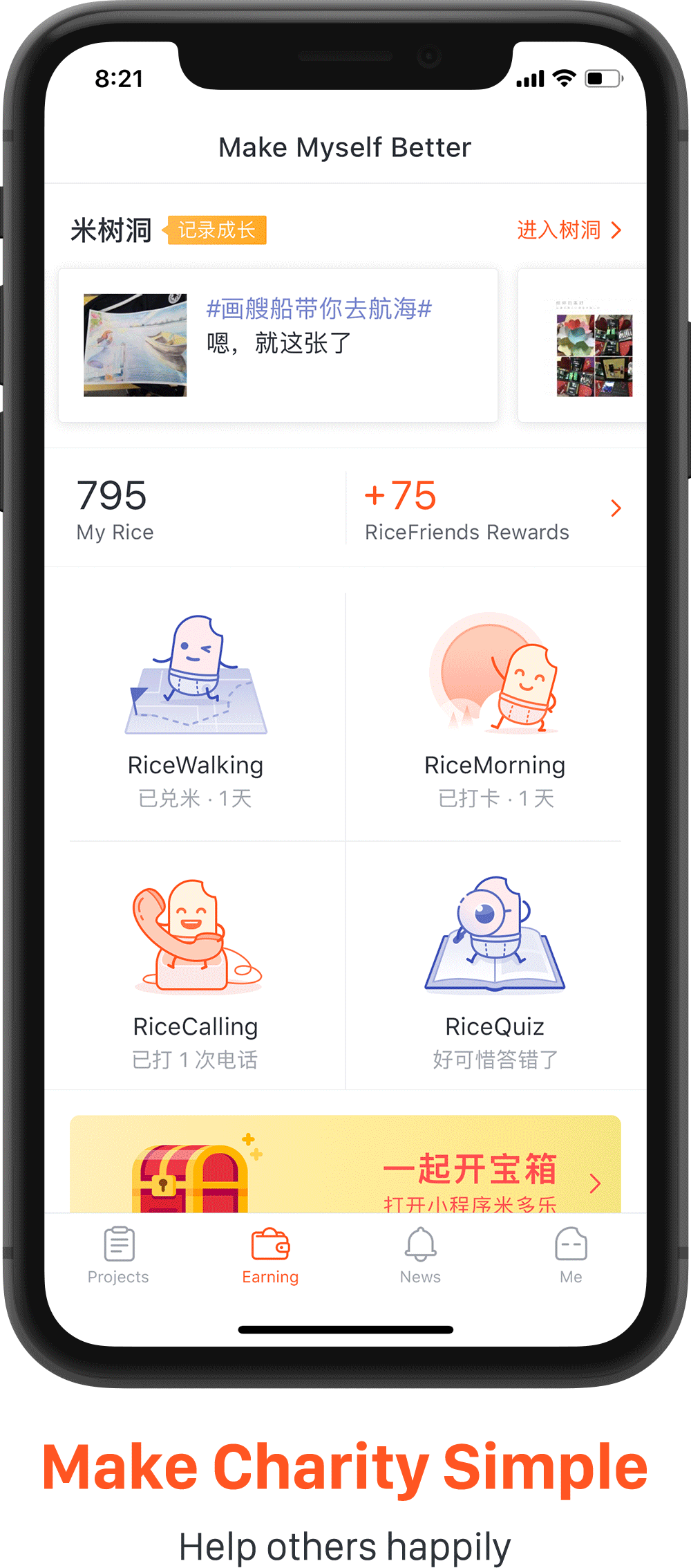
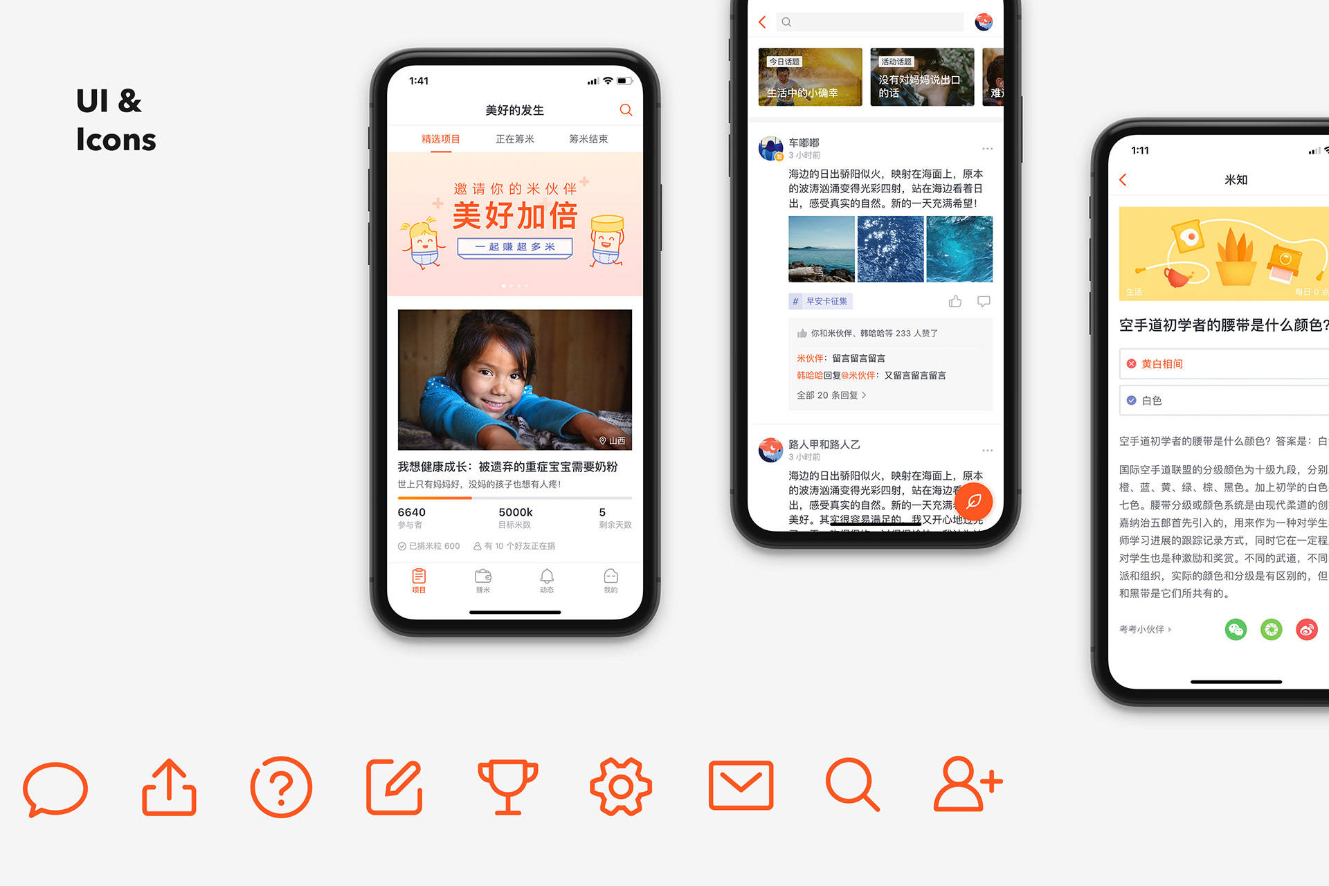
Redesign the Earning page. Replace the RiceBoxing with RiceMorning.

Initially, the Earning page had a cartoonish interface with male and female characters based on gender. However, I believe our product doesn't need to emphasize users’ gender, and a single cartoon image can’t represent the diverse range of individuals. Therefore, in subsequent versions, we designed RiceBaby as our product’s mascot and used it to represent the four different ways of earning rice.

Additionally, we replaced the RiceBoxing feature with RiceMorning, which records the user’s daily wake-up time. The original RiceBoxing feature relied on shaking the phone using the gyroscope, which didn’t align with our vision of helping users develop good habits, and not all users enjoy boxing. We implemented RiceMorning to give users a positive and fresh start to each day by recording their wake-up time and writing down what they want to achieve. It also encourages users to open our app every day to do something good for themselves and others who need help. This feature was further iterated based on user feedback, such as removing the ‘what to do’ section and randomly displaying a ‘Morning Card’ from other users, which could be a blessing or a small joy that others share. We hope that users can feel the sense of companionship — that many like-minded people are striving together for a better self and a better world.

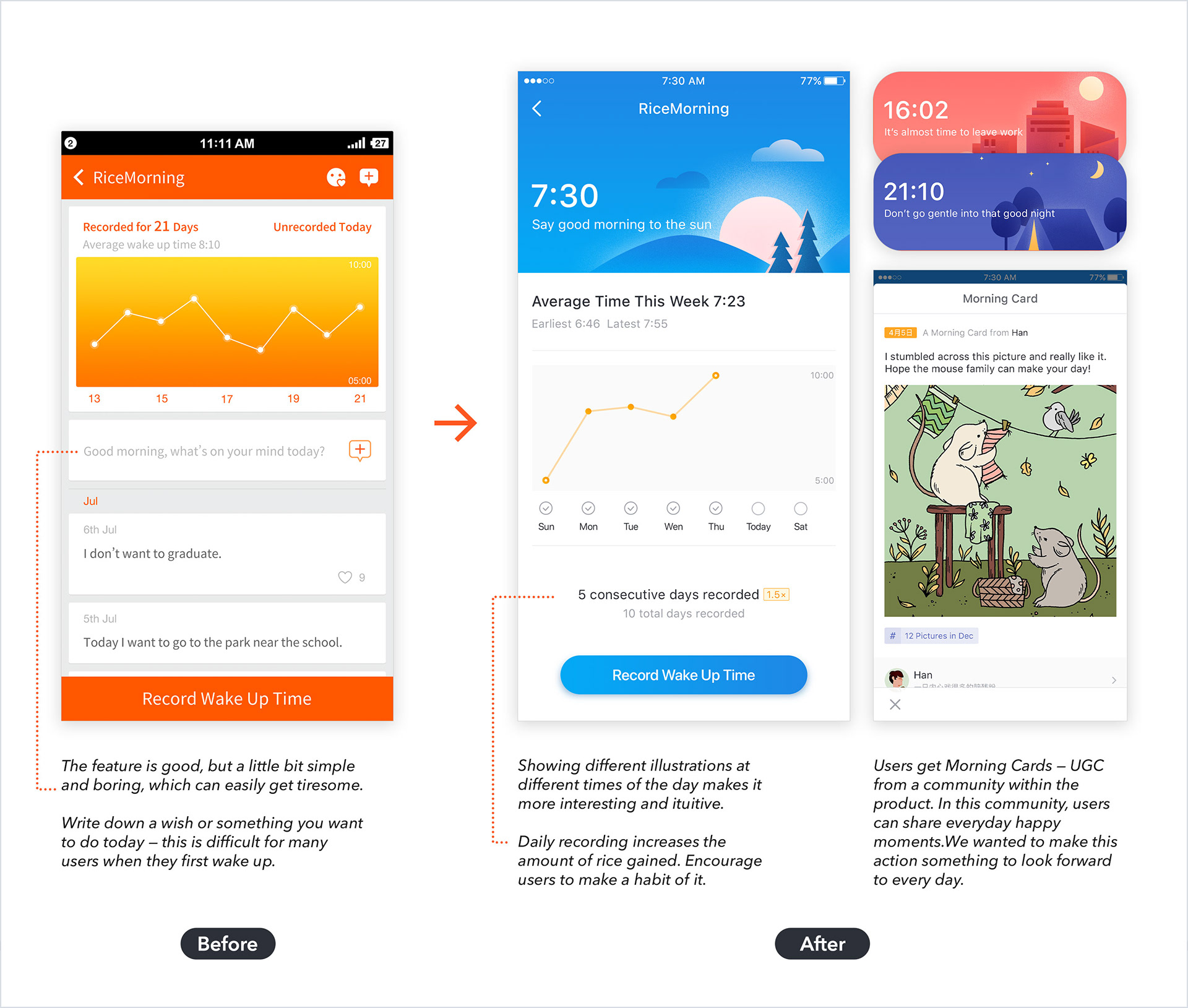
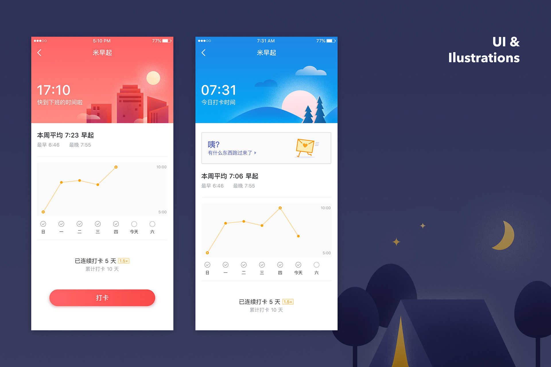
Improvements in RiceMorning.

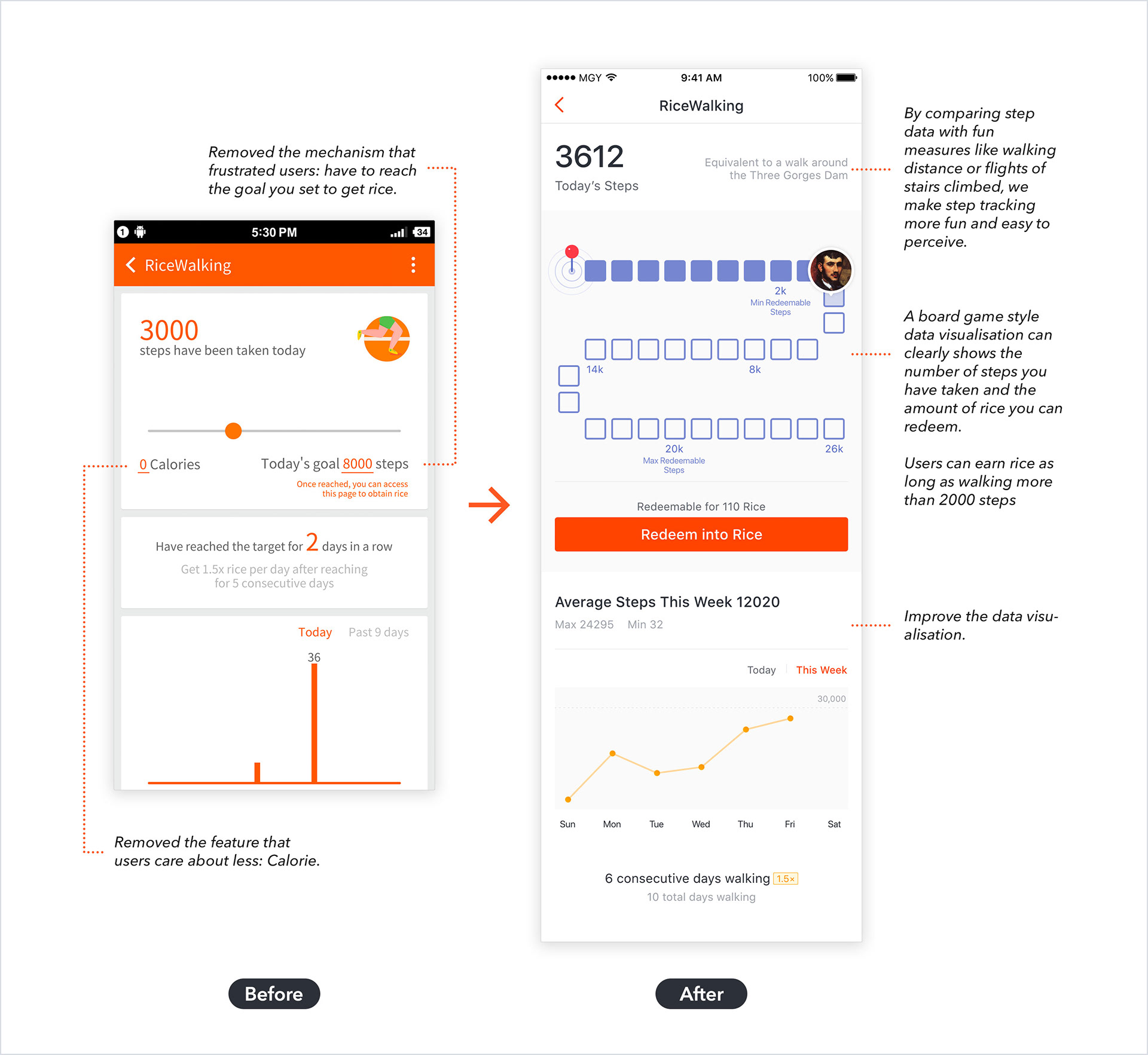
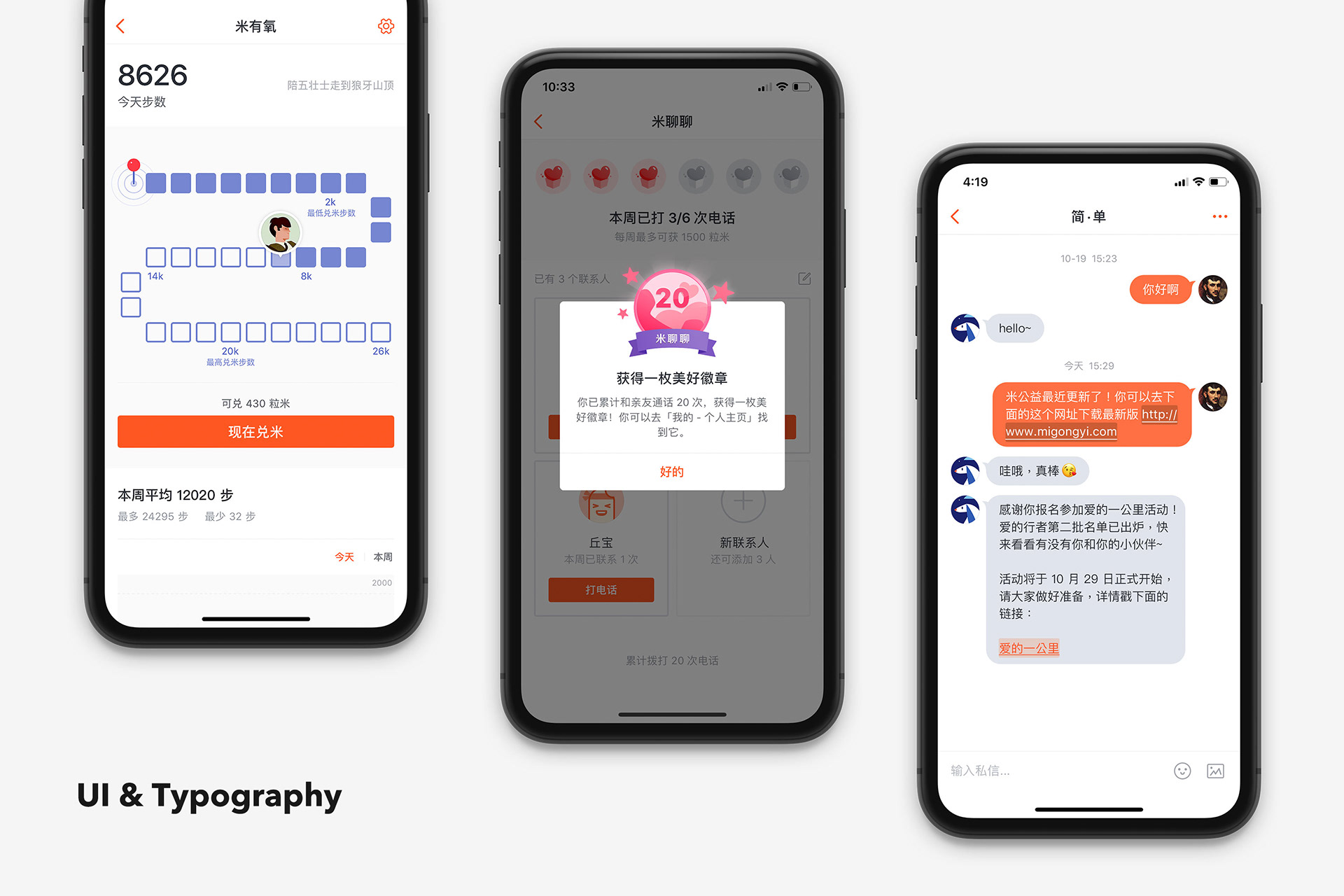
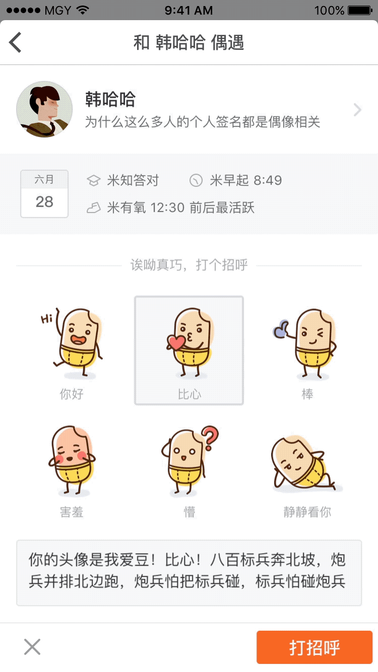
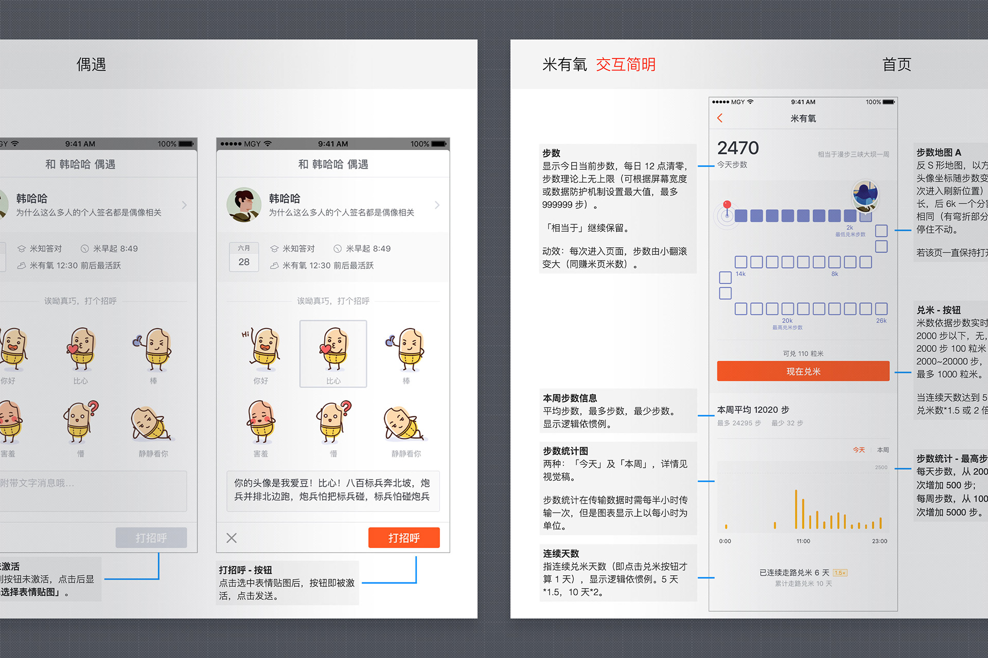
Improvements in RiceWalking.

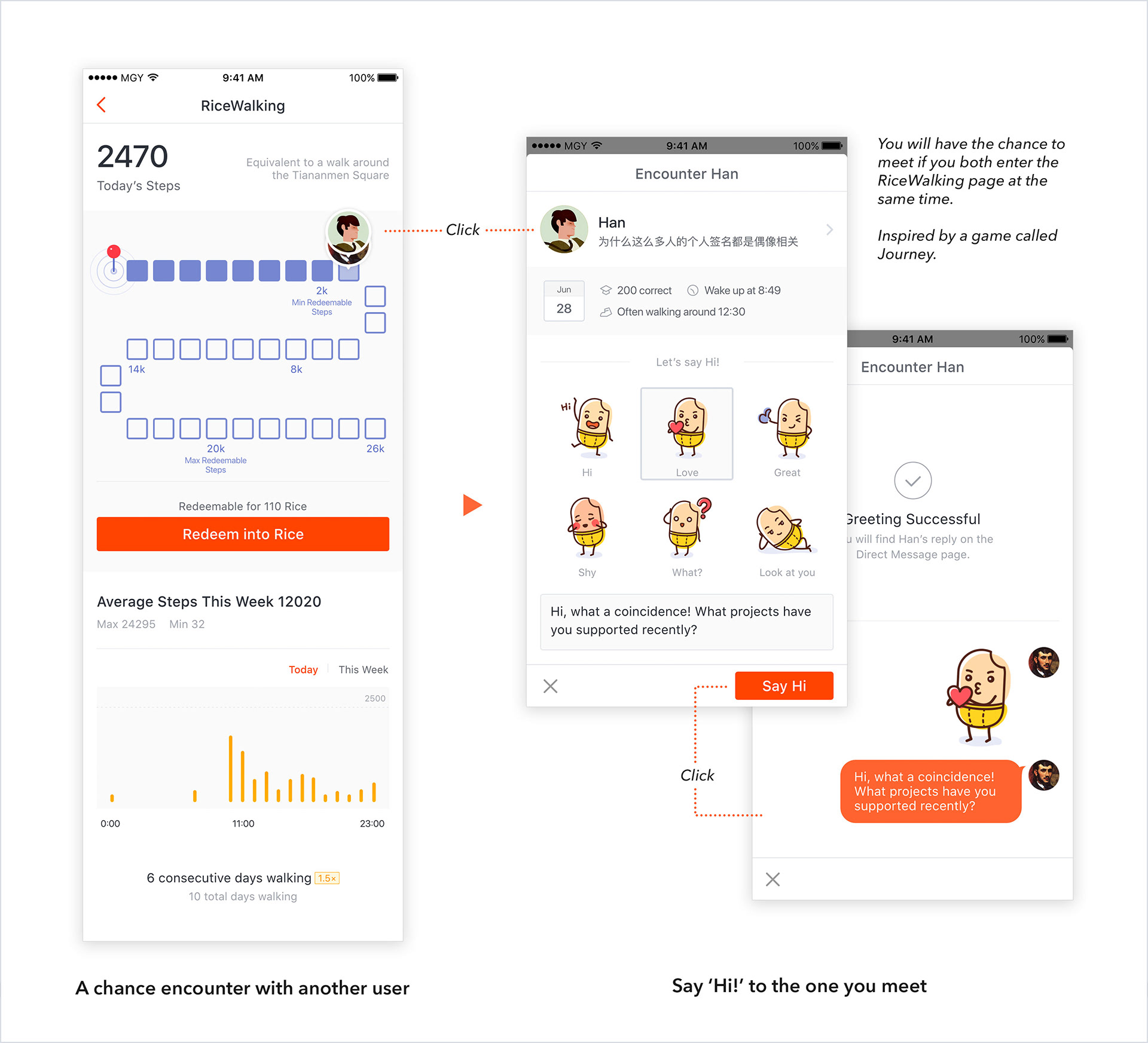
More improvements in RiceWalking.

2. Design improvements for vision 2: helping users to help others — by helping users find their favourite projects.

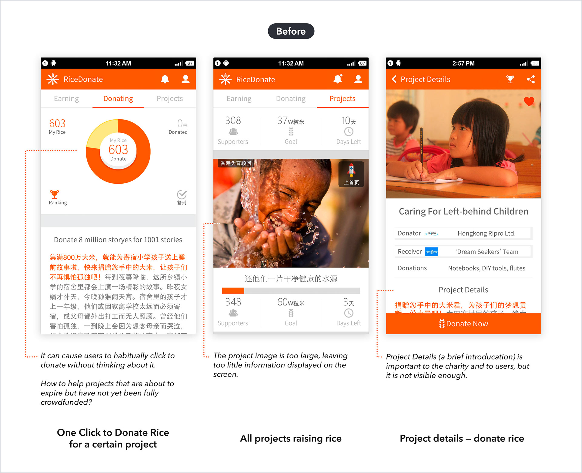
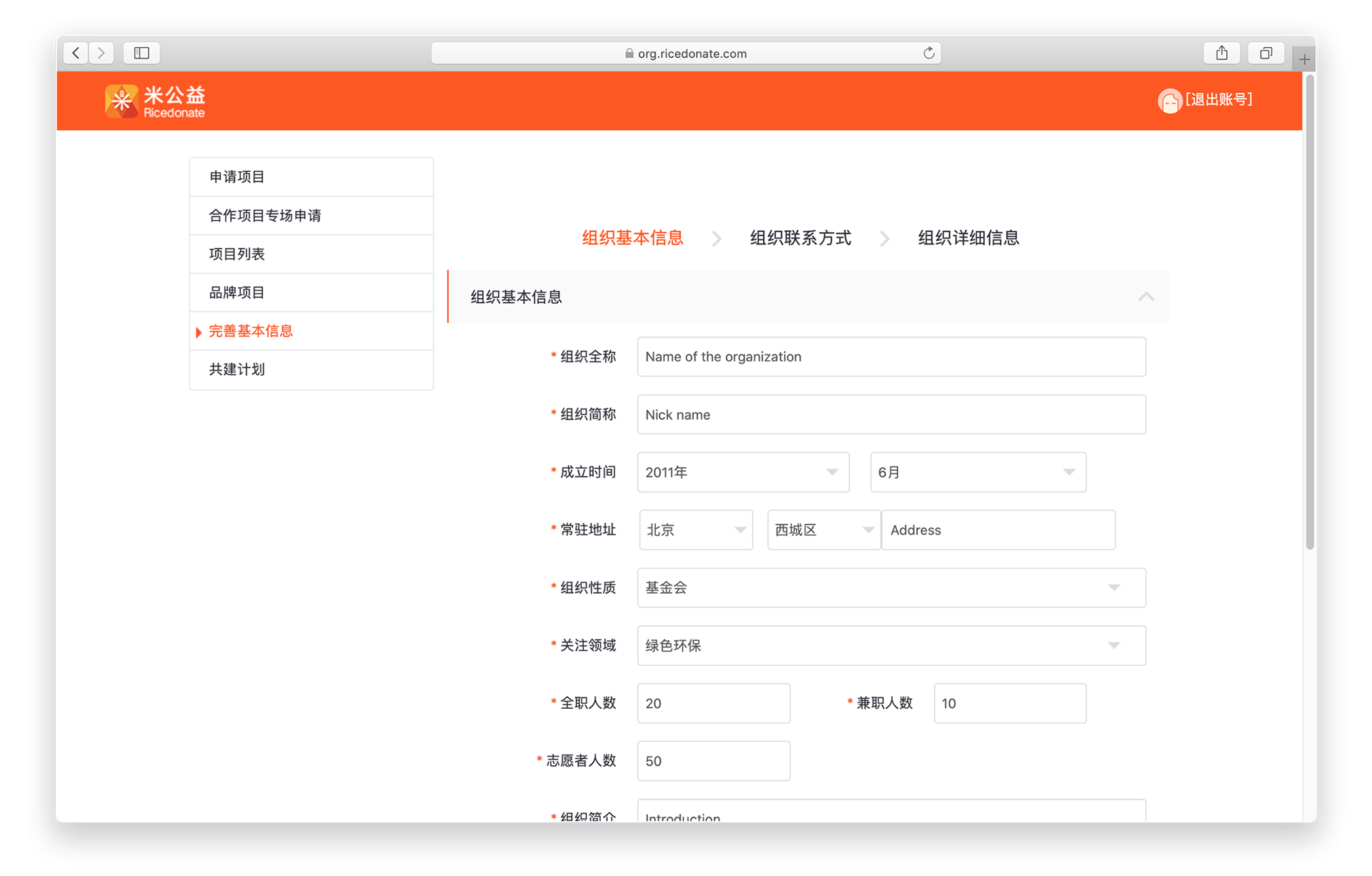
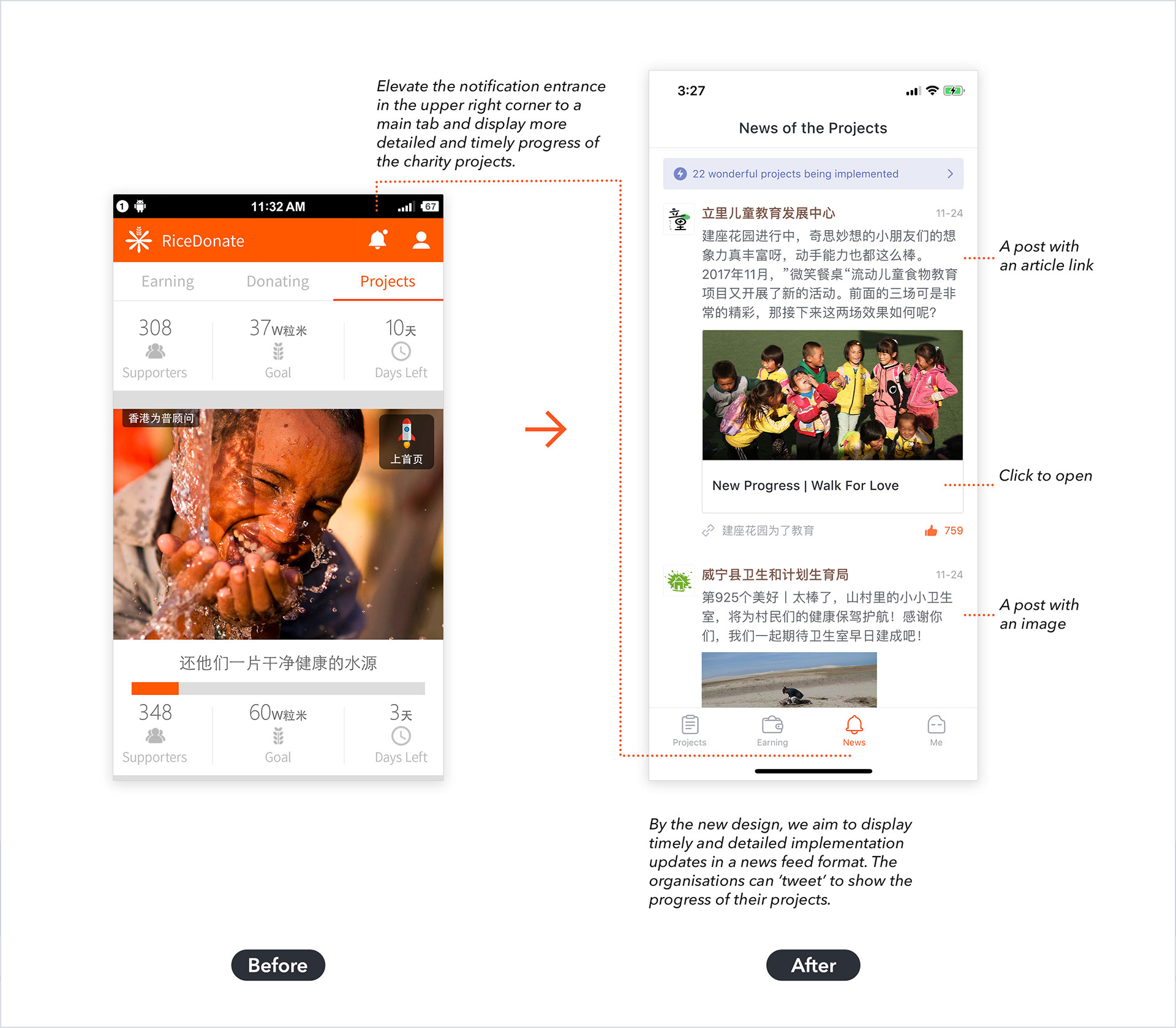
Improvements in the Projects and Project Details page — before.

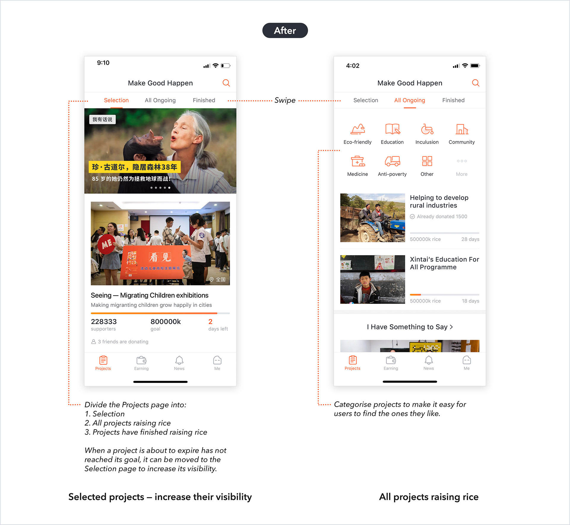
Improvements in the Projects page — after.

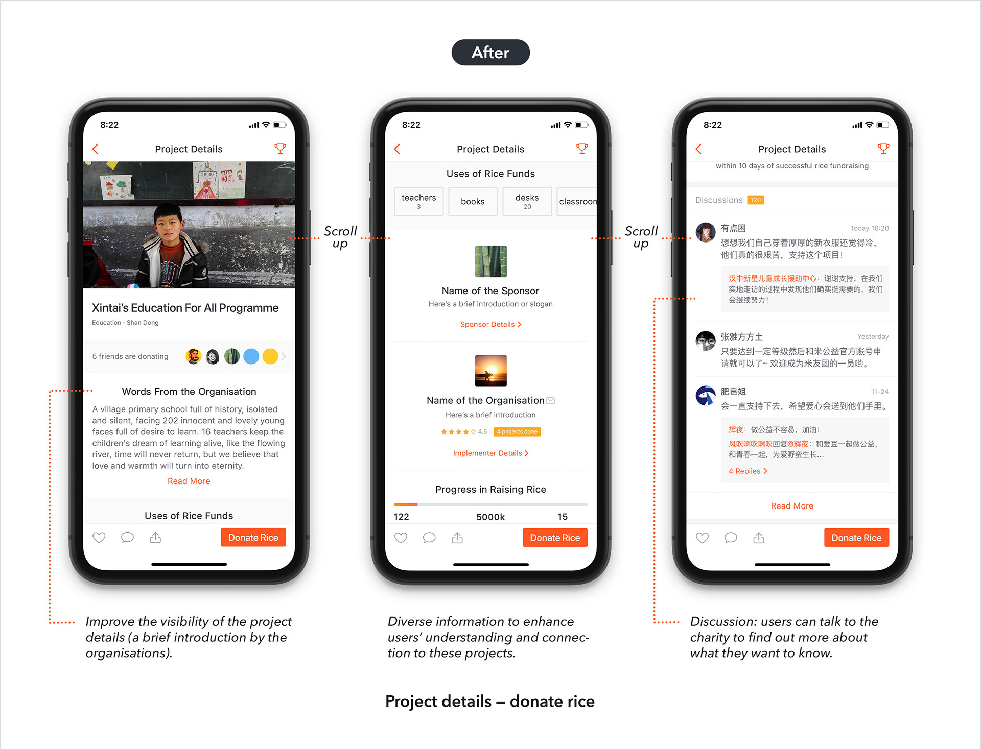
Improvements in the Project Details page — after.

3. Design improvements for vision 3: helping users to gain joy and fulfillment — by providing users with more timely and detailed updates on the implementation of their supported projects.

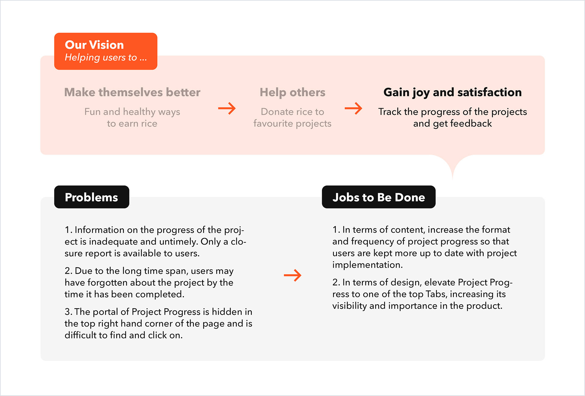
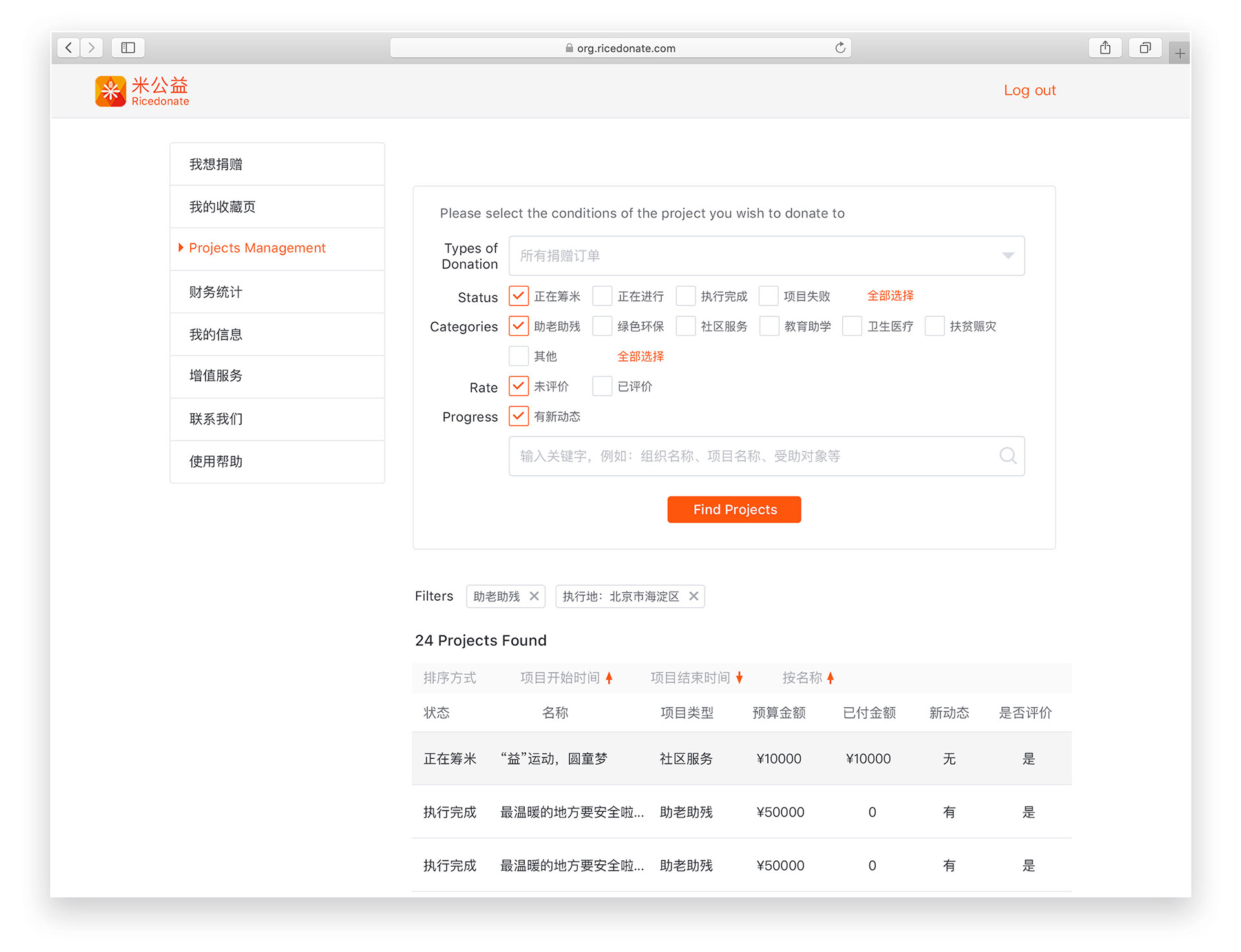
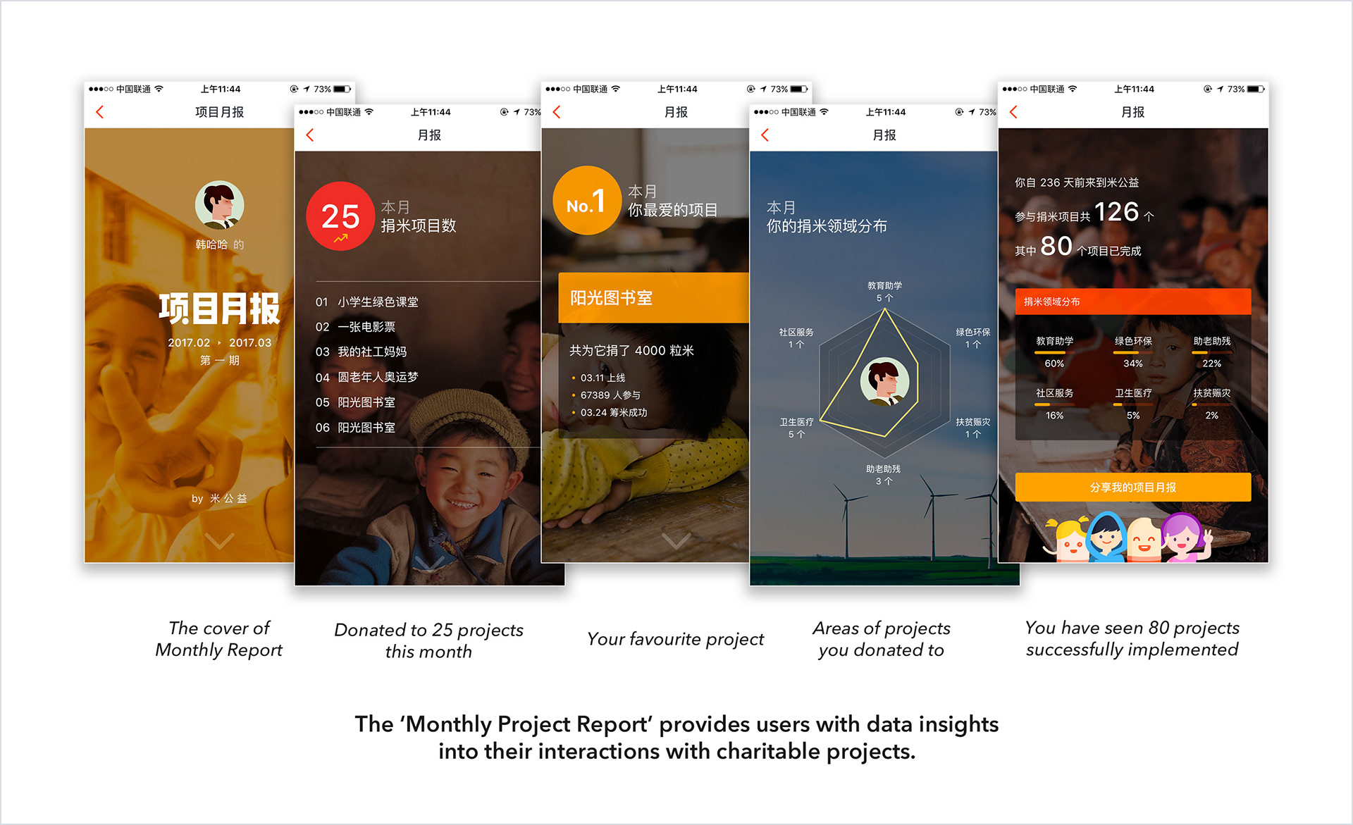
Improvements in tracking the progress of projects.

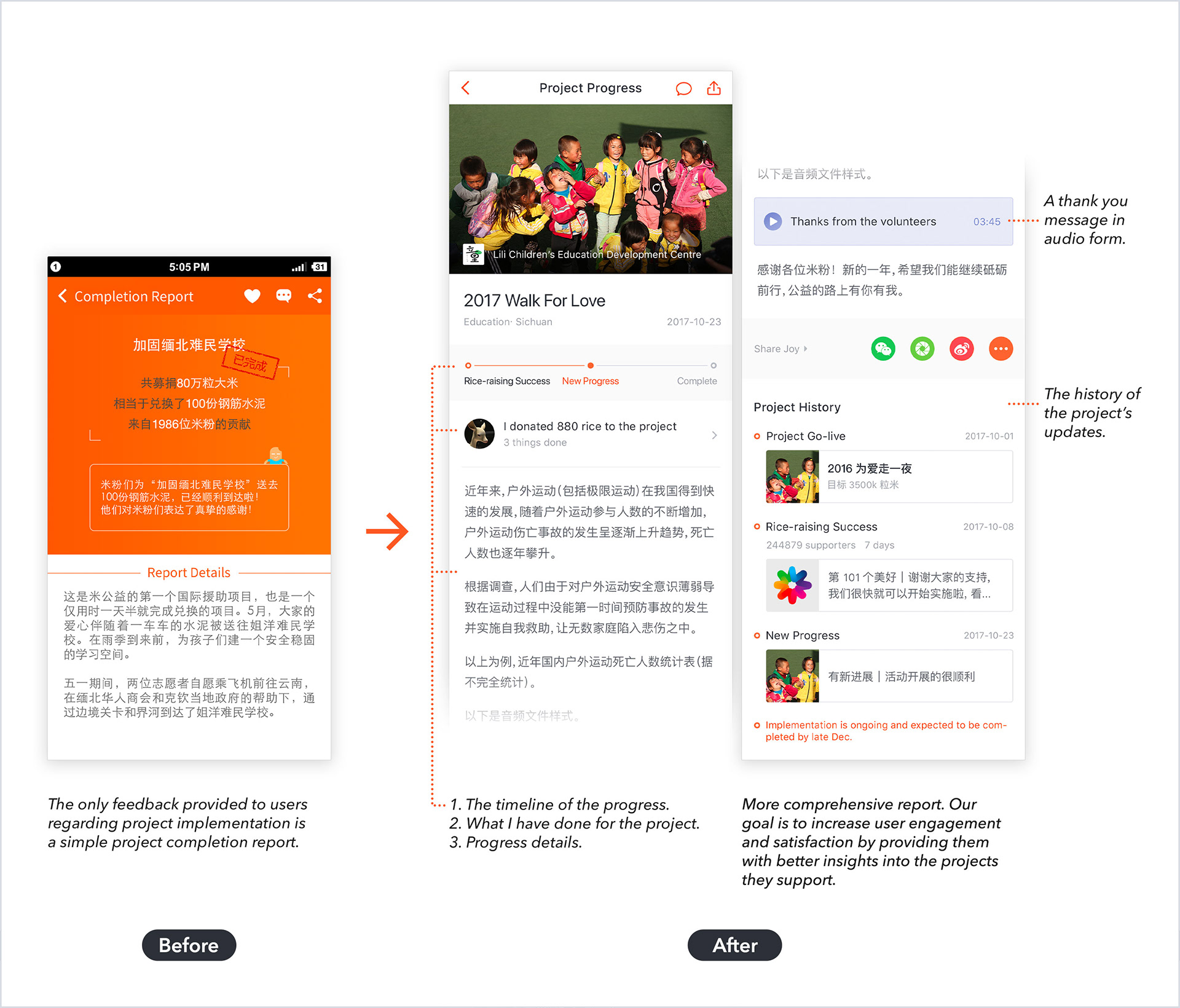
More improvements in tracking the progress of projects.

Results of the redesign
With this redesign, the RiceDonate app was greatly improved in terms of user experience and visual design. The feedback we collected from users proved this and the new version received a rating of 4.9 out of 5 on the App Store with many positive reviews (you can find them at the bottom of the page).
Challenge 2: Continue to build a connection between users and projects
Problem
The journey to improve user experience was ongoing. We continued to gather user feedback through various channels such as WeChat groups for active users and In-app Feedback.

We discovered that there was still room for improvement regarding the connection between users and charitable projects, a problem we had previously identified.

The user insights we had previously gained.

Based on our analysis, a challenging factor was that users did not support projects with their own money, but with virtual currency — Rice. Our initial intention was to make charity simple and inclusive, allowing everyone to contribute regardless of their financial situation, so we eliminated the barrier of money. However, this also meant that there was no direct monetary connection between users and projects, which challenged the traditional relationship between helpers and beneficiaries in charity.

Despite the lack of monetary connection, we could still sense users’ genuine satisfaction and happiness from their feedback. Therefore, my next challenge was to design solutions that could:

1. Further enhance their happiness and satisfaction.
2. Help users feel that their participation was important.
3. Continue to establish a connection between users and projects.

Design solutions
Here are my specific design solutions for this challenge.

1. Designing various ‘achievement badges’ related to earning rice and supporting projects, as well as recording all the charity projects that users have participated in.
2. Showing users that different amounts of rice correspond to different real items needed by the recipient. At the same time, users can receive a thank you letter from the project’s executor and sponsor after each rice donation.
3. Providing milestone review data in the form of Monthly Project Reports, including which projects the user donated rice for, how many projects have been implemented, how many are ongoing, and what their favorite (most donated) project is.
Results
We have collected a lot of positive feedback from our users in the WeChat group after the launch of these features. These features helped users to see the impact of their actions and feel more connected to the projects they are supporting. It also gave them a sense of accomplishment and motivation to continue their contributions.
Challenge 3: How do we quickly get new users to understand our product?
As a design team in a fast-paced startup environment, we constantly seek user insights to improve our product’s user experience. Our two primary methods for gaining user insights are:

1. Analysing anonymous user behavior data within the product, including identifying frequently visited and less frequently visited pages, as well as where users tend to pause or abandon their activity.

2. Continuously collecting user feedback through the In-app Feedback feature.

In the following case study, I will demonstrate how we integrate and analyze data from both channels to gain insights and ultimately translate them into design improvements that enhance the user experience.

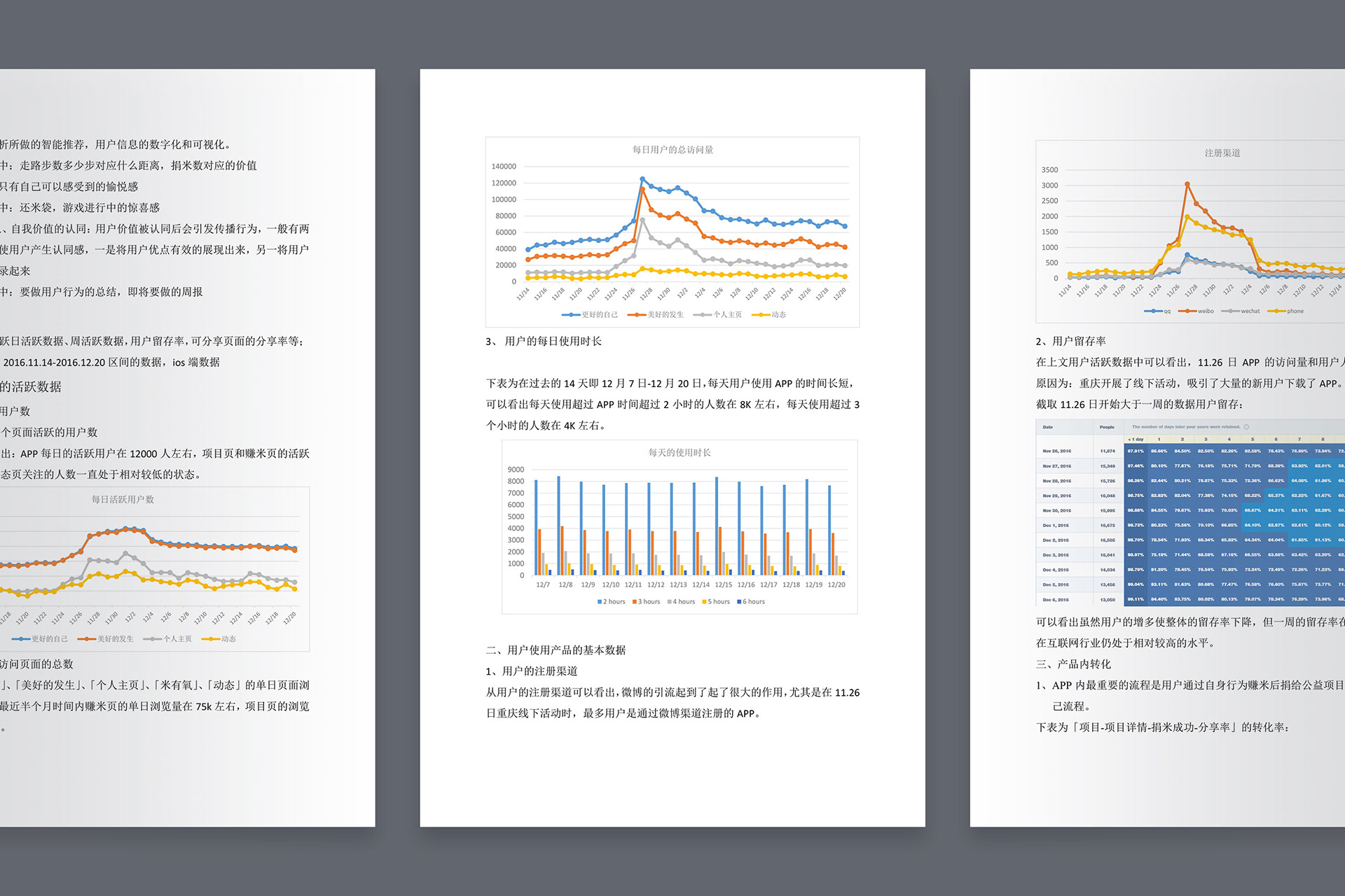
A data analysis report co-authored by product design team members. Focuses primarily on user behaviour data.

Problem
According to the user feedback reports that we have been compiling weekly, some new users have expressed that they don’t understand our product and don’t know what they can do with it.

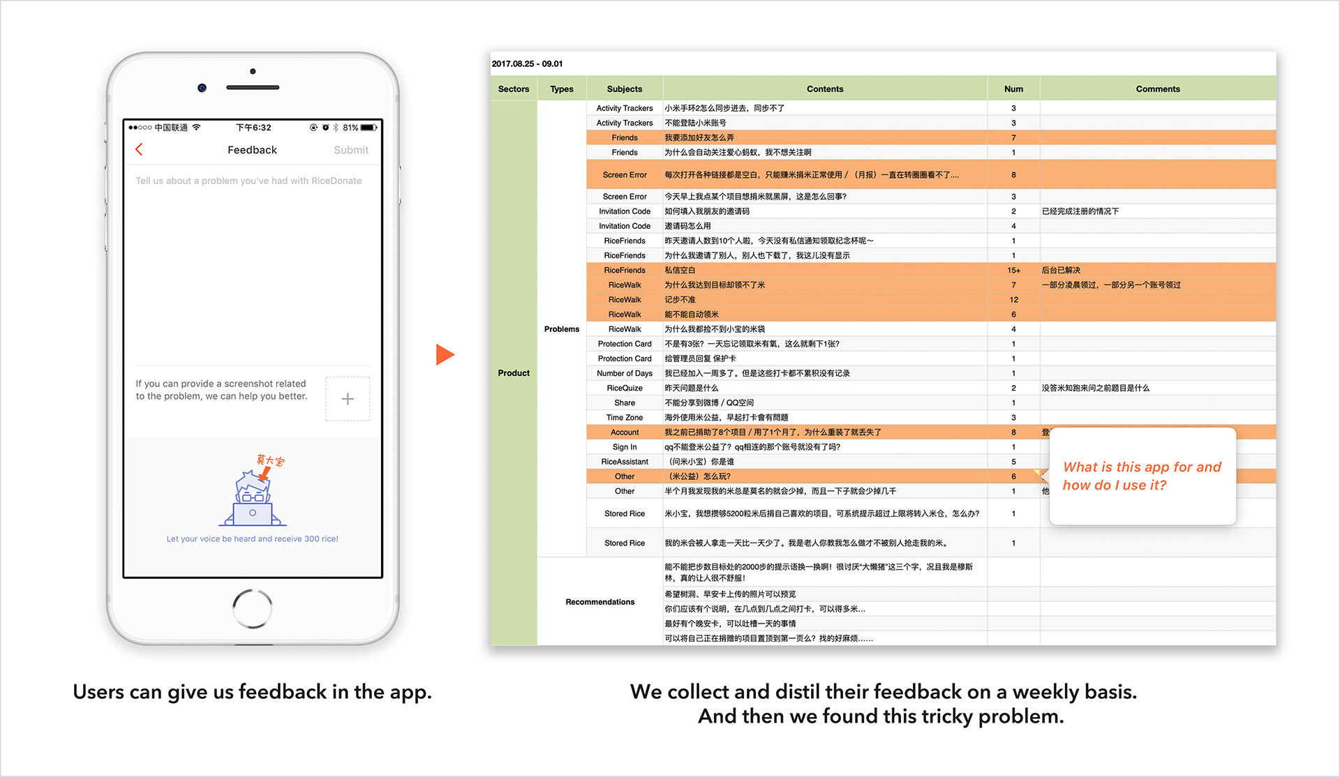
Collect users’ feedback through the In-app Feedback feature and find problems.

Analysing the problem and user data 
Initially, we were unsure about how to address this issue. As an innovative product, we have focused on intuitive interaction design and have incorporated some designs specifically for new user onboarding experience. For example:

1. New users receive a direct message from us when they first enter the app, introducing them to what they can do on RiceDonate.

2. As they begin to explore the app, targeted prompts appear on the screen, explaining the main features of the different pages and guiding them to explore further.

Therefore, we had a hard time finding an appropriate design space to help new users quickly understand our product. However, we soon discovered a crucial piece of data that we believe is related to this issue:

About 7% of users left our product without donating rice even once.

We managed to reach out to these users and found that many of them left because they did not understand our product quickly enough. Furthermore, we discovered that users who tried to donate rice on their first day of using the product had a high 7-day retention rate. This inspired us to make ‘donating rice’ the key to the new user onboarding experience — because it is one of the most important Aha-moments in our product, it can give users a great sense of satisfaction and help them better understand our product through practice.

Design solutions & Results
Therefore, we decided to improve the In-App Guides to enhance the onboarding user experience. After new users entered the ‘Projects’ page, we immediately gave them some rice and guided them to browse a featured project, click on ‘Donate Rice’, donate the rice, and receive a thank-you letter from the nonprofit organization and sponsor.

As a result, we saw a significant reduction in users leaving without donating rice, and a marked increase in our 7-day user retention rate. Additionally, we received fewer complaints from users about having difficulty understanding our products.

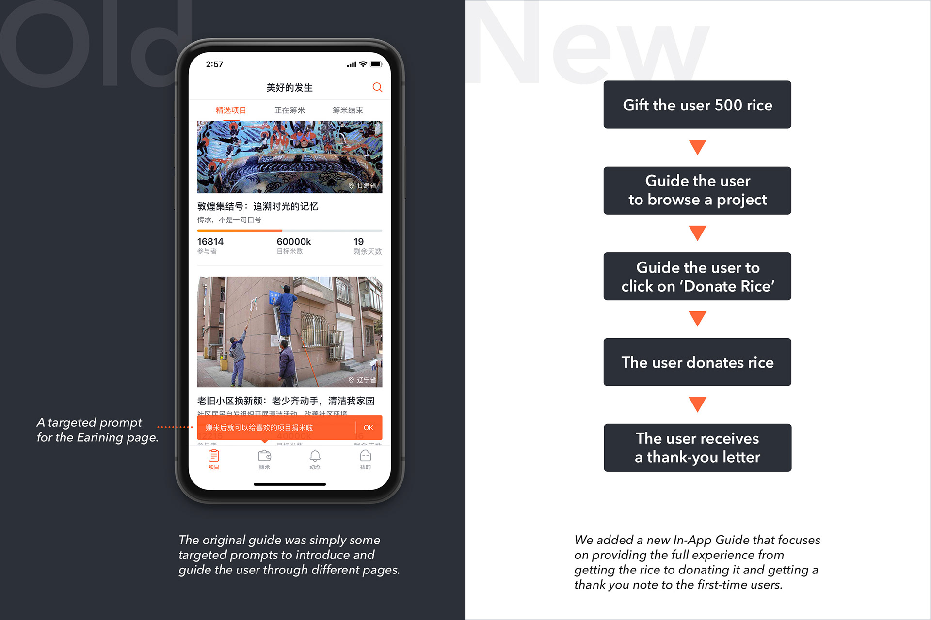
We identified the issue with the old guides and added a new in-app guidance, which makes 'donating rice' the key to the onboarding experience.

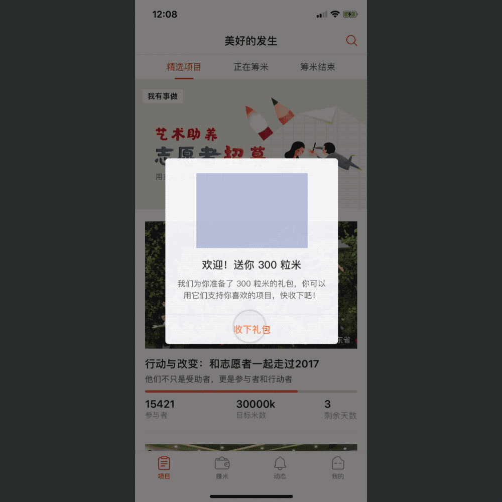
The new in-app guidance (prototype) made by Principle. Gift new users rice and then guide them to make a donation to a project.

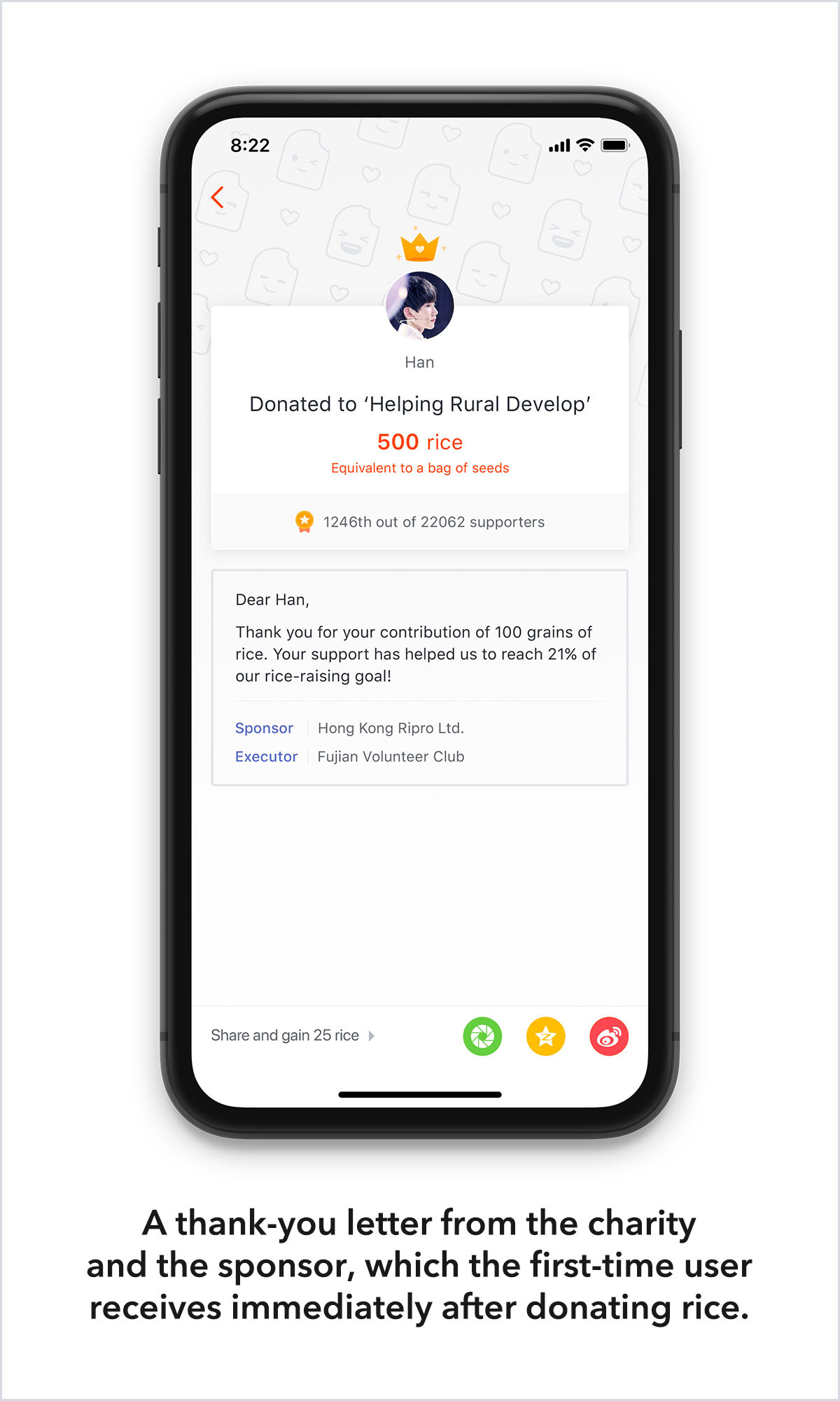
The new users can receive a thank-you letter immediately after the first-time donation, giving them a huge fulfillment.

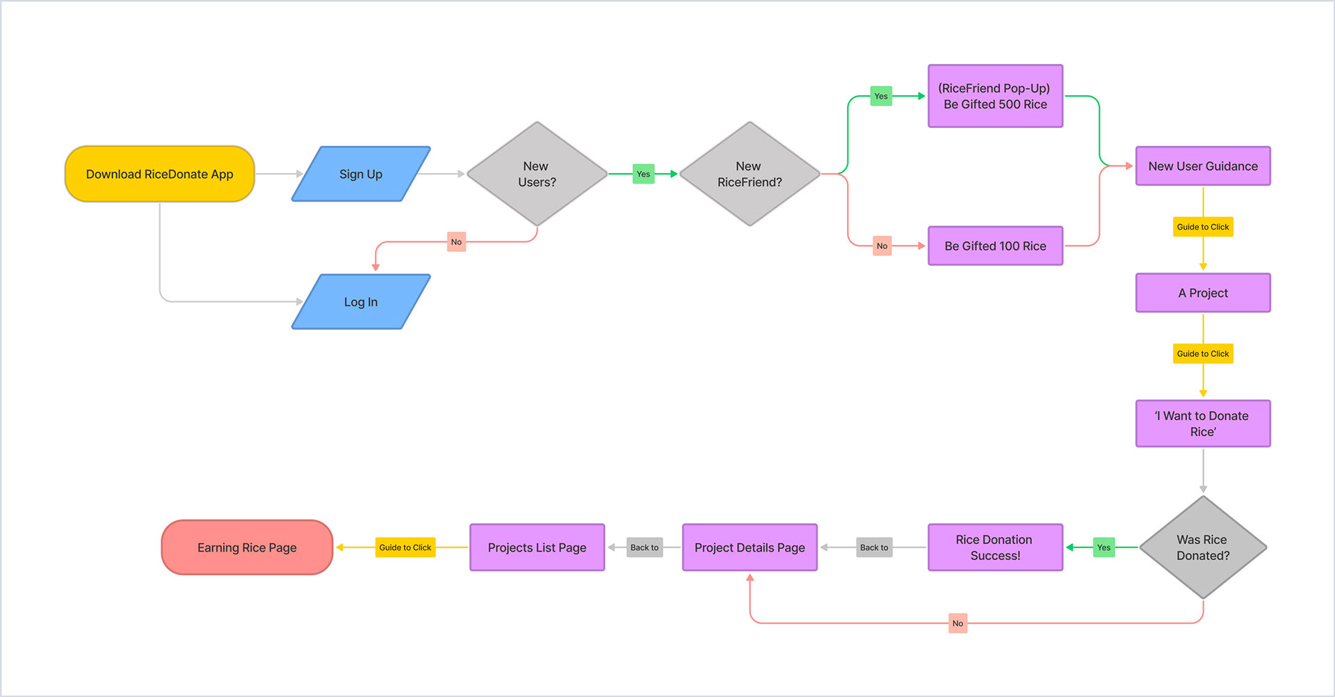
User flow of the new in-app guidance.

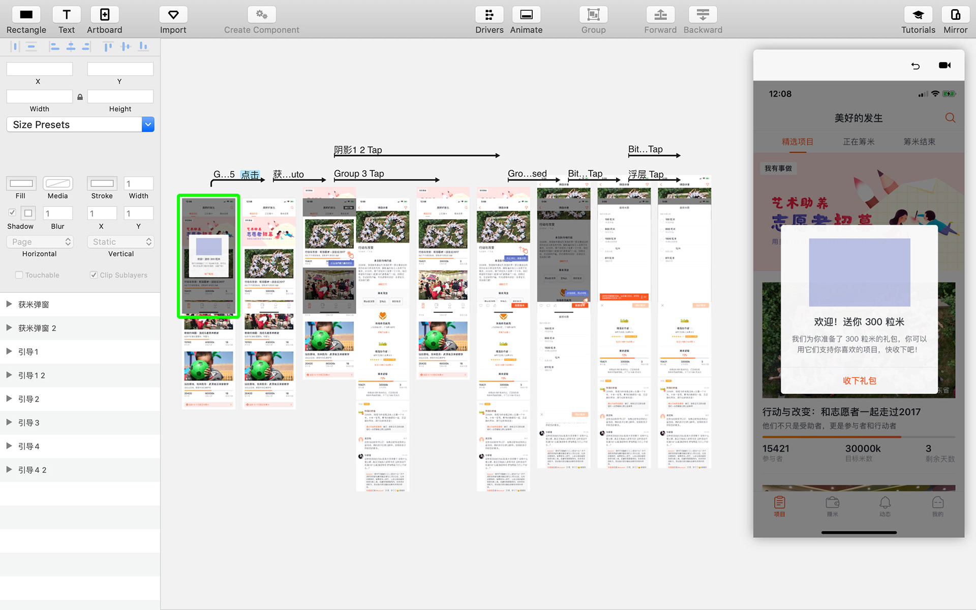
The screenshot of Principle when making the in-app guidance prototype.

Challenge 4: Achieving User Growth
Problem
How to increase user acquisition is a challenge that every user-oriented startup must face. In my opinion, providing value to users that aligns with our vision is the most fundamental and effective way to achieve user growth.

Here are two case studies where we used an in-app survey to gain user insights and inspire us to design for growth.

Design For Growth 1: RiceFriends
As our product is closely associated with happiness and a sense of fulfillment, we sent a direct message as ‘RiceBaby (in-app assistant)’ to some active users with just one question —

‘What was your happiest moment when using RiceDonate?’

Among the more than 500 moments of joy we received, one theme came up repeatedly, and that was the joy of having friends join RiceDonate.
We discovered that many users who experience the joy of helping others through RiceDonate recommend the app to their friends. To harness this insight, we created a feature called RiceFriends. This feature enables users to invite their friends to join RiceDonate, and offers an extra layer of joy to the experience: as you and your RiceFriends earn rice together every day, you can earn extra rice rewards. We call this feature Double Happiness.

Since launching this feature, over 500 new RiceFriends have joined RiceDonate every day. This enduring sense of partnership has become an important driver of user growth and value. We’re thrilled about the positive impact of RiceFriends, and are proud to offer our users even more reasons to share the joy of giving with others.

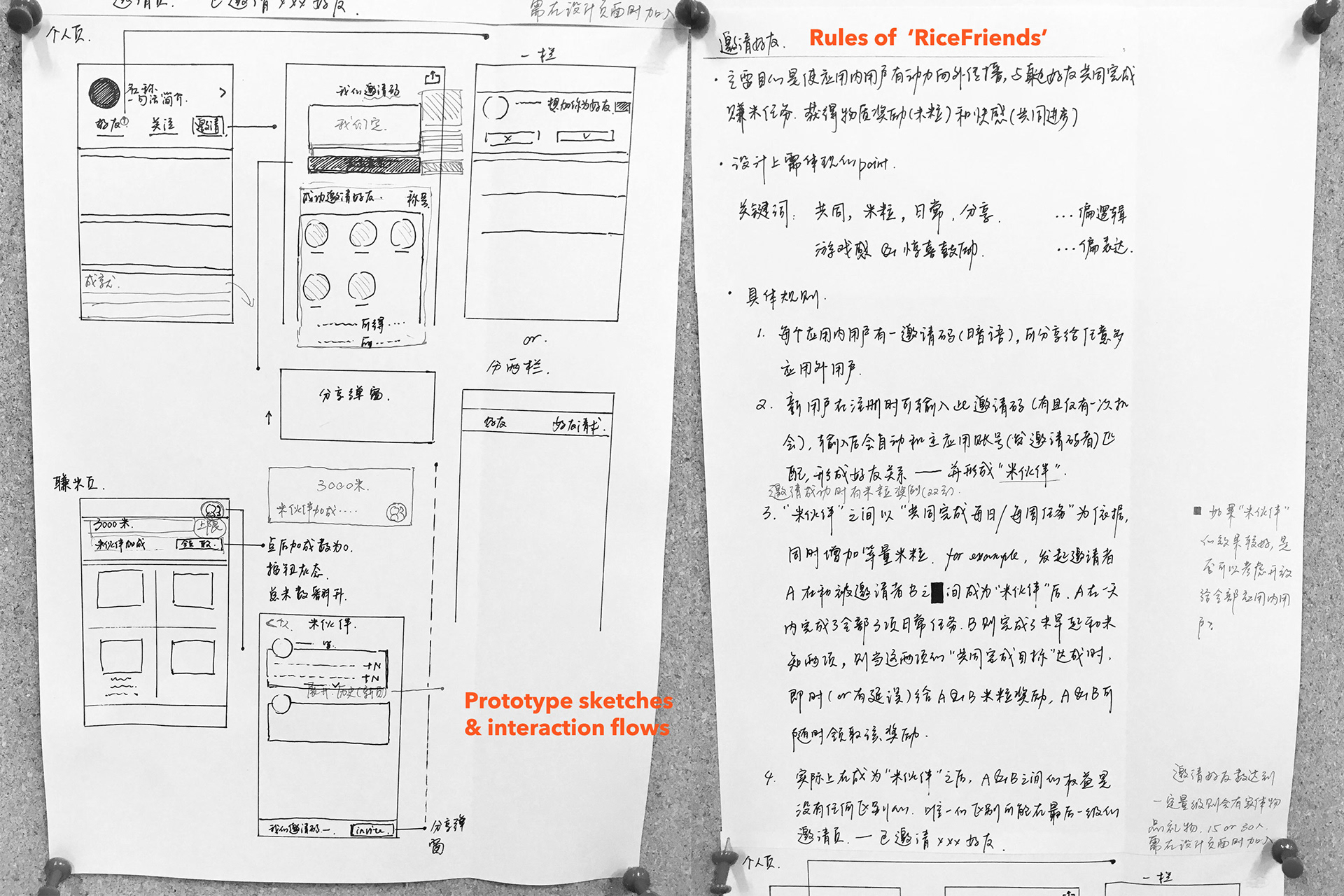
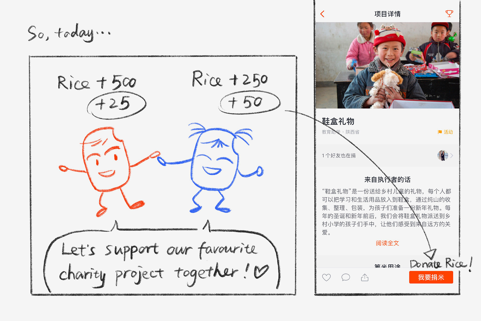
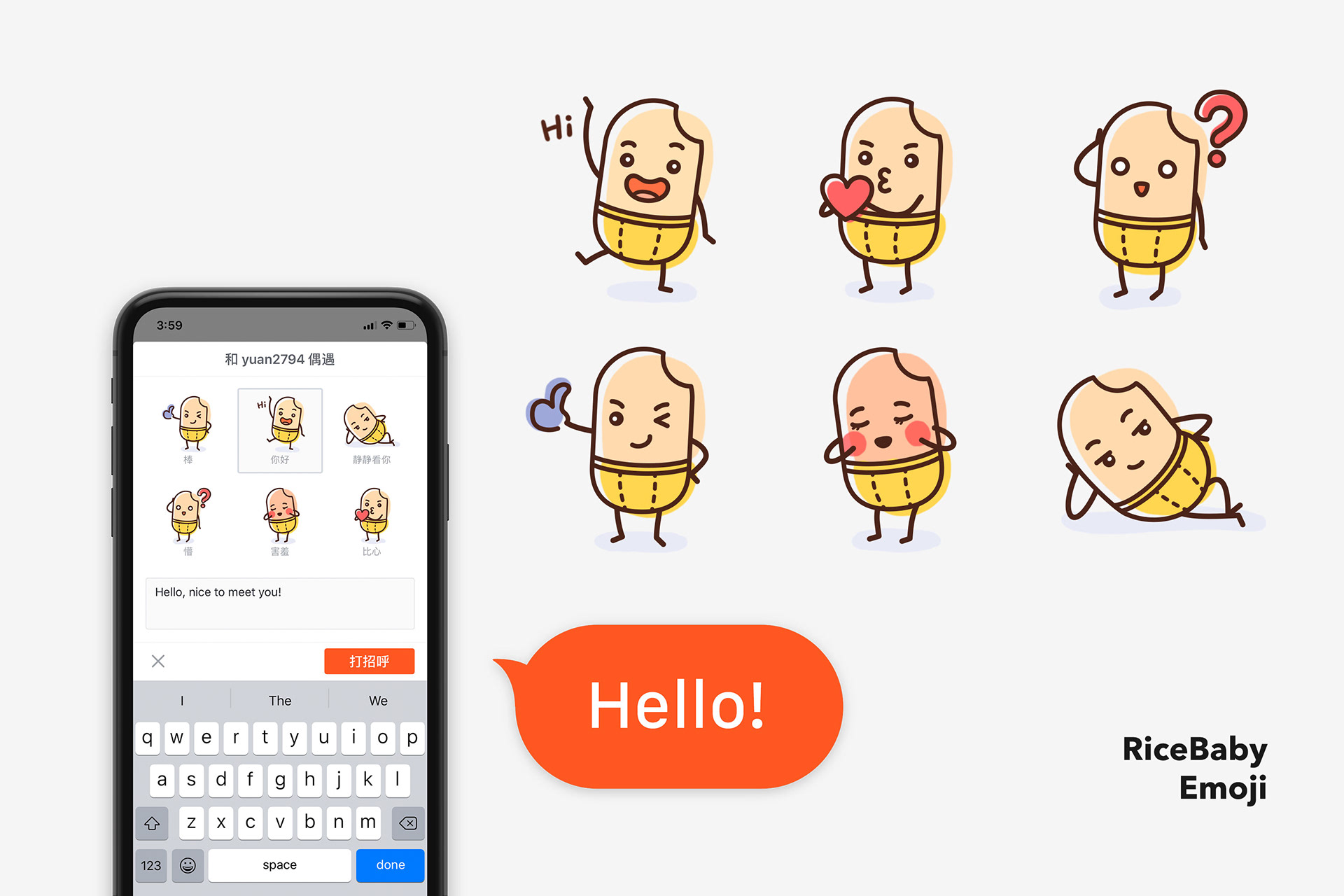
 The prototype sketching and the rules of RiceFriends. 

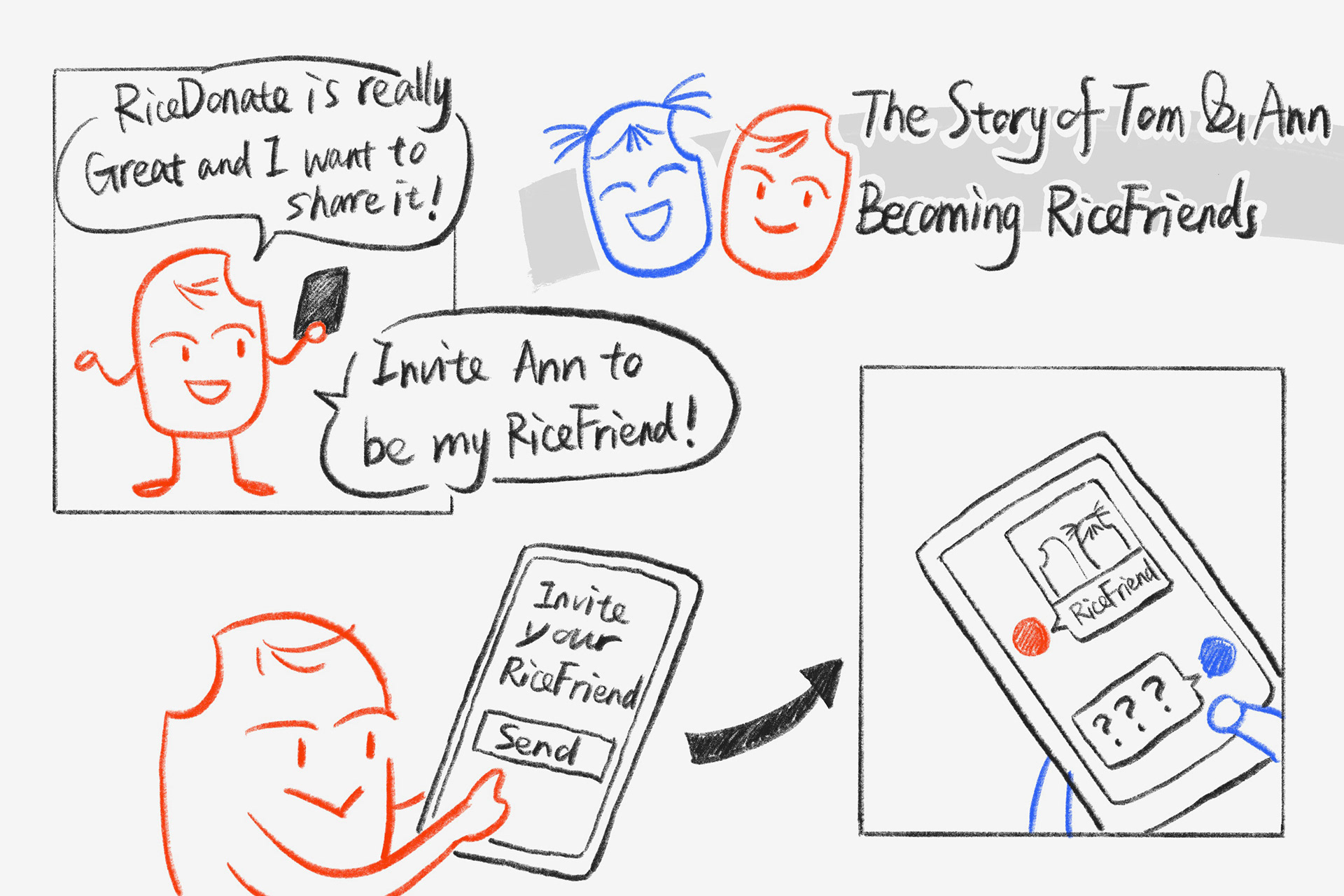
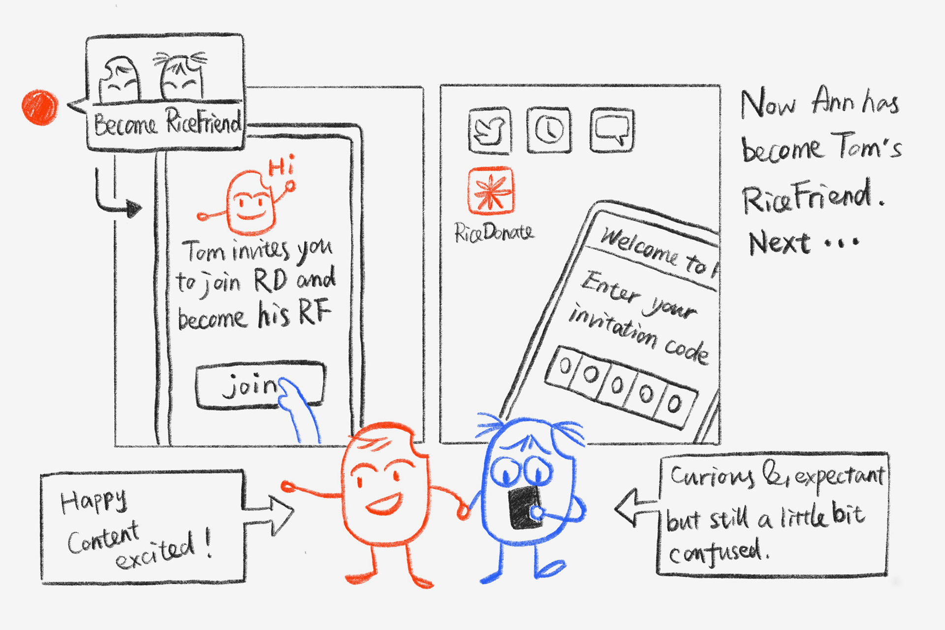
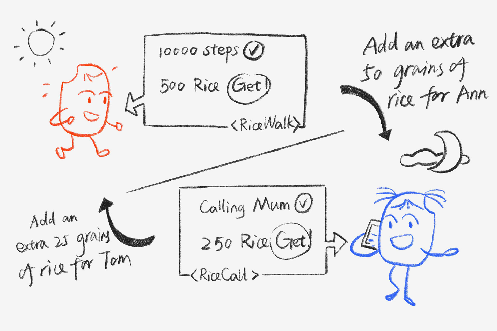
The storyboards of RiceFriends.

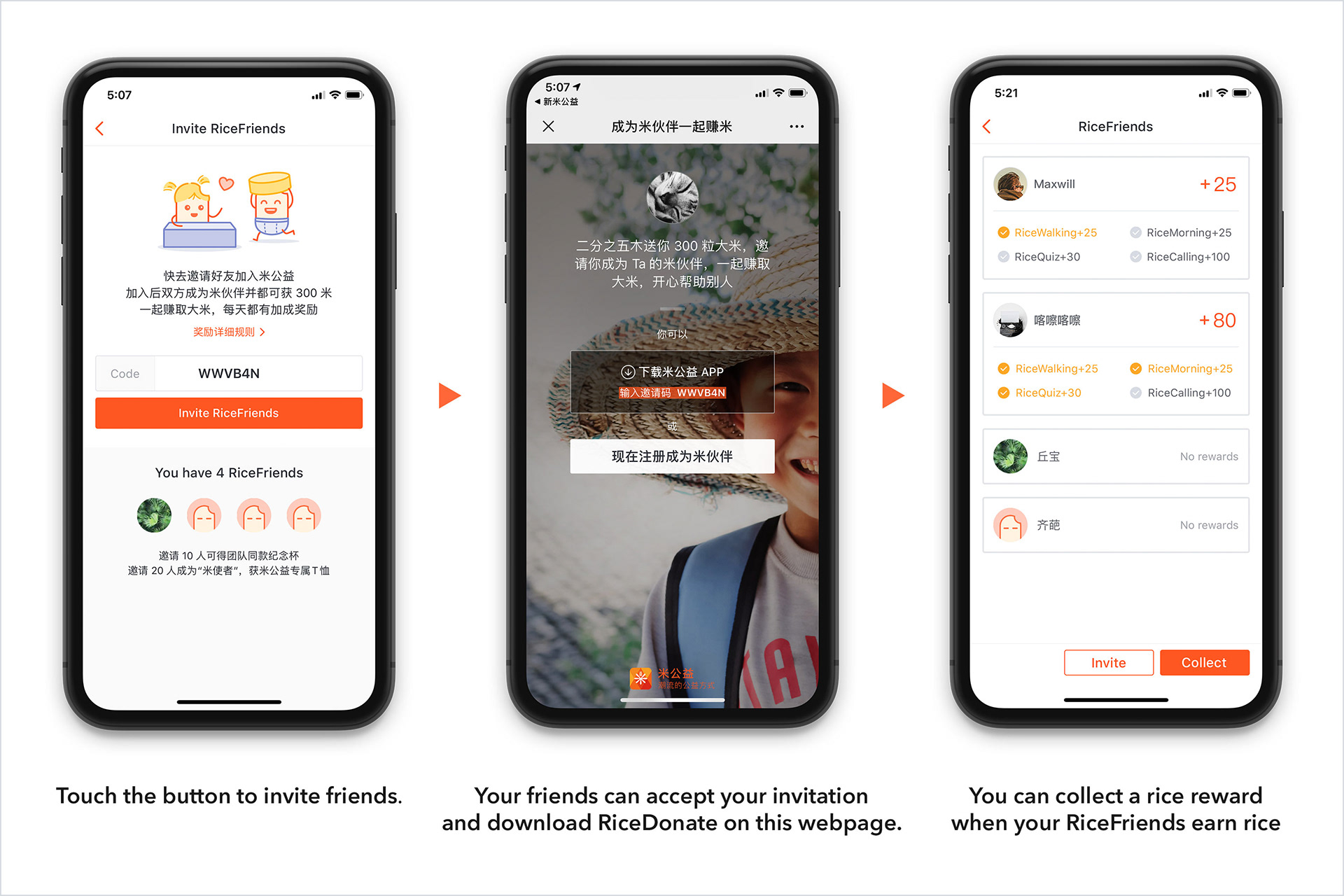
The user interfaces and the main user flow of RiceFriends.

Design For Growth​​​​​​​ 2: thank-you gifts, mini-game, and marketing campaign.
In the aforementioned collection of happy moments from users, a number of them mentioned another thing that made them feel happy — receiving handwritten postcards.

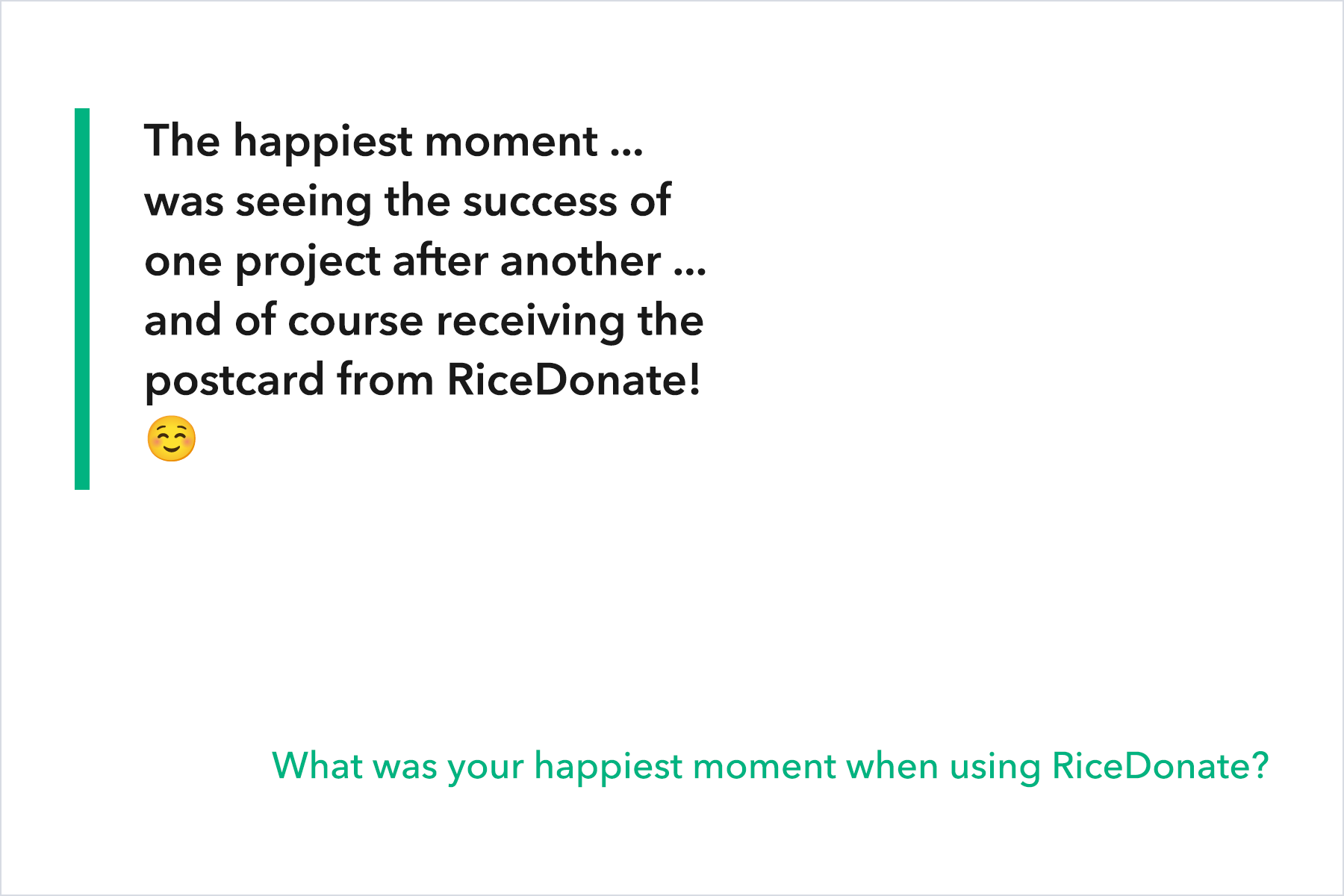
In fact, we write postcards to active users at level 6 and above to thank them for their continued participation. They did enjoy the postcards very much. This feedback inspired us to explore how we could further delight our users with physical gifts. As gifts are limited, we decided to create a mini-game campaign for some of our loyal users to win ‘Thank You Gifts’.

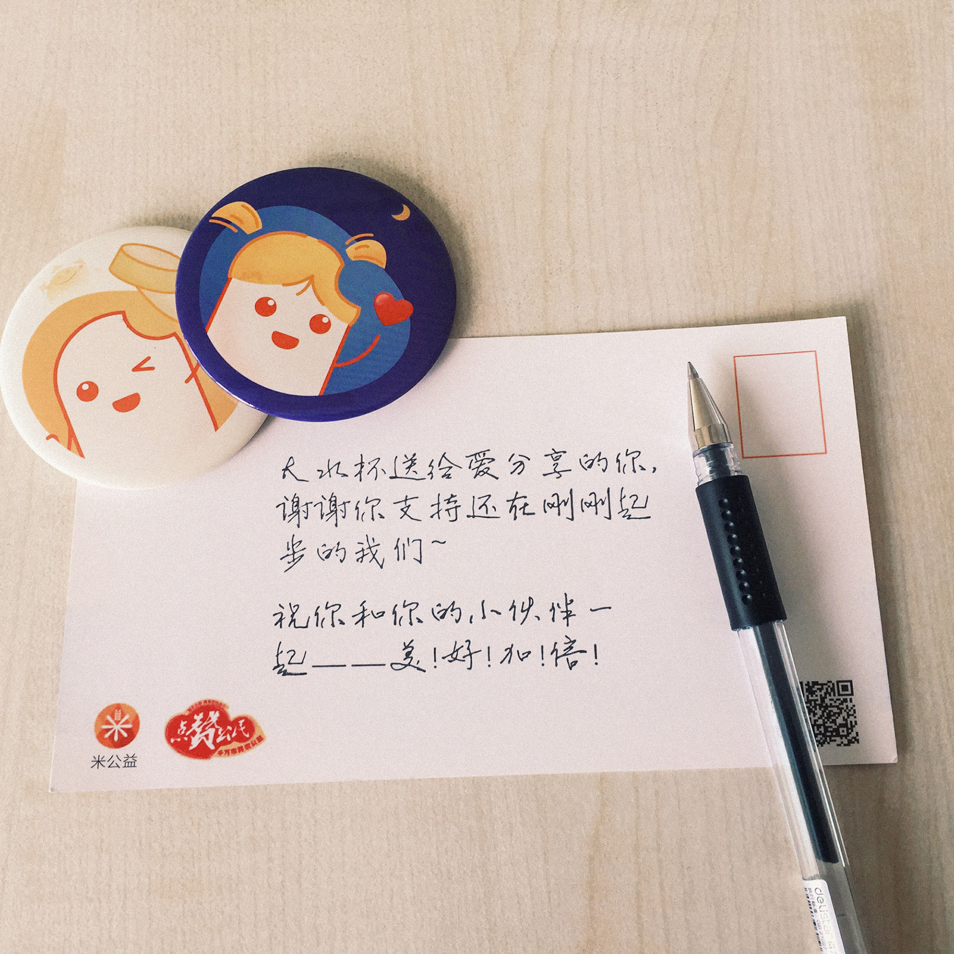
Postcards we sent to users regularly.

Our first gift was plant seeds, and we designed the mini-game in such a way that different ‘seed cards’ would appear randomly within the app as users earned rice. Once users had collected all the cards, they could exchange them for a vial of plant seeds. To encourage users to share their joy with others, we created a hashtag called #RiceDonateSeedsGuardian on social media, where users could share photos of their seeds sprouting. The hashtag quickly gained popularity, with about 630,000 views at the time.

We found that this campaign not only made our users happy, but also increased our product’s exposure and bring new users. Thus, it has become a regular campaign for us, with only minor changes to the gifts and cards.

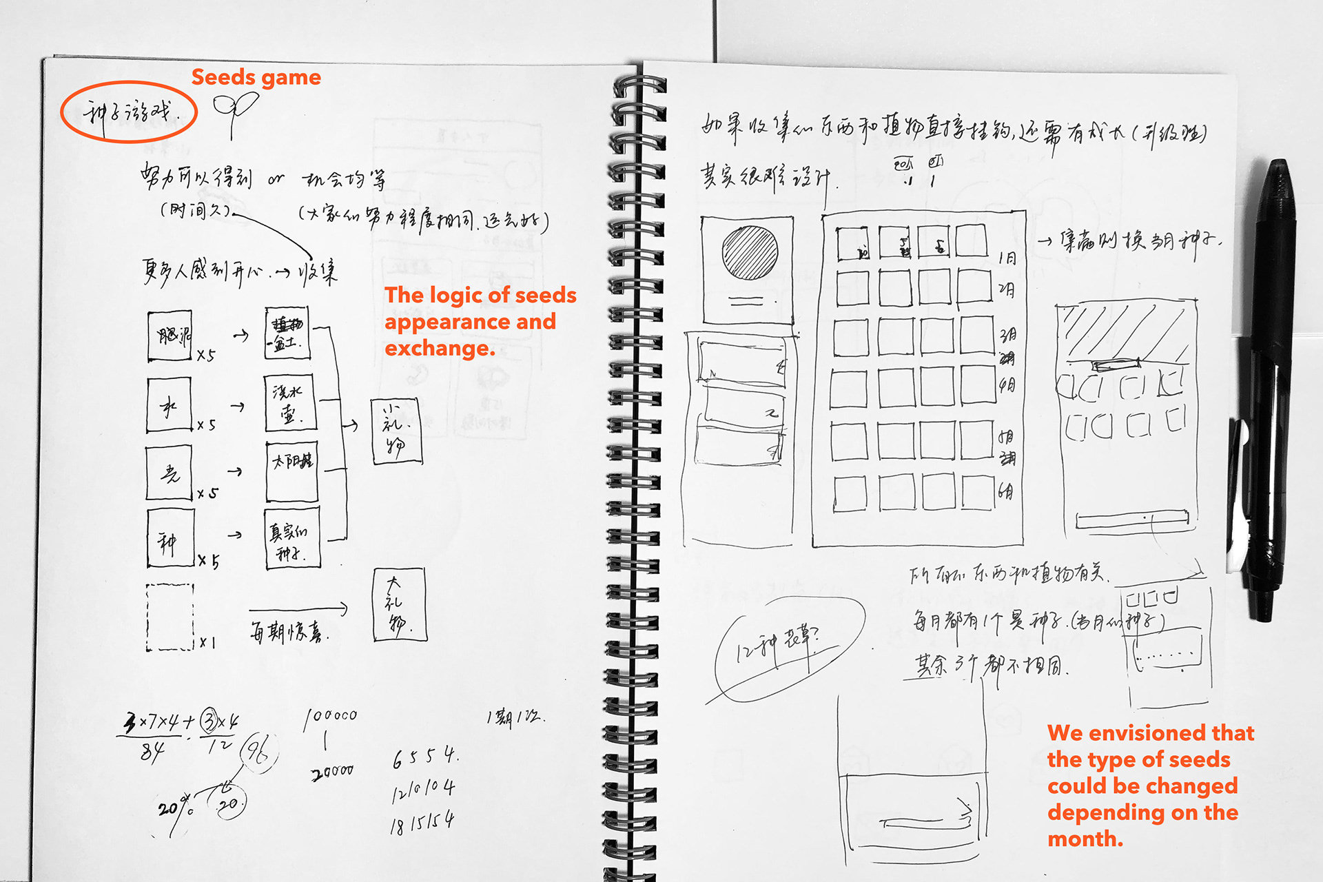
Sketches of the game ‘Secret Seeds’.

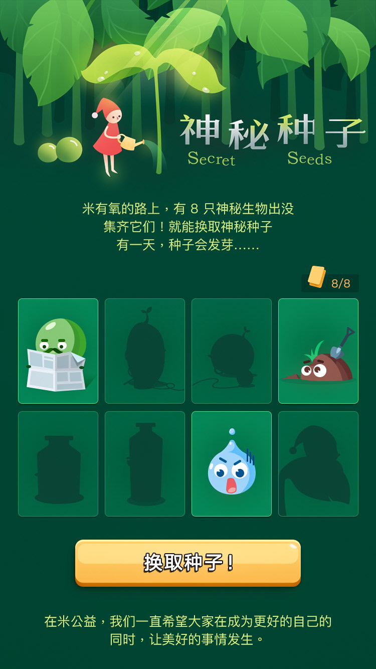
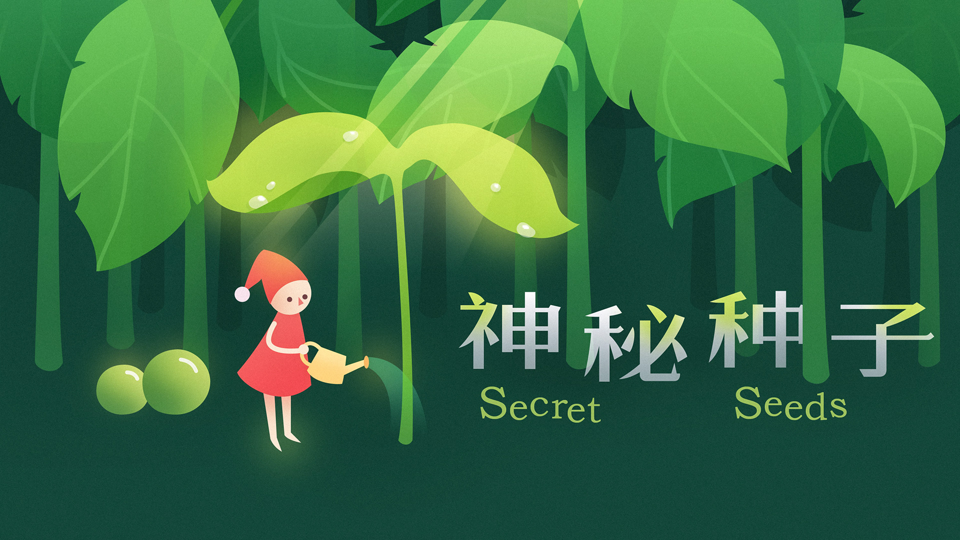
I drew the illustration and designed the interface of the game.

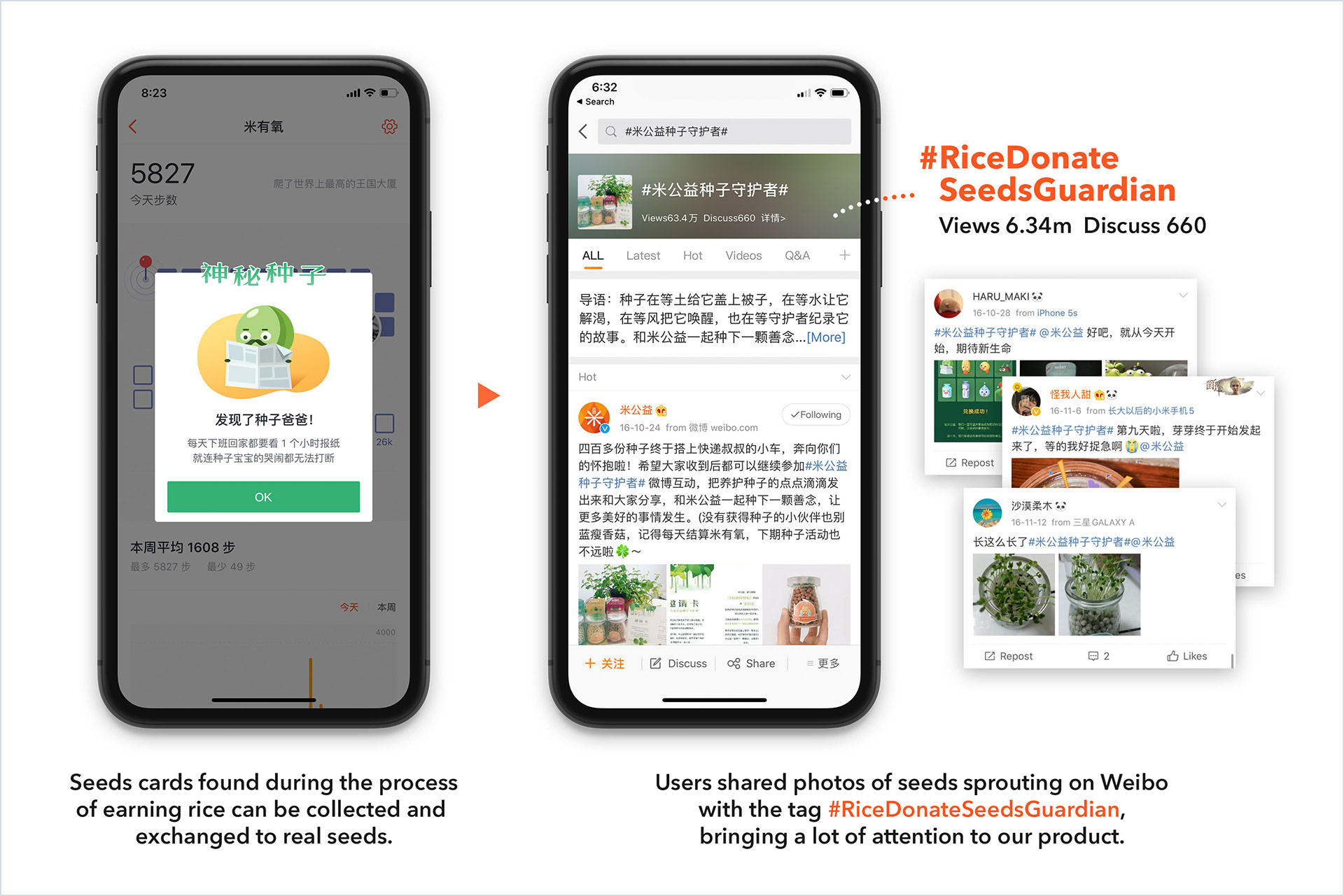
The main process of this mini-game campaign: find seeds cards, exchange them for real seeds, and share photos of seeds sprouting with the tag on social media.

UI & Visual Design
UI and visual design are significant, influencing the image and the vibe of a product. We hope that the user interface of RiceDonate can convey happiness and joy to users, that’s why we use bright colors, icons with subtle rounded corners, and vibrant illustrations.

Although Design System was not as popular as it is today when we designed our products from 2015, we were very concerned with consistency and reusability of design resources — consistent icons, buttons, illustrations, font sizes, spacing, various reusable modules, etc.

Here are some of my favorite UI designs, and I independently created most of them. Enjoy!

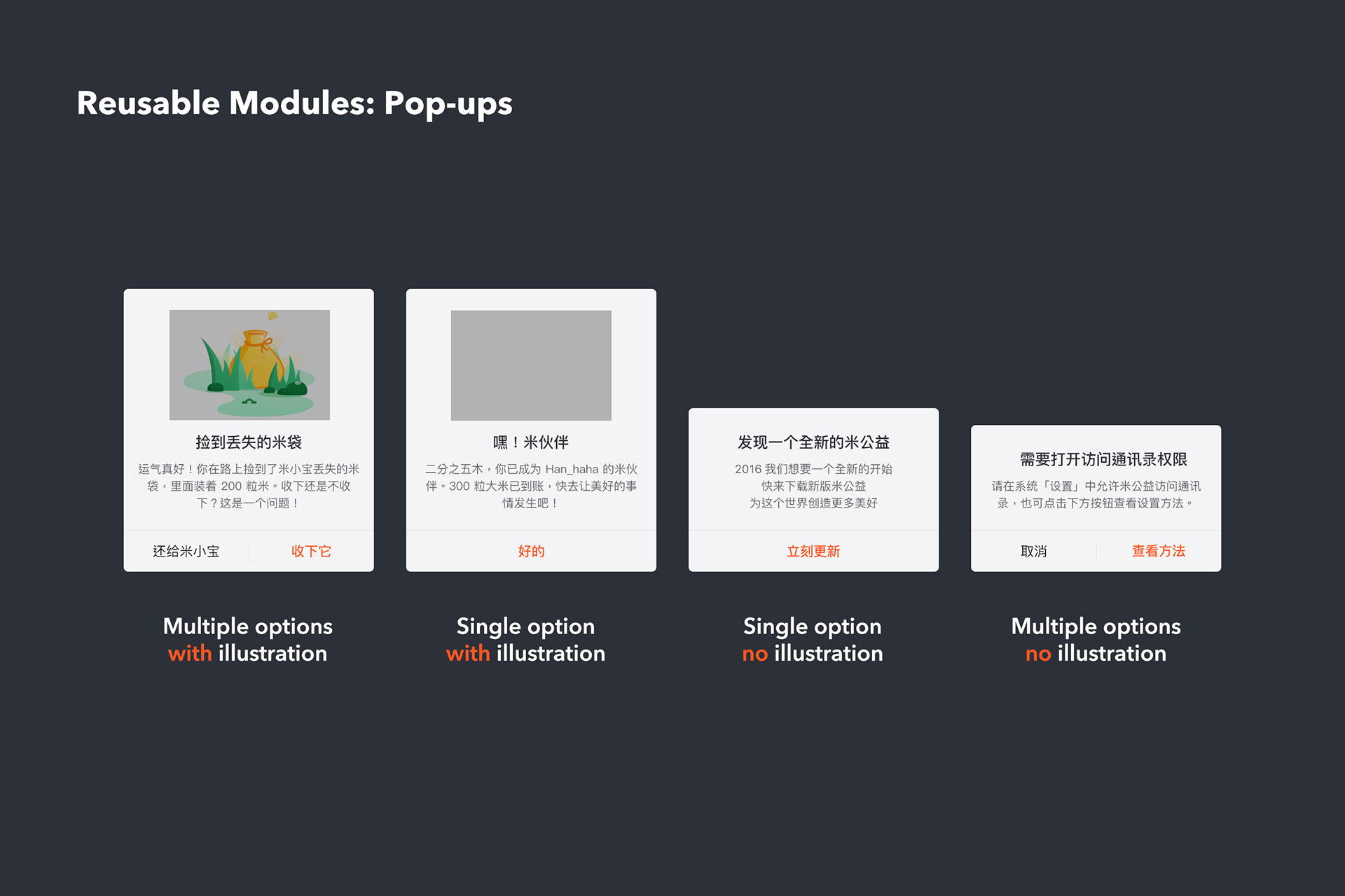
Part of the RiceDonate Design System: reusable pop-ups.

Working With the Dev Team
When working with our development team, we still follow the principles of Agile. We always do our best to minimise friction in collaboration and reduce the likelihood of rework or changes to requirements, in order to make new features go live quickly to get feedback from real users.

In order to achieve this, our main methods are —

1. Keep communicating.
2. Providing comprehensive handoff documentation.

We meet and discuss with the dev team at least three times during the design process at three stages —

1. When defining the design requirements
2. After completing the wireframe flow
3. When delivering the final design.

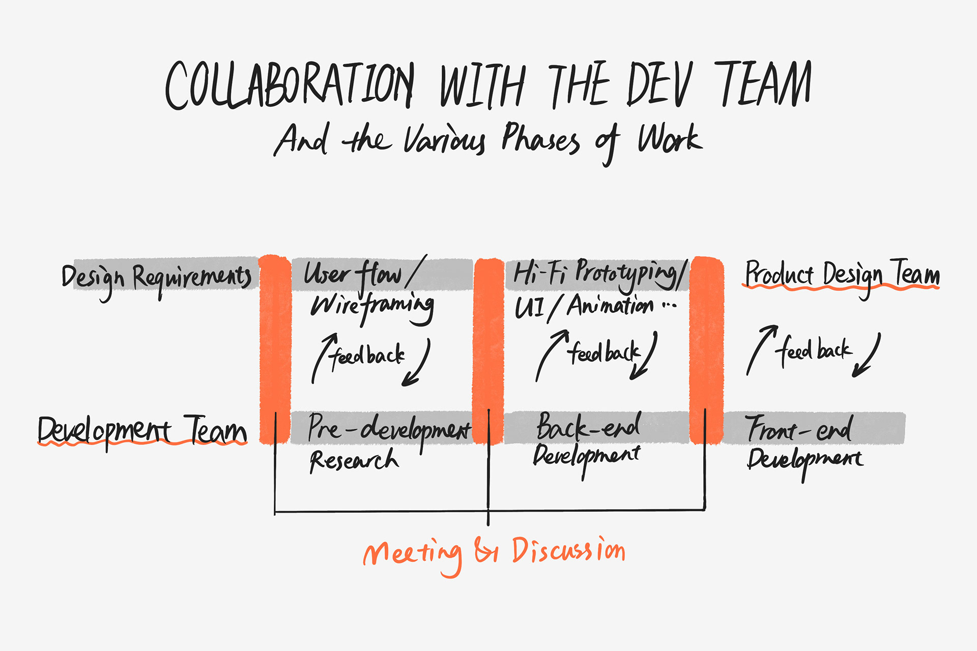
At least 3 times meetings with the dev team at different stages during the design process.

When defining the requirements, we present initial user flow ideas and wireframe sketches to help the development team define their requirements and conduct technical research. Once the wireframes are complete, we deliver detailed prototypes and discuss technical feasibility with the dev team. Based on their feedback, we finalize designs for implementation and the back-end engineers begin development.

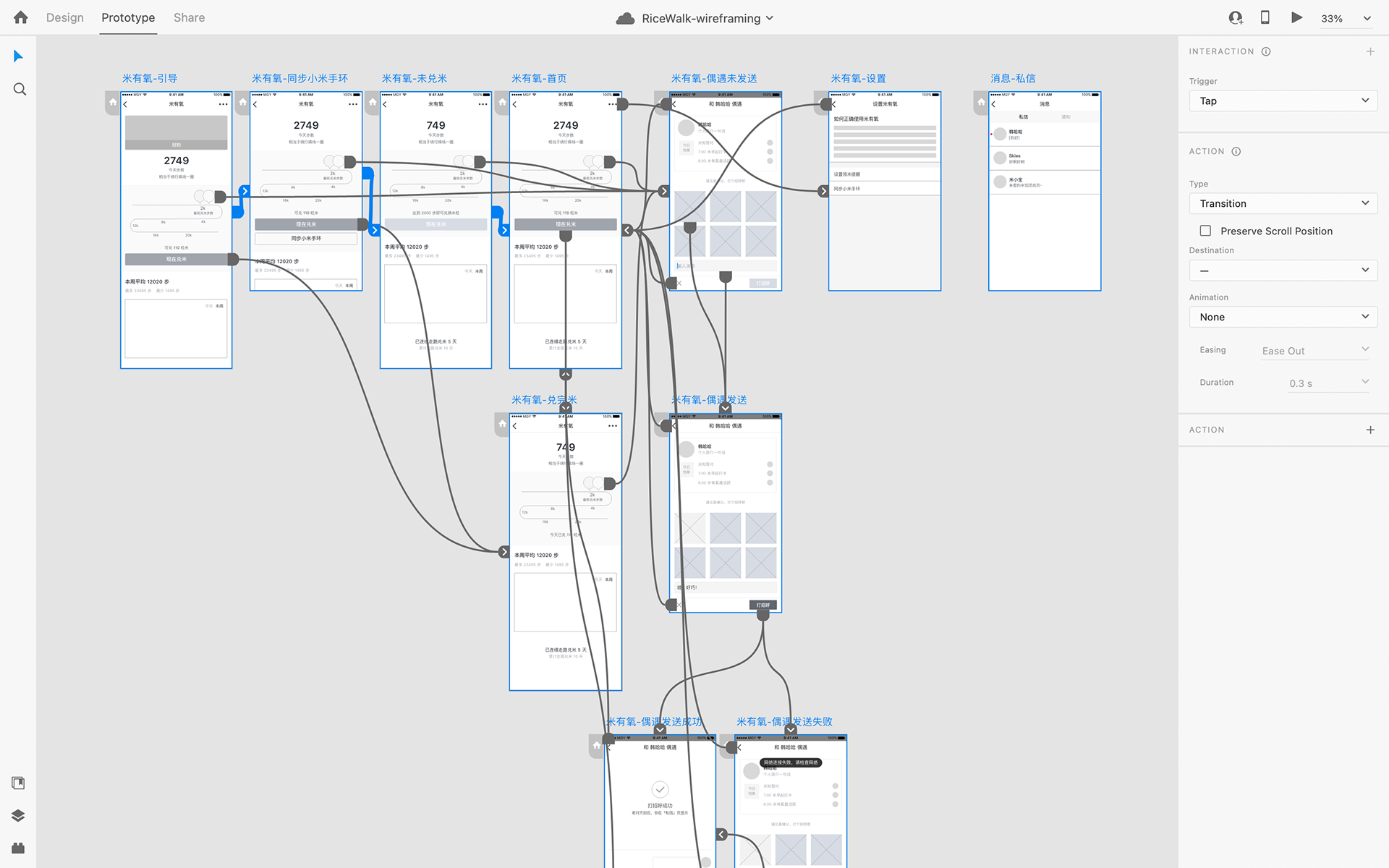
The wireframing of RiceWalking.

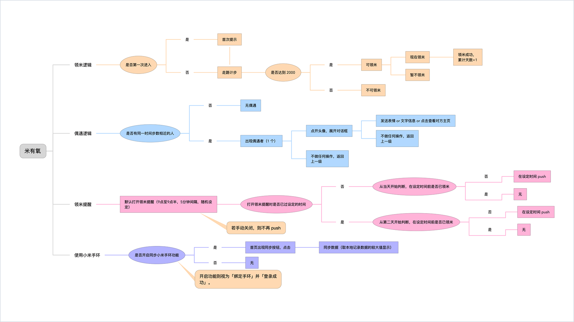
The user flow of RiceWalking was provided to the dev team.

After delivering the final design, we update the wireframes with high-fidelity prototypes and add annotations for various interaction scenarios. Occasionally, we create prototype animations for motion designs within the app. The dev team then reviews and provides feedback on the updated wireframes to confirm the final requirements. Once confirmed, the front-end engineers can begin their work.

The prototype animation of a feature in RiceWalking.

The hi-fi prototypes with annotations were delivered to the dev team.

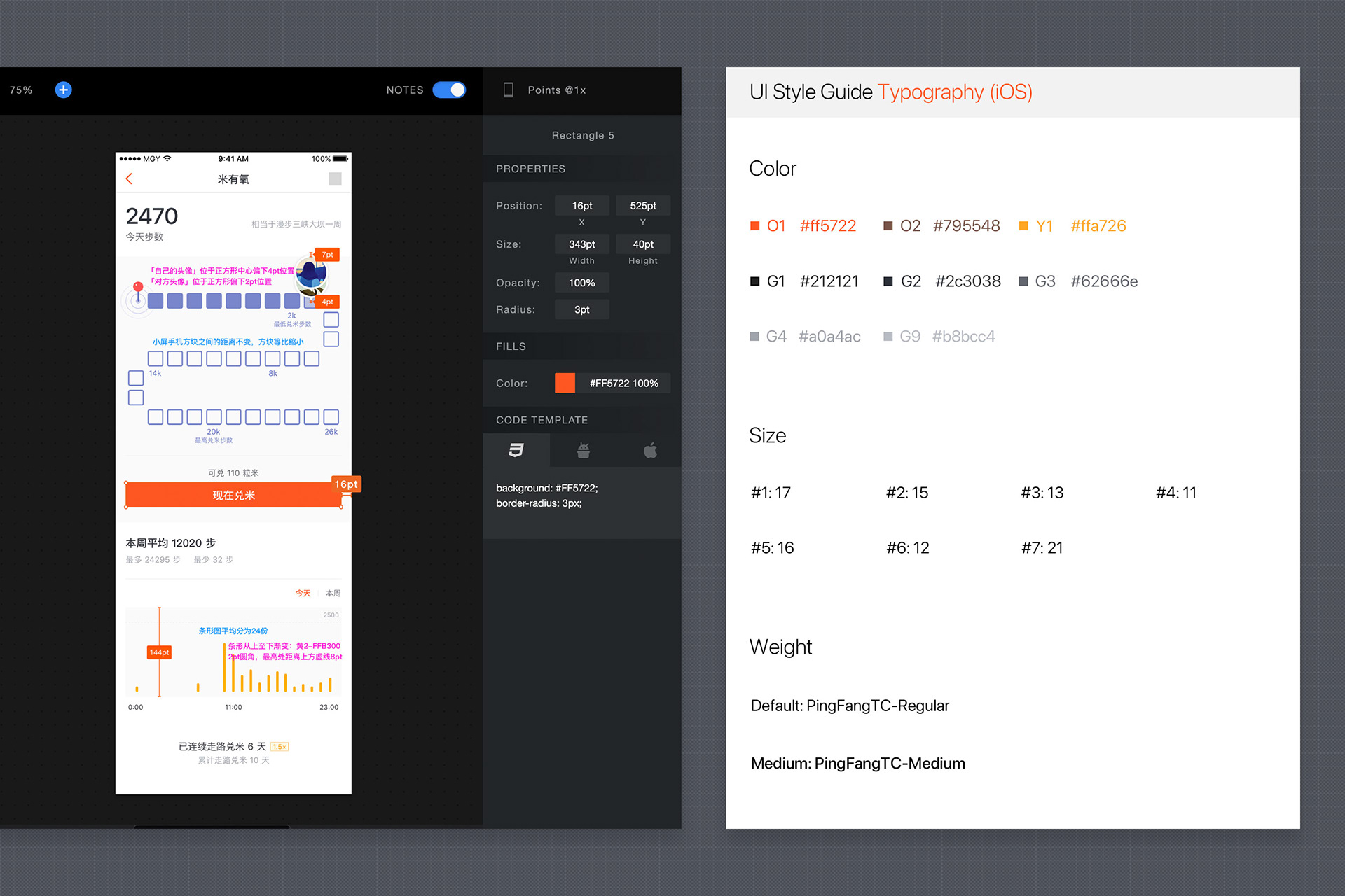
We delivered the UI docs of RiceWalking via Sketch Measure. They can be used with the UI Style Guide to provide UI details.

Achievements & Takeaways
For our products, the most significant achievement is to have a large group of users who love RiceDonate. We have over 10K real ratings on the App Store, 4.9 out of 5. We also have many well-known corporate partners, including Microsoft, Johnson & Johnson, DBS Bank, Bank of America, etc. Our two founders, Mo and Wang, were also included in the 2017 Forbes Asia’s 30 Under 30 list.

For me, the most valuable gain is this almost zero-start entrepreneurial experience — discussing late into the night, constantly iterating, communicating with users and working closely with team members.

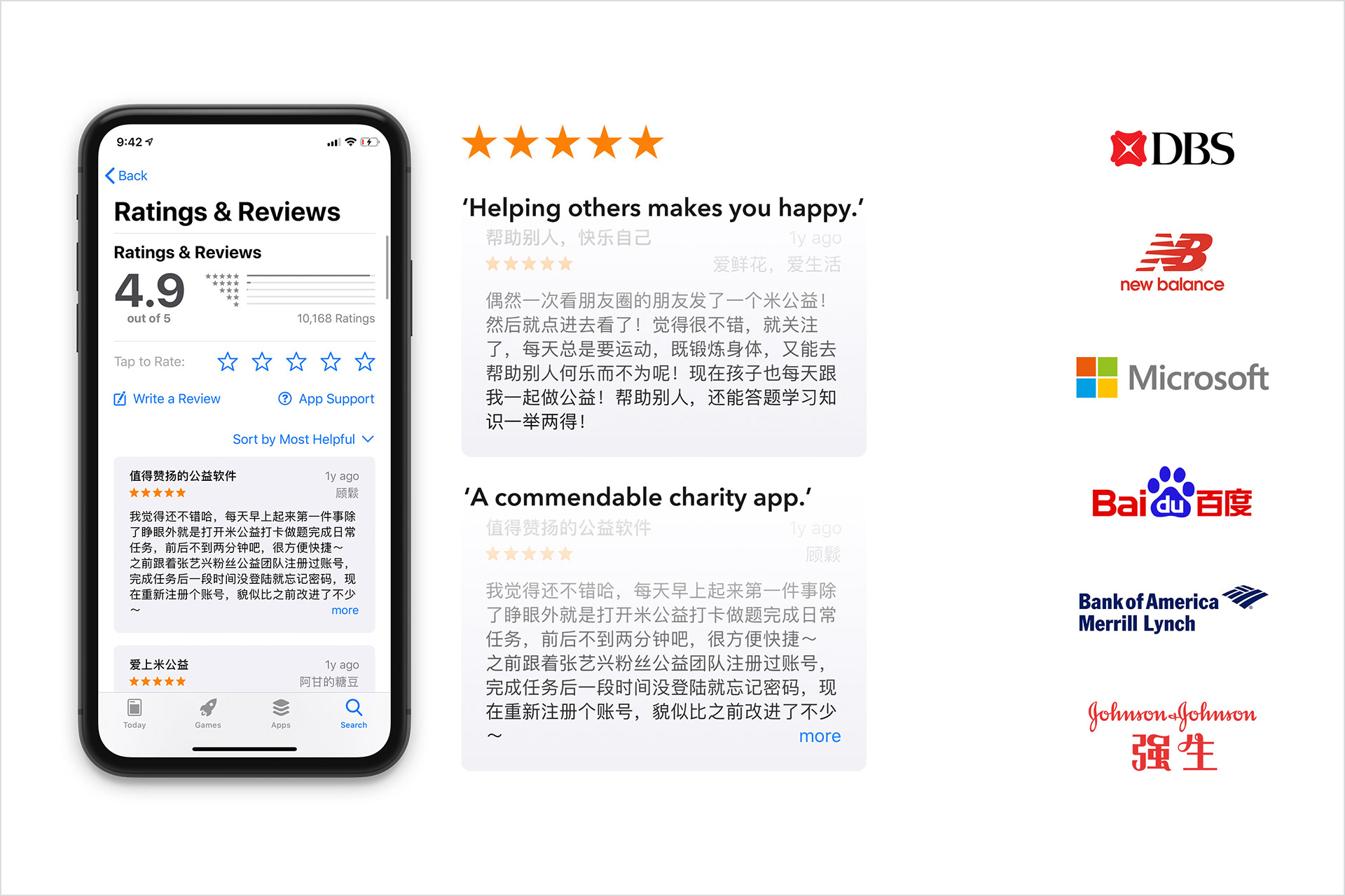
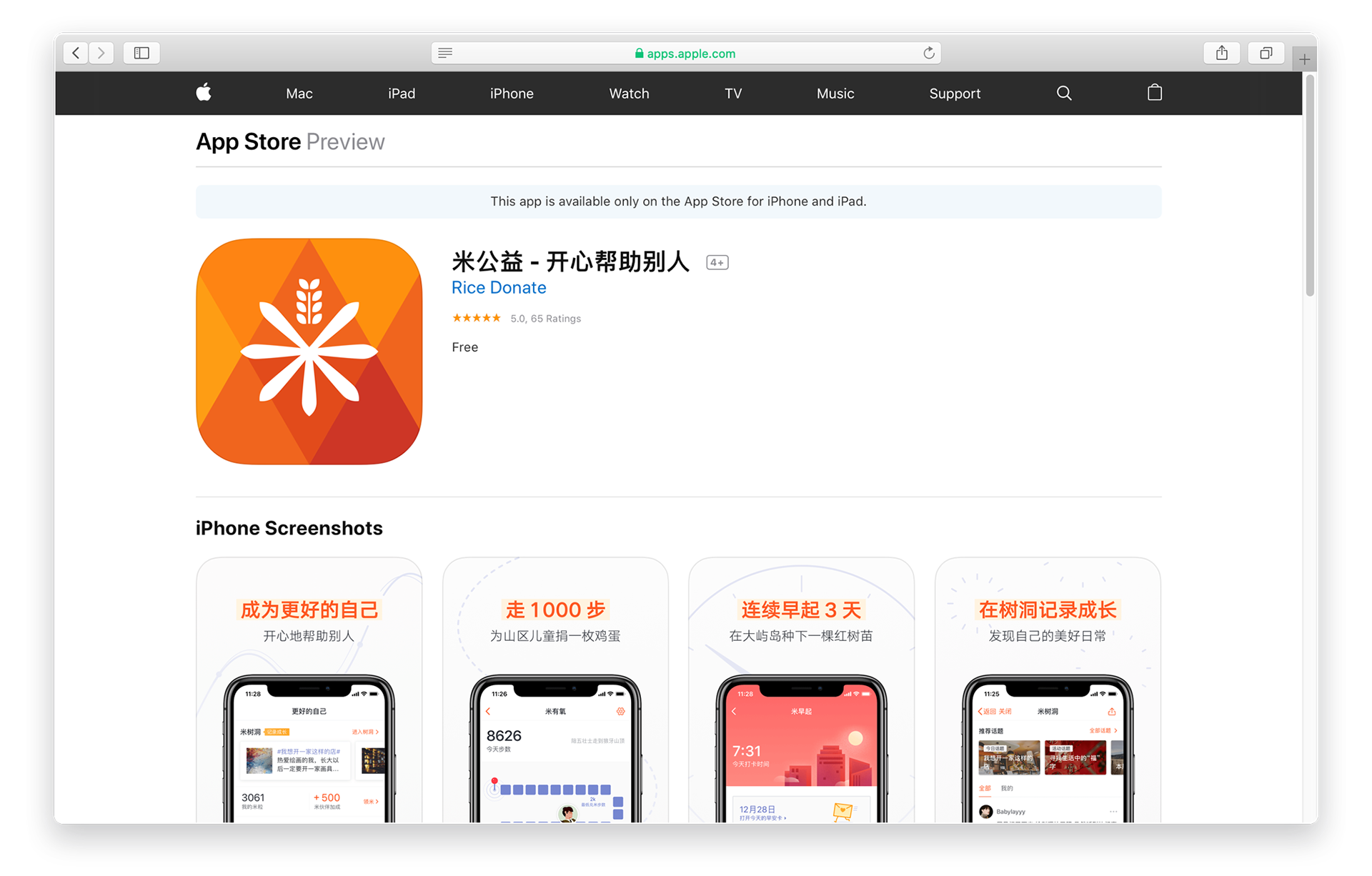
RiceDonate App ratings on the App Store and our corporate partners.

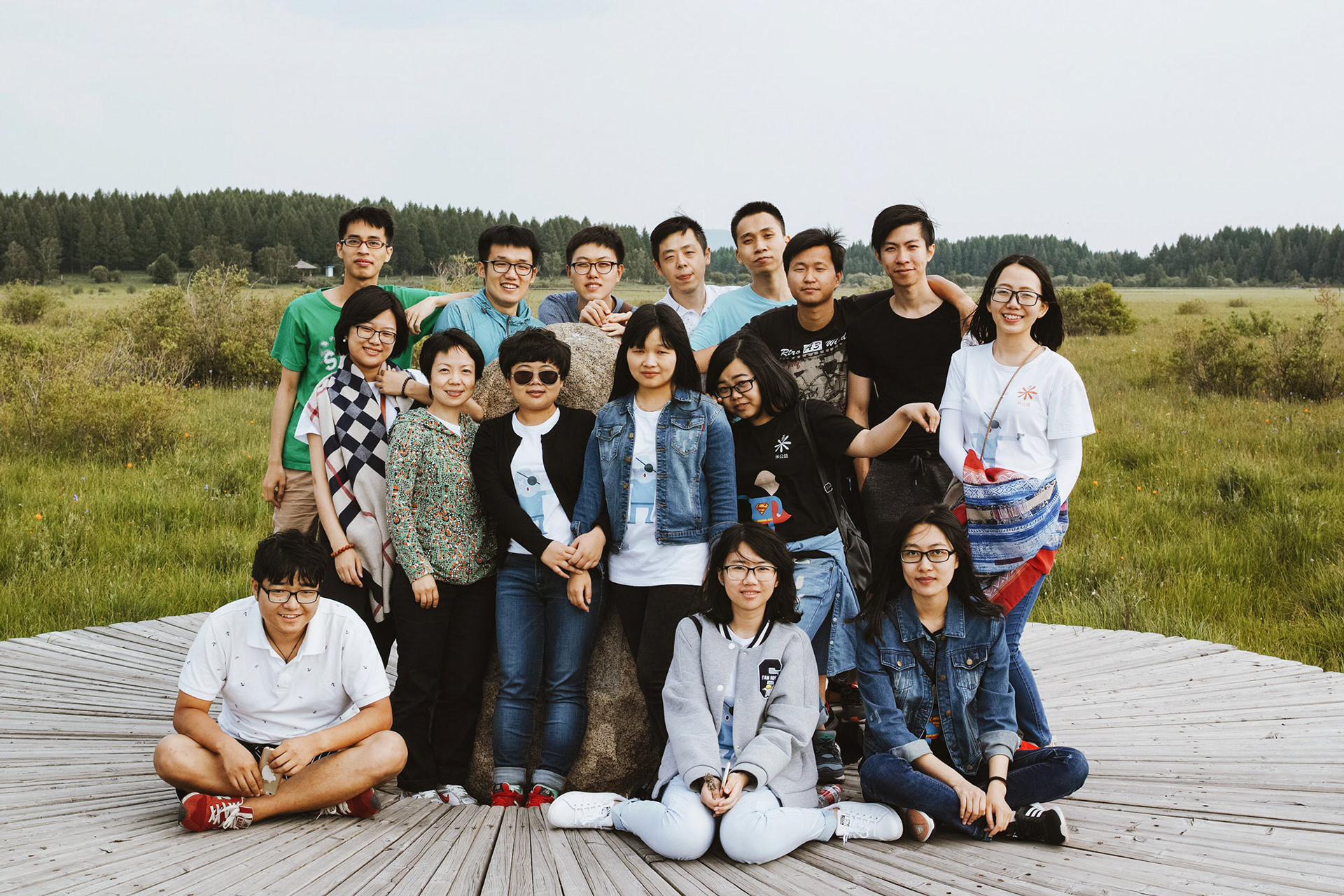
The photo of the early members of RiceDonate. Miss you guys.

Other Works